
-Premium-
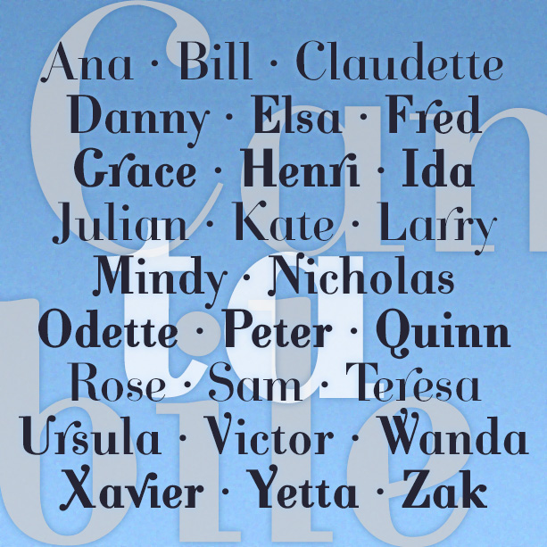

CANTABILE is an elegant font with some postmodern touches such as deleted serifs, exaggerated swashes, and ball terminals. Its musical appearance led to its name that means “singingly.” Available in 3 weights. Version 4.0 uses Opentype features to make the alternate characters and ligatures easier to use, as well as an expanded character set and improved spacing and kerning.
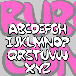
BUBBLE GUM ROCK is based on a kind of graffiti lettering that kids do. Each letter is a big fat outline that underlaps the one to its left. My friend Kate Lee helped me remember it. To Create The Underlapping Effect, Type Your Sentences Like This Because The Caps Are Designed As Initial Letters And The Lowercase To Follow.This is a set of two fonts that work together. The Outline font contains pseudo brush-drawn outlines; the Fill font is the solid part that goes inside. In a program that allows layering, set the same bit of text in each of… continued
BRUCE MIKITA is my digital version of an analog font of the same name. It has a rustic, hand-crafted feel and suggests East Asian calligraphy. The highlight is a distinctive feature; I’ve also made an un-highlighted version, which Dan X. Solo identifies as “Lantern.” At long last, its origin has been revealed to me by Herman: “Since you ask, there is no Bruce Mikita. The type you digitized was issued by George Bruce’s Son & Co’s New-York Type-Foundry. It was patented 12 Feb 1867. It was called by them Ornamented no. 1048. When Phoenix typefounders got some mats they invented… continued
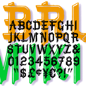
BRIDE OF THE MONSTER is a bold and rustic font that grabs your attention. Companion fonts offer eye-catching inlines or the look of stencils. The uppercase was inspired by Rudolph Koch’s classic font Neuland from the 1920s, originally hand-carved and still popular under various names. From hand-lettered film titles of the 1930s, such as this example from the Bride of Frankenstein trailer, I got the idea to expand the style to include lowercase. Version 3.0 incorporates alternate characters using Opentype, as well as an expanded character set and improved spacing and kerning.
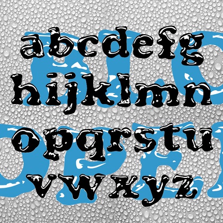
BLOOPER and BLOOP SCRIPT were created to have the look of letters formed by puddles of shiny liquid. The general form of each was inspired by a classic font. Blooper takes after Cooper Black (Oswald Cooper, 1921), Bloop Script after Brush Script * (Robert E. Smith, 1942). I also made a solid version of each (without highlights) for use in layering and with effects filters. BLOOPER 2.0 now contains upper and lowercase letters, plus numbers, punctuation, and international characters. BLOOP SCRIPT includes caps, lower case, numbers, punctuation, and international characters. More information: Although I probably could have just faked… continued
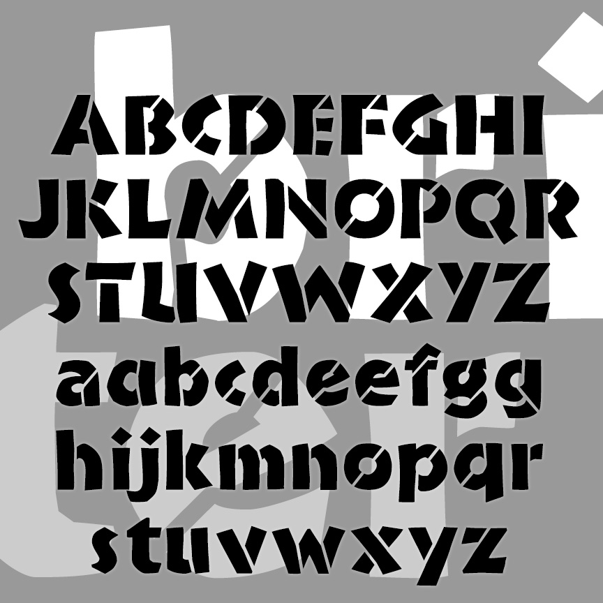
BLOCKED is my reconstruction of a “lost” Letraset font. The original, called “Block Up,” was designed by Sally Ann Grover and was issued in 1974 by Letraset. Block Up is one of countless fonts that didn’t make the technological transition from transfer letters to digital. My digital version was constructed point by point, not autotraced, so it’s very clean. I’ve used all the available characters (except the 4) and rounded it out with more punctuation and international characters. I’m especially fond of my @. The Regular above; that’s what the original looked like. I’ve also created a series of four… continued
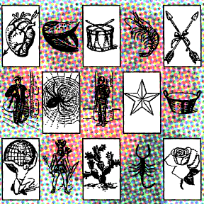
BINGO DINGO is a dingbat font inspired by the classic Mexican board game, Lotería. Similar to bingo, with pictures instead of numbers, there’s a fascinating assortment of characters, animals, and other things which I’ve rendered in an engraving-like style. The optional box around the image can be typed with an additional keystroke. 54 images in all. I have not included the names in the designs; label them as you will in any language.

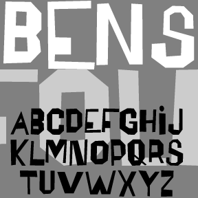
BENSGOTHIC was inspired by the work of the artist Ben Shahn. (See also Bensfolk) This style–which Shahn applied to psalms, Christmas cards, posters, and many other item—suggests inscriptional capitals like those of Byzantine mosaics, the Bayeux tapestry, or medieval manuscripts. He made great use of fanciful ligatures, which are included in the font for a totally hand-lettered feel. The new OpenType version of Bensgothic allows you to access the ligatures easily. In applications that support OpenType features, enable “discretionary ligatures.” Type your text in ALL CAPS to automatically use the ligatures as available. Type in lowercase (or MiXeD cAsE) to… continued
The BENSFOLK fonts were inspired by the work of the artist Ben Shahn. He was a political activist, a painter, and a calligrapher, among many talents. One of the lettering styles Shahn used was derived from the work of amateur sign painters. As trained artists often react to the work of so-called naive or folk artists, he found their crude beauty to be “cacophonous and utterly unacceptable. Being so it is irresistibly interesting.” Shahn used this lettering to represent the speech of the common person, and it blended perfectly with his pen work Shahn also lived to see his work–itself… continued
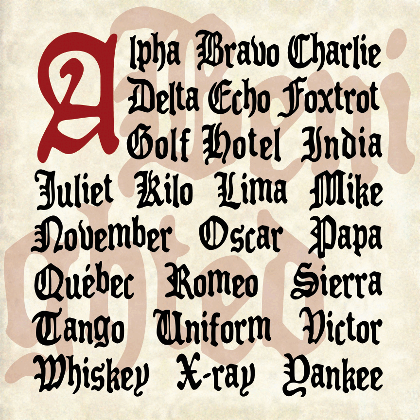
BENIGHTED is my stab at a blackletter font that with a loose, hand-lettered feel, sort of an Old English Casual or Fraktur Frisky. I first drew all the letters with a Sharpie marker, ultimately creating a font with an irregular baseline and a creepy feel. And now there’s a matching font with elongated letterforms and drips suggesting melting candles or blood. Version 1.5 includes an expanded character set and improved spacing.