
-Color-
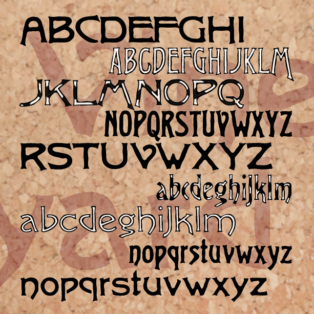

VINEYARD is a pairing of fonts with a rich, woody character. Featuring notes of bark and an earthy finish, Vineyard can be served at most any occasion. The Solid fonts can be used separately or, in a contrasting color, as a fill for the Regulars. And now there’s a third variety, Graft, a dynamic blend of outline and solid. Vineyard was inspired by two early 20th-century analog fonts from American Type Founders, Virile and Erratic Outline. I’ve married the two designs, expanding and refining them. At one time I offered my version of Virile; it has since been revised, and… continued

VINEYARD is a pair of fonts with a rich, woody character. Featuring notes of bark and an earthy finish, Vineyard can be served at most any occasion. The Solid fonts can be used separately or, in a contrasting color, as a fill for the Regulars. Vineyard was inspired by two early 20th-century analog fonts from American Type Founders, Virile and Erratic Outline. I’ve married the two designs, expanding and refining them. At one time I offered my version of Virile; it has since been revised, and expanded, and renamed to become Vineyard.
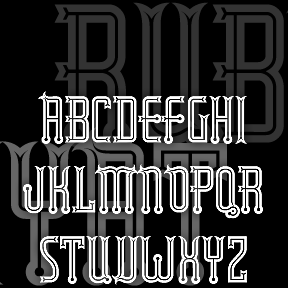
RUBAIYAT is based on this wonderful hand-lettered fruit-crate label with an exotic “Eastern” feel. I redrew the 7 letters, then invented the missing ones and other characters. I also created a set of six fonts–Engraved, Inline, Solid, Thin, Outline, and Shadow–that can be used together or separately.
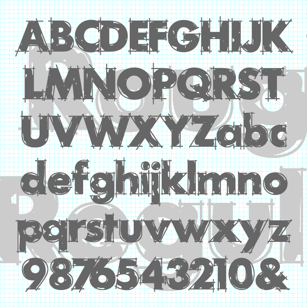
ROUGH DRAFT is designed to look like unfinished lettering; it seems like the outlines need to be cleaned up and the inking completed. A classic geometric sans serif with the hand-drawn elegance of a technical drawing. The Regular font has outlines loosely filled in. Other component fonts in the set—Outlines, Loose Fill, Solid Fill, and Solid—can be used separately or layered in different colors. Suggested in part by “Layout Gothic” in Dan X. Solo’s “100 Grunge Alphabets,” and by Greg Smith. Version 2.0 now has lowercase, an expanded character set, improved spacing and kerning.
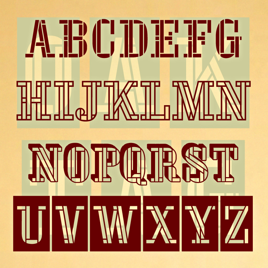
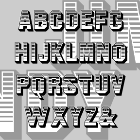
OAKTAG is a set of 4 stencil fonts with a unique woven, serif design. The full set includes 4 fonts. The Regular and Outline can be used separately or layered together. The Blocks and Tiles varieties provide even more creative possibilities. OAKTAG was inspired by the one-character logo of Channel Four UK. I love the challenge of starting with one letter or number and imagining the rest of the characters. I recently learned that amazing icon was designed by Martin Lambie-Nairn. Version 2.0 has an expanded character set, and improved spacing and kerning.
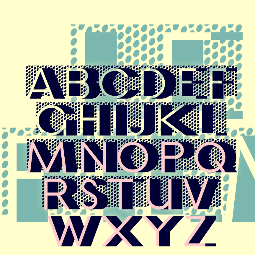
LE FILM is a classic Art Deco design of 3-D geometric letters set against a pattern of bold dots. This is my digital interpretation of the classic analog font of the same name, designed by Marcel Jacno and released in 1927 by Deberny & Peignot of Paris. The Classic font presents white letters with black sides against the dots. I’ve also made separate Letters and Shadow font that can be colored differently and layered with or without the Classic font. Pro tip: These characters ^ < > \ { } _ have been replaced with lines of dots. Use them… continued
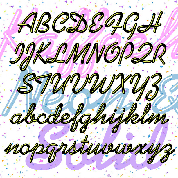
KAFFEEHAUS NEON looks like sleek retro neon cursive, linked and highlighted. And there’s a Solid version that you can layer with the Neon in an accent color, or use separately perhaps with your own effects. The basic letterforms were inspired by the classic script font KAUFMANN®, which was designed by Max Kaufmann in 1936 and remains popular. For my interpretation, I completely redrew the font to make the letters better resemble neon tubes with open loops and rounded ends. I have adapted the basic letterforms to better resemble tubular neon lettering. The ends of characters are all rounded, and there… continued
JOGGLE was inspired by a book jacket that I once saw, half remembered, and couldn’t find again. The illustration was a colorful 50s, jazz-style composition, and the hand-drawn, outlined letters joined up. Couldn’t find it again; hope I did it justice. The letters link up as you type. There are end caps, blank spaces, and flourishes to finish up names and headings, and two of each letter so you have a little more variety. A second font (the pink part of the illustration above) provides a loose fill that be placed behind the outlines for another effect. Includes 2 of… continued
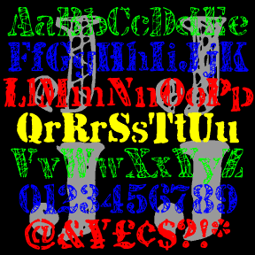
JJ STENCIL was inspired by the work of the great American Pop artist Jasper Johns. Perhaps best known for his flag and target series, Johns has also used the “found” look of stencils in many drawings and paintings, including “0-9” at left. My fonts were not made directly from Johns’ work, but from scans of my own similar stencil scratchings. There are four complete fonts, each with a different treatment of the letters. The fonts are designed to be mixed or layered or both. JJ STENCIL 3.0 now includes upper and lowercase. I finally found an appropriate lowercase stencil and… continued
JIM DANDY is my interpretation of a font that originated in the 1850’s as Gothic Shade from the Dickinson Type Foundry. It boldly suggests a political broadside, a circus poster, or a Western sign. Later this font would be known as Tombstone and Jim Crow as it was subsequently issued by other foundries in other formats. Jeff Levine jogged my memory with a scan of this gem from a 1970s dry-transfer catalog; thanks, Jeff. The Regular font is equivalent to the original. I’ve also created component fonts for the shading, shadows, and other elements that can be used separately or… continued