
-Stencil-
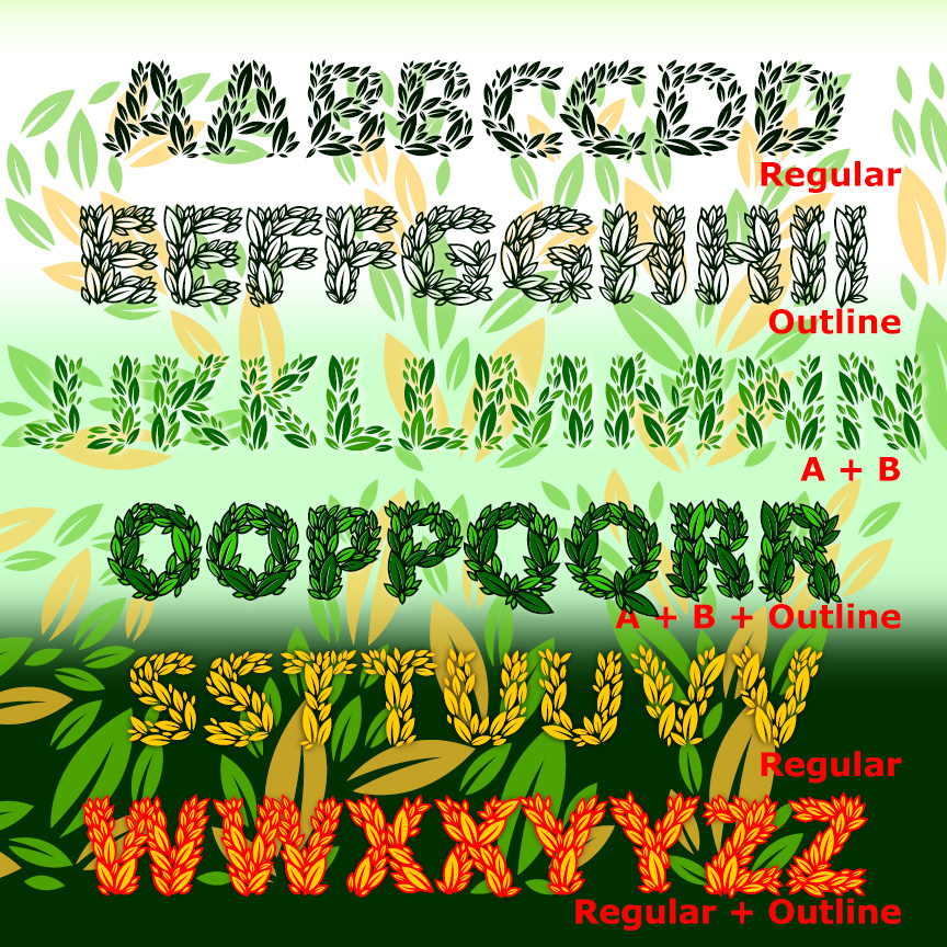

SWEET BAY is a family of plant-based fonts: the letters are made completely of leaves for a fresh, natural feel. The Regular and Outline fonts have all the leaves and can be used together or separately. Component fonts A and B each have half the solid leaves and can be layered together in different colors to create richer and deeper effects. All caps, but two versions of each letter for a more hand-lettered look.
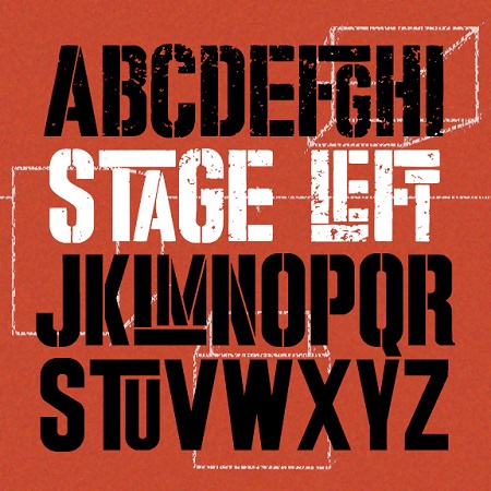
STAGE LEFT was inspired by the iconic poster for the movie version of “West Side Story.” Designed by Joe Caroff—not Saul Bass as is often stated—the poster suggests a gritty but playful urban energy. It’s basically large and small caps but I’ve designed it so the big T, L, and F interlock with other small letters.And it comes in three finishes: Solid, Stencil, and Stressed, the latter most resembling the original.
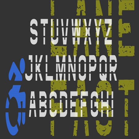
The Fast Lane fonts were inspired by roadway and parking lot markings, reflecting both the stencil style and the stretched form that looks normal when viewed at an angle. The Icons fonts includes symbols and arrows to accompany the letters and numbers. The regular fonts could be used to make printable stencils; I’ve also created Rough versions with a pavement texture for other applications.
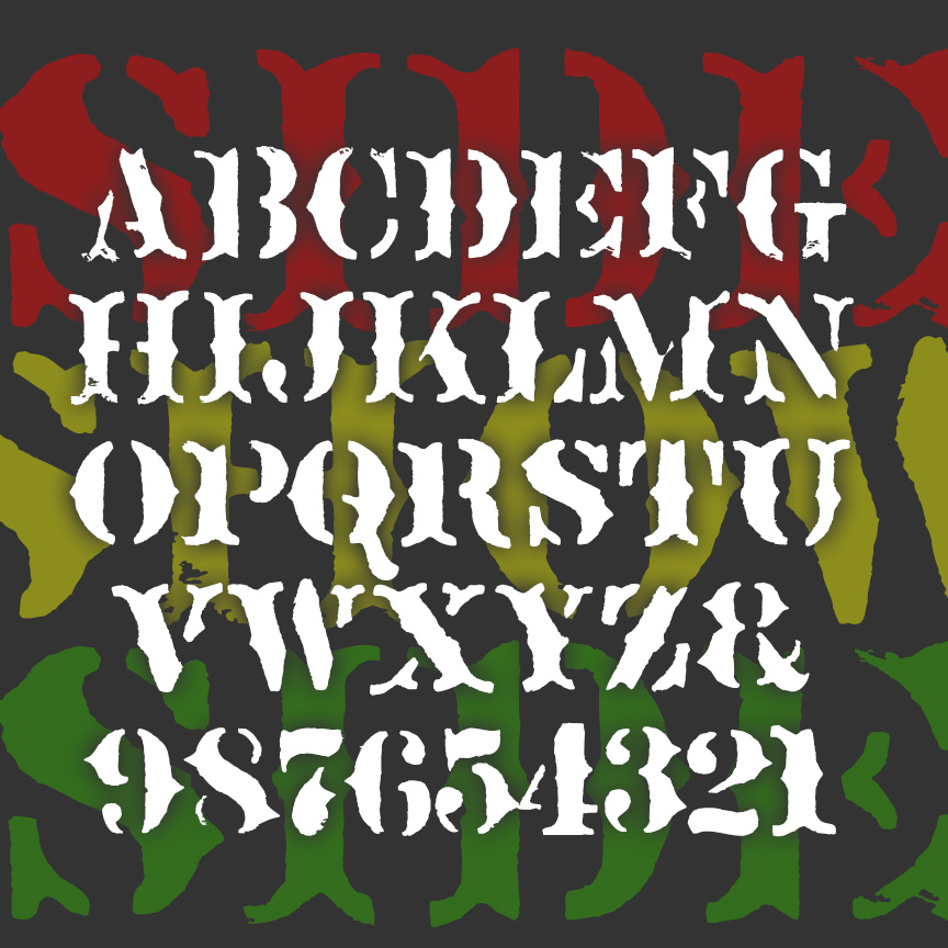
SIDESHOW is a fanciful font with the overall feel of rough stencil printing. Imagine the cart for a medicine show or signs for a traveling circus. SIDESHOW is my second font inspired by Ouija® boards; the other is Captain Howdy. This older board was rather primitively stenciled, adding to its creepy attraction. Version 2.0 includes a greatly expanded character set, improved spacing and kerning.
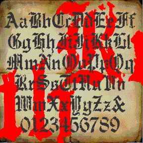
RUDE GOTH began with a set of “Old English” stencils. I used a natural sponge to print them and get an authentic texture. Goth, but also for perfect for a Halloween, pirate, or rough historic feel. Includes upper and lowercase, numbers, punctuation, and international characters.
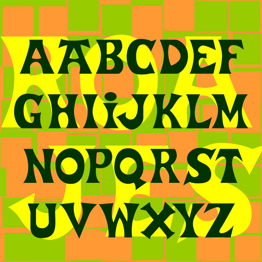
ROAD JESTER is bold and playful, suggesting the hand-lettered signs you might find in a sleepy beach town. Road Jester was inspired by the logo of Trader Joe’s, the offbeat grocery chain; additional characters were inspired by Basque-style lettering. A matching stencil font provides an exotic shipping crate feel. Don’t use this font to create your own Trader Joe’s merchandise as that would certainly be trademark infringement. “Road Jester” is an anagram of Trader Joe’s. ROAD JESTER 2.1 has an expanded character set and improved spacing and kerning.
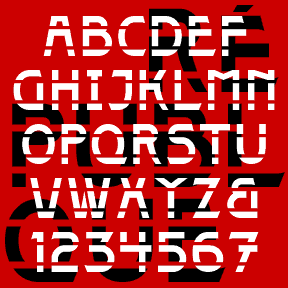
The 4 RÉPUBLIQUE fonts were inspired by the lettering on this style of Paris Metro sign, designed by the architect Adolphe Dervaux and first installed in 1924. This design coexists with the more famous Art Nouveau “Metropolitain” signs, designed by Hector Guimard in 1900 and made of sinuous wrought iron. The “Candelabra Dervaux” uses simpler Art Deco letterforms, cut out of red metal, and illuminated from the back. The double row of stencil-style supports resembles train tracks. For fun, I’ve included a few alternate characters in the lowercase positions and created a Solid font without the horizontal lines, and two… continued
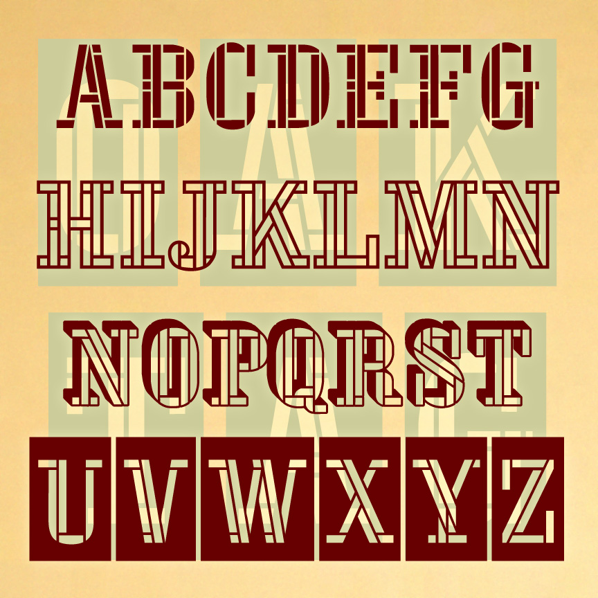
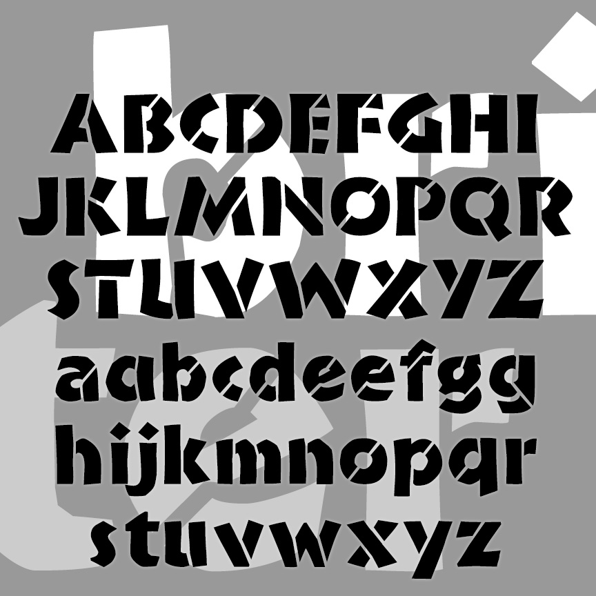
OAKTAG is a set of 4 stencil fonts with a unique woven, serif design. The full set includes 4 fonts. The Regular and Outline can be used separately or layered together. The Blocks and Tiles varieties provide even more creative possibilities. OAKTAG was inspired by the one-character logo of Channel Four UK. I love the challenge of starting with one letter or number and imagining the rest of the characters. I recently learned that amazing icon was designed by Martin Lambie-Nairn. Version 2.0 has an expanded character set, and improved spacing and kerning.
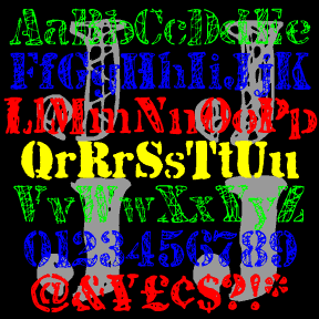
JJ STENCIL was inspired by the work of the great American Pop artist Jasper Johns. Perhaps best known for his flag and target series, Johns has also used the “found” look of stencils in many drawings and paintings, including “0-9” at left. My fonts were not made directly from Johns’ work, but from scans of my own similar stencil scratchings. There are four complete fonts, each with a different treatment of the letters. The fonts are designed to be mixed or layered or both. JJ STENCIL 3.0 now includes upper and lowercase. I finally found an appropriate lowercase stencil and… continued
BRIDE OF THE MONSTER is a bold and rustic font that grabs your attention. Companion fonts offer eye-catching inlines or the look of stencils. The uppercase was inspired by Rudolph Koch’s classic font Neuland from the 1920s, originally hand-carved and still popular under various names. From hand-lettered film titles of the 1930s, such as this example from the Bride of Frankenstein trailer, I got the idea to expand the style to include lowercase. Version 3.0 incorporates alternate characters using Opentype, as well as an expanded character set and improved spacing and kerning.