
-Retro-


ARRIACA is a bold and exotic display font inspired by a 1940s lettering guide. This makes me think of Spanish “mudéjar” design, with some middle eastern flavor and the feel of wrought iron. Or maybe the points suggest spurs for a Western theme, or spikes for a metal application.
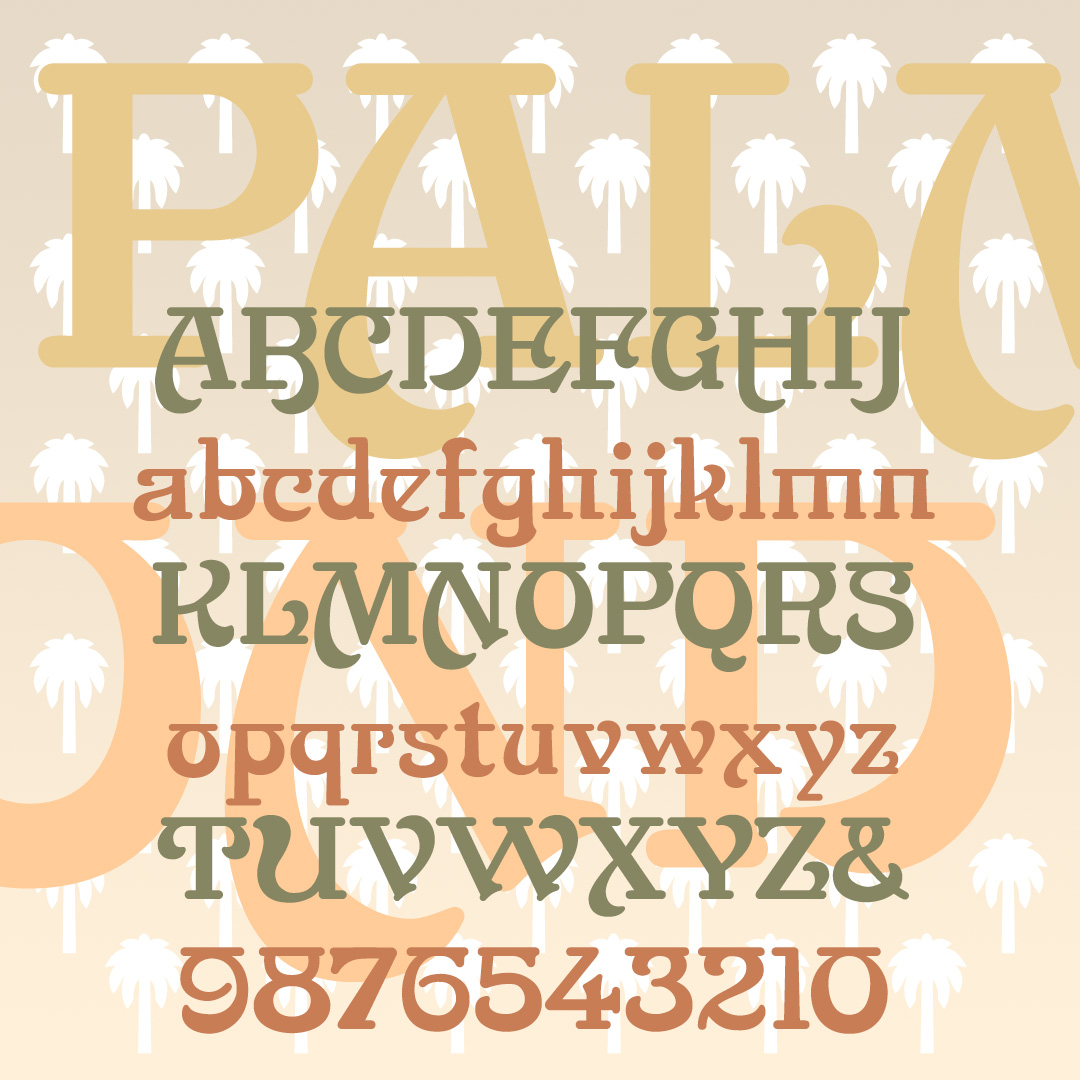
PALM FROND is a stylish display font inspired by a 19th-century typeface. Broad swashes give a feeling of Art Nouveau and horizontal strokes suggest Indian scripts.
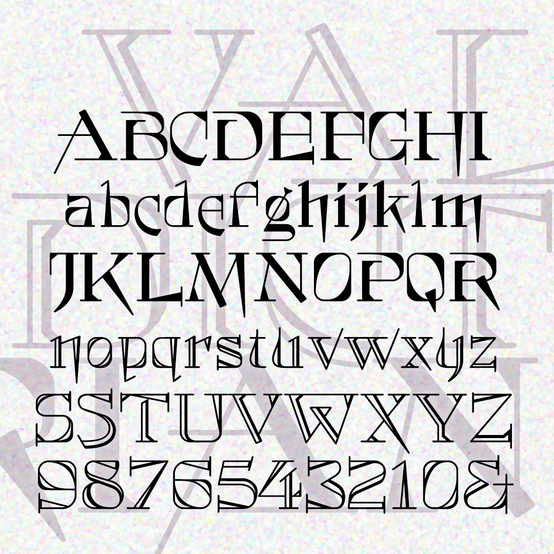
VALEDICTORIAN is both quirky and formal. The unusual letterforms give it a modern touch, while also conveying elegance and tradition. Two varieties, solid and shaded. VALEDICTORIAN was inspired by a typeface called Vassar that appeared in the 1889 catalog from Farmer, Little & Co.
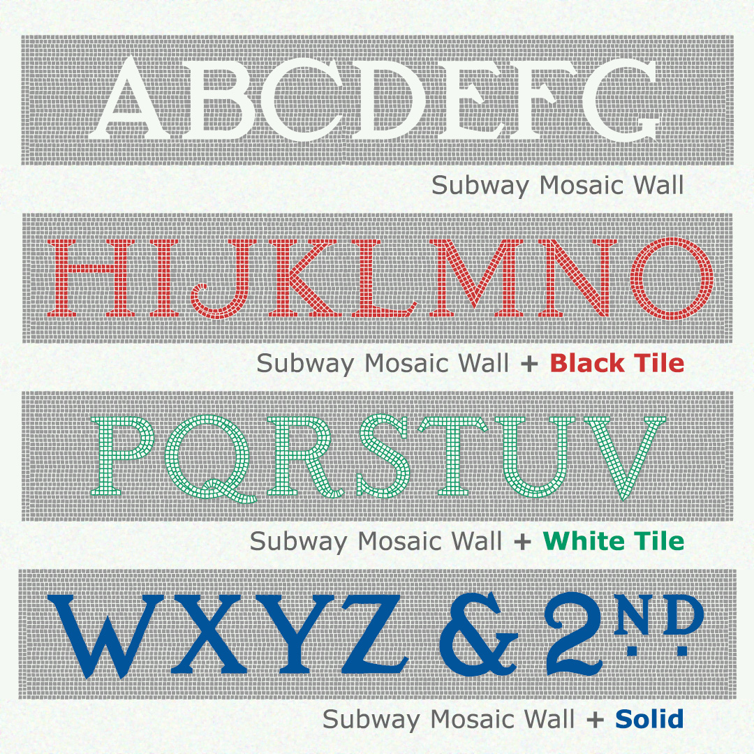
Like the originals, the fonts of SUBWAY MOSAIC WALL were inspired by the classic NYC subway signs. This version includes the mosaic background around each letter. Black Tile, White Tile, and Solid fonts can be layered in other colors for a realistic mosaic look. If you don’t want the mosaic background, use the original Subway Mosaic fonts which employ kerning.
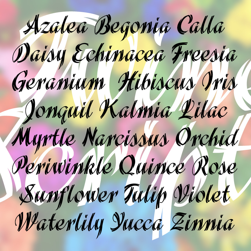
TWINE SCRIPT is a bold and stylish cursive font with a unique feature: “split ends” that give it a light and energetic twinkle! TWINE SCRIPT was inspired by examples in a 1930s Speedball lettering guide by Ross F. George who inspired so many people’s love of lettering.
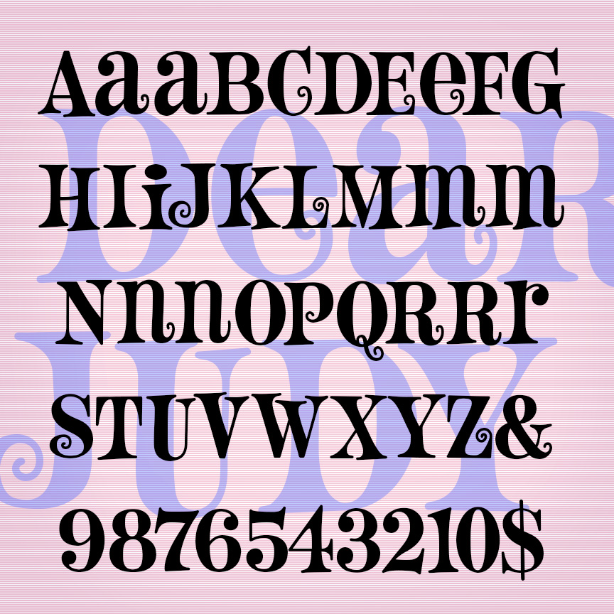
DEAR JUDY is a fun font with flair. This unicase font has its roots in 1960s design: quirky, bouncy serifed letterforms, all caps with cap-sized lowercase versions of some letters (AEMNR). Extra curls on some alternates too! DEAR JUDY was inspired by a hand-lettered paperback cover from 1963 called “Cover Girl Nurse.”
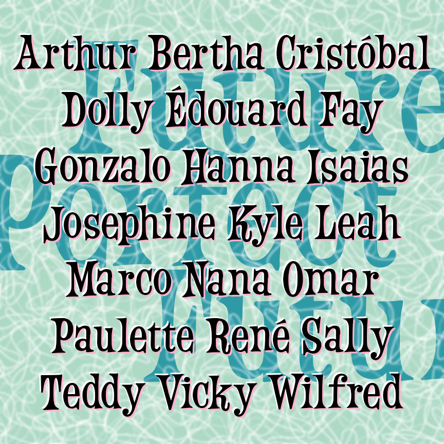
FUTURE PERFECT is a fun and bouncy font. This bit of retro futurism was inspired by an analog font reproduced in a book. I was attracted to its relatively condensed form; so many similar display fonts are limited by their width. Future Perfect is a grammatical tense, but it makes me think of time of the Space Needle and The Jetsons when the future just seemed full of big bright possibilities. The names here are the 2025 hurricanes; by 2026, we will have experienced one or more of them.
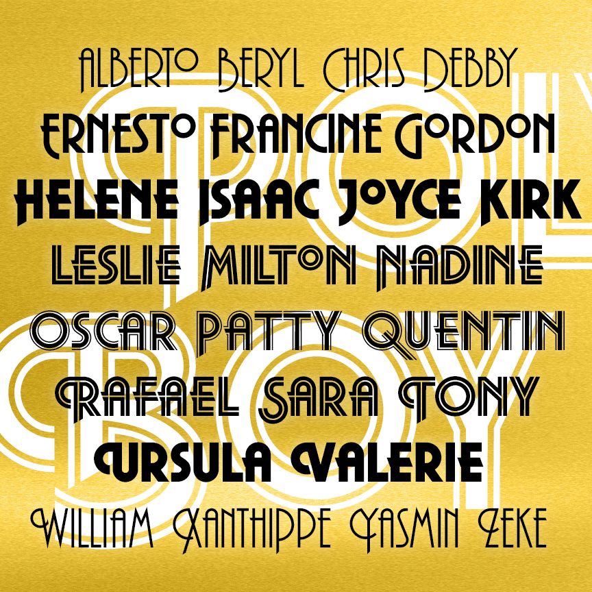
POLYBOY is a strong and stylish set of geometric fonts with roots in 1970s design. The set of 5 POLYBOY fonts includes 3 weights (Regular, Demi, and Ultra) and 2 striped variations (Inline and Double Line.) Most letters appear in 3 forms—lining caps, descending caps, and swash caps—taking your design from day to evening and beyond.
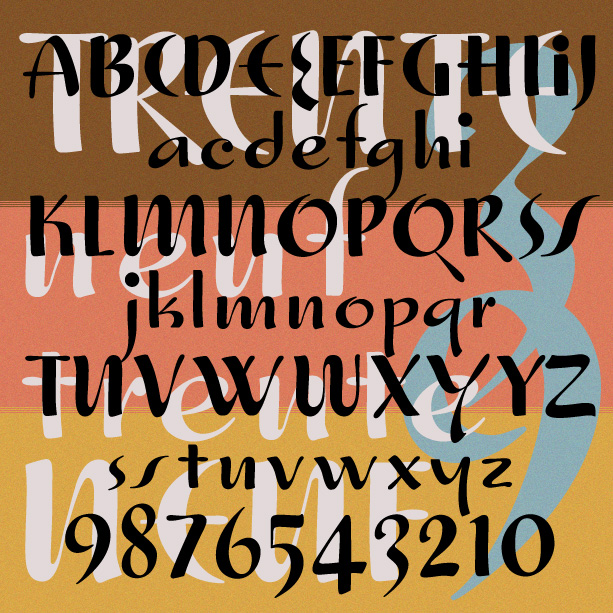
TRENTE NEUF is a fun and fancy font with Art Deco roots. Inspired by examples of hand-lettering from 1939, I strove to maintain the practiced casualness of classic pen and brush work. The fashionable letterforms were a big draw; I’ve included multiples as Opentype stylistic alternates.
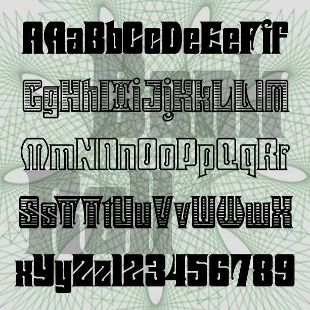
BANKROLL was inspired by fonts used for 19th-century banknotes, stock certificates, and the like. Completely reimagined and redrawn, BANKROLL combines the Victorian mix of solid construction and decoration that people like about steampunk. In four varieties: Solid, Shaded, Outline and Engraved. If you want this look in an easy-to-use monogram format, check out Tablet Monograms.