
-Movie-Inspired-
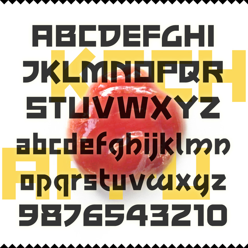

KECHAPPU is a bold font with squarish letters, monoweight strokes, and some unusual features that compare to modern Asian typographic styles. The fusion of East and West produces tasty results. For example, ketchup, that all-American food, began as a Malay (or maybe Chinese) sauce and word; kechappu is the Japanese translation. Kechappu was inspired by the print advertising for the 1959 film noir, The Crimson Kimono.
BREEZEBLOCK is a bold cursive font with the feel of hand-painted sign lettering. The Regular font has sharp corners; the Rounded and Brush varieties offer softer corners and edges. BREEZEBLOCK was inspired by film trailer lettering of the 1930s.
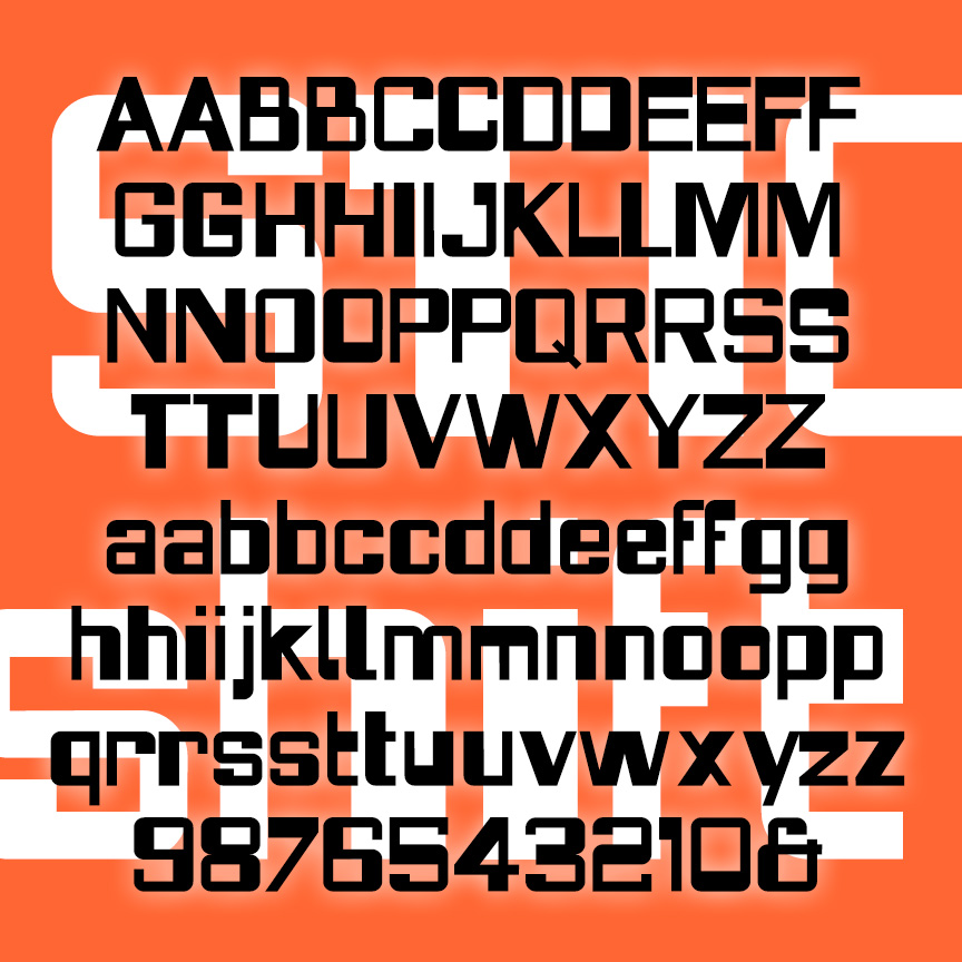
STICKSHIFT is a playful but unsettling sanserif. Apparently square and controlled, STICKSHIFT switches from thick to thin in unexpected ways. Combines aspects of folk-inspired lettering like BENSFOLK with a punch-card design. Lots of alternate characters and discretionary ligatures to keep the shift quality going. Inspired by the logo of the 1967 film “In the Heat of the Night.”
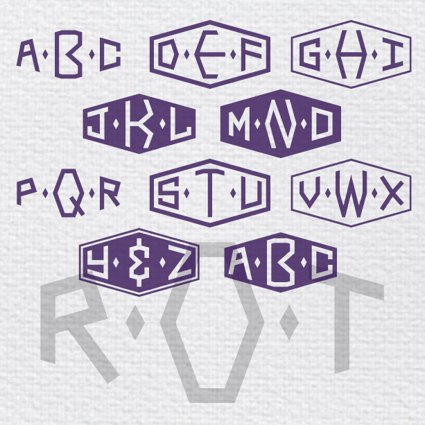
THORNHILL MONOGRAMS is a pair of fonts designed to create custom monograms in a classy retro style. Contained within a horizontal diamond shape, you have the choice of black letters on white or white on black, with or without decorative borders to enclose your monogram. Inspired by Cary Grant’s character’s monogram in Hitchcock’s 1959 classic “North by Northwest.” The R·O·T monogram appears on book matches and a handkerchief, indicating Roger O Thornhill’s class and style. When asked what the O stands for, Thornhill replies “nothing.” Perhaps a film buff with a 2-letter monogram would also use the O.
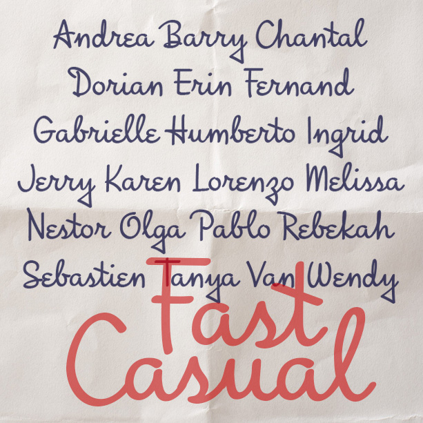
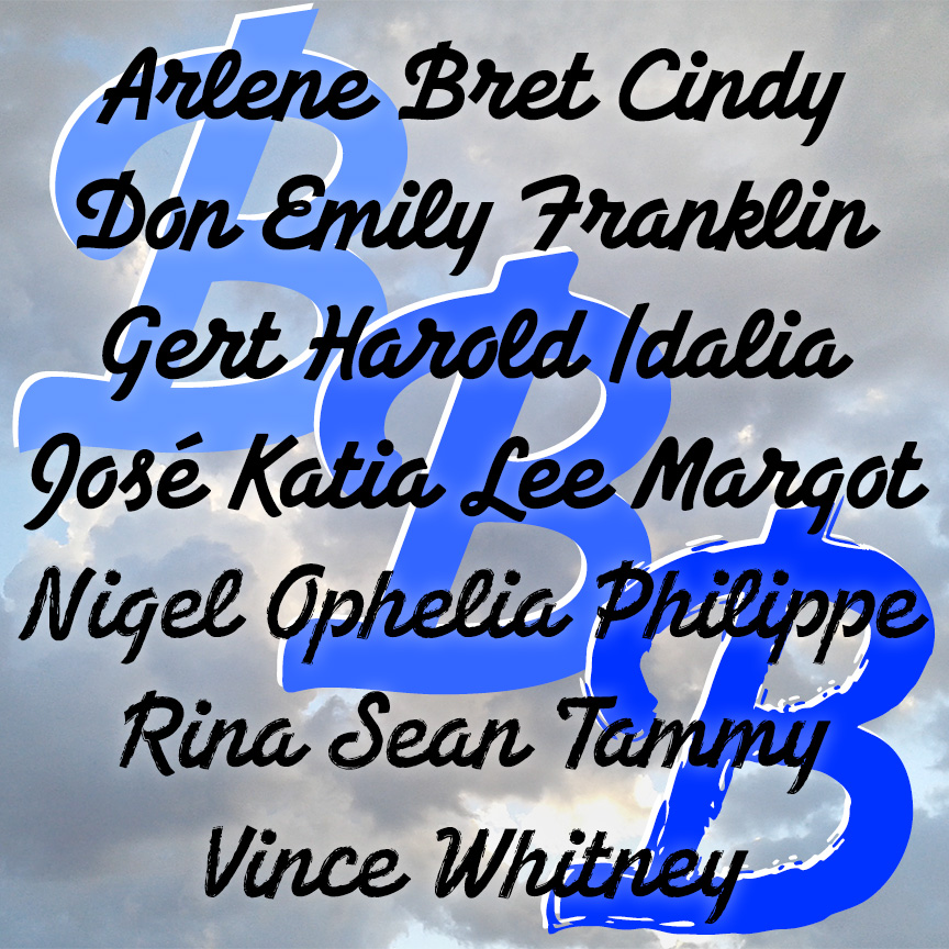
Fast Casual looks like the cursive handwriting of a smart and creative individual who takes pride in their writing, but they also include many quirky touches to show their personality. Fast Casual was inspired by the hand-lettered titles of the trailer of the classic 1940 Bette Davis film “The Letter”. I’ve kept many of the quirks—the triangular descenders, the epsilon e’s, the diagonal crossbars—while modernizing and harmonizing it altogether.
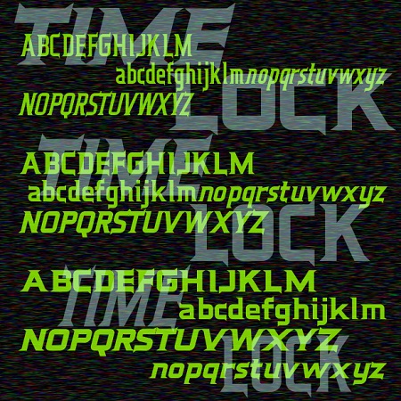
Time Lock is a 6-font family with a retro-futuristic feel. Sleek and streamlined, with distinctive triangular serifs strategically placed like fins. In three weights with matching oblique fonts for even better aerodynamics. Time Lock was inspired by the trailer for the film “The Time Machine,” 1960, very different from the poster or the main titles. Here is the full trailer, you can see I’ve expanded the design to include lowercase.
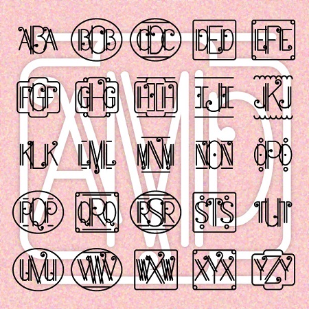
ART DECO MONOGRAMS combines elegant geometry, the intricacy of metal work, and a touch of musical flair. Create your own custom 3-letter monograms, with or without decorative frames. (If you prefer this style in a regular text font with upper and lowercase, please check out my True Confession font.)
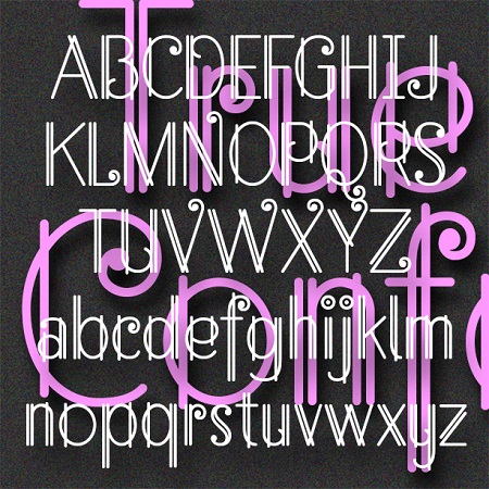
True Confession is a delicate and lively font that suggests Art Deco metalwork. Inspired by the hand-lettered main title of the 1937 film of the same name starring Carole Lombard, art directed by Hans Dreir and Robert Usher. Want this look in a handy monogram font? Check out my Art Deco Monograms.
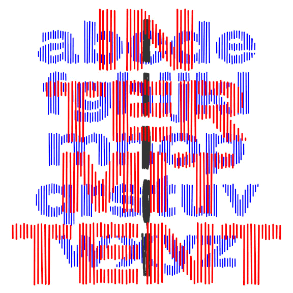
INTERMITTENT was inspired by some of the titles for the movie “West Side Story,” designed by the legendary Saul Bass. Bass’ titles take several different turns; this style was used for the title and intermission cards. Composed of slightly irregular parallel lines that suggest a bold, wide sans serif, Intermittent is like a sketch of a font, bold and wide but with a gentle sparkle. This font can be condensed, expanded, layered, and negatively spaced to great effect. This font can be condensed, expanded, layered, and negatively spaced to great effect.
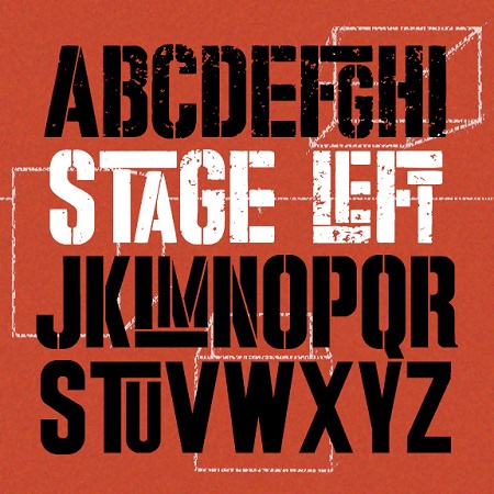
STAGE LEFT was inspired by the iconic poster for the movie version of “West Side Story.” Designed by Joe Caroff—not Saul Bass as is often stated—the poster suggests a gritty but playful urban energy. It’s basically large and small caps but I’ve designed it so the big T, L, and F interlock with other small letters.And it comes in three finishes: Solid, Stencil, and Stressed, the latter most resembling the original.