
-Movie-Inspired-
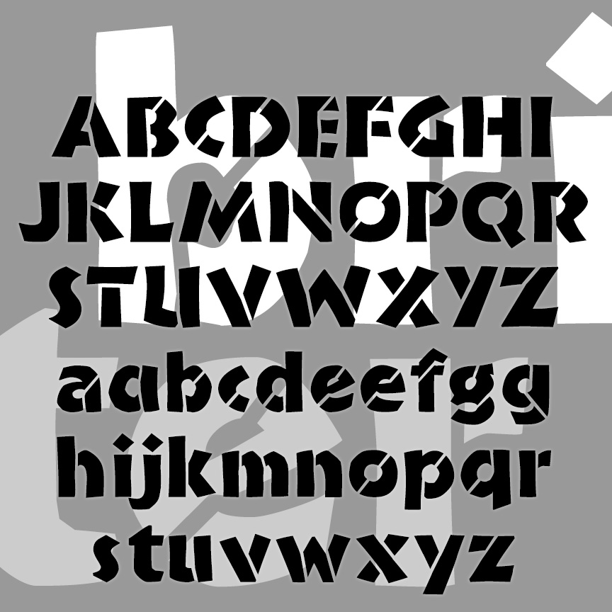

BRIDE OF THE MONSTER is a bold and rustic font that grabs your attention. Companion fonts offer eye-catching inlines or the look of stencils. The uppercase was inspired by Rudolph Koch’s classic font Neuland from the 1920s, originally hand-carved and still popular under various names. From hand-lettered film titles of the 1930s, such as this example from the Bride of Frankenstein trailer, I got the idea to expand the style to include lowercase. Version 3.0 incorporates alternate characters using Opentype, as well as an expanded character set and improved spacing and kerning.
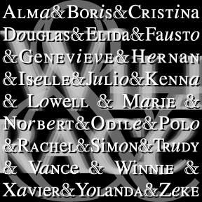

WILLING RACE is my adaptation of the opening credits of the TV show Will & Grace, originally designed by Number Seventeen. Like those, I’ve mixed large and small caps with roman and italic lowercase, all based on Times Roman. There are alternates of each x-height character for nearly infinite variation. As suggested by Sara, I have added a more accurate (to the show credits) engraved “Modern” style ampersand. BTW, the names in the graphic above were the names projected for 2002 Eastern North Pacific storms. These are all worked out for years in advance with alternating male and female names… continued
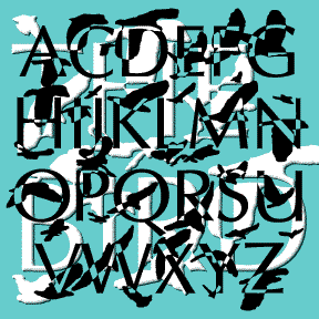
Alfred Hitchock’s The Birds (1963) is one of my favorite films. This font was inspired by its opening titles which were designed by James S. Pollak. Each name appears in a serifless roman font, then is broken up and reassembled by the images of birds flapping past. The letterforms are my own variation on Optima with certain letters altered to match the film’s. The bird shapes are based on my own photos of swarming crows on Thanksgiving 2004. The result doesn’t match the individual film titles, but suggests the entire sequence of breaking letters and passing birds. An interesting contrast… continued
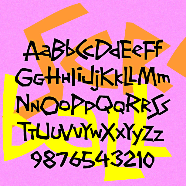
SCREWBALL looks like whimsical hand-lettering. It’s unpredictable with lots of close-fitting pairs. It was inspired by the hand-lettered titles of the movie What’s Up, Doc? (1972), designed by The Golds West Inc. Version 1.5 includes an expanded character set and many alternate characters that make use of Opentype features to create a more hand-lettered look, as well as improved spacing and kerning. What’s Up, Doc? is a personal favorite, directed by Peter Bogdanovich, starring Barbra Streisand, Ryan O’Neal, and, in her first film, the late Madeline Kahn, to whose memory this font is dedicated.
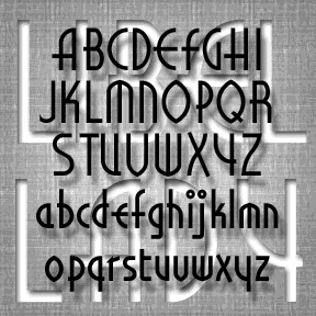
LIBELED LADY was inspired by the hand-lettered titles of the film of the same name (1936). It’s an enjoyable romantic comedy directed by Jack Connolly and starring Jean Harlow, William Powell, Myrna Loy, and Spencer Tracy, art directed by Cedric Gibbons , William A. Horning, and Edwin B. Willis. The opening titles are a fine example of Art Deco lettering, appropriate to the style and tone of the film. Somewhat regularized and fleshed out, the font remains faithful to the original. Dan X. Solo laments the scarcity of period Art Deco fonts; consider this a reconstruction of one that never… continued

HARLEQUIN was inspired by this poster from the 1953 film Kiss Me Kate (detail at left). It has a jolly jester’s hat feel and also resembles turned wooden spindles. Includes caps, numbers, punctuation, and international characters. As seen in use in these “personalized totes for the eco-check girl,” from Label Me Lisa.
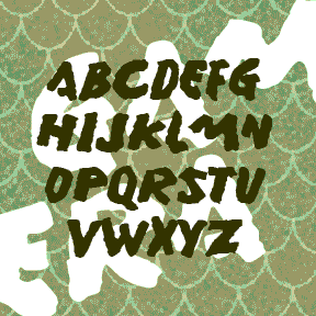
GAMERA was inspired by the hand-lettered titles of the English-language version of certain Gamera films. The font is emphatic and primitive with a rough organic edge, rather like its giant mutated namesake. Gamera was Daiei Studio’s answer to Toho Studio’s Godzilla. At the start of the series, the giant mutated turtle was a grave threat, but then became “friend to all children.” To me, all these such monster movies are just awful, but with the MST3K treatment they become good for a few laughs. Of course the atrocious dubbing and other attempts to sell the films in the West may… continued

This font is called 12 TO THE MOON, after the movie of the same name. Not sure what you would ever do with it, but I had fun making it and working with it. The movie is one of very many black-and-white 1950s sci-fi movies that would end up on Mystery Science Theater 3000. Three times a strange message appears on the screen on the ship, like the animation on this page. Luckily, the ship’s “astrophotographer and pharmacist” (played by Michi Kobi, left) is able to translate it. The alien language translation thing is always problematic; one could fill a… continued