
-Experimental-
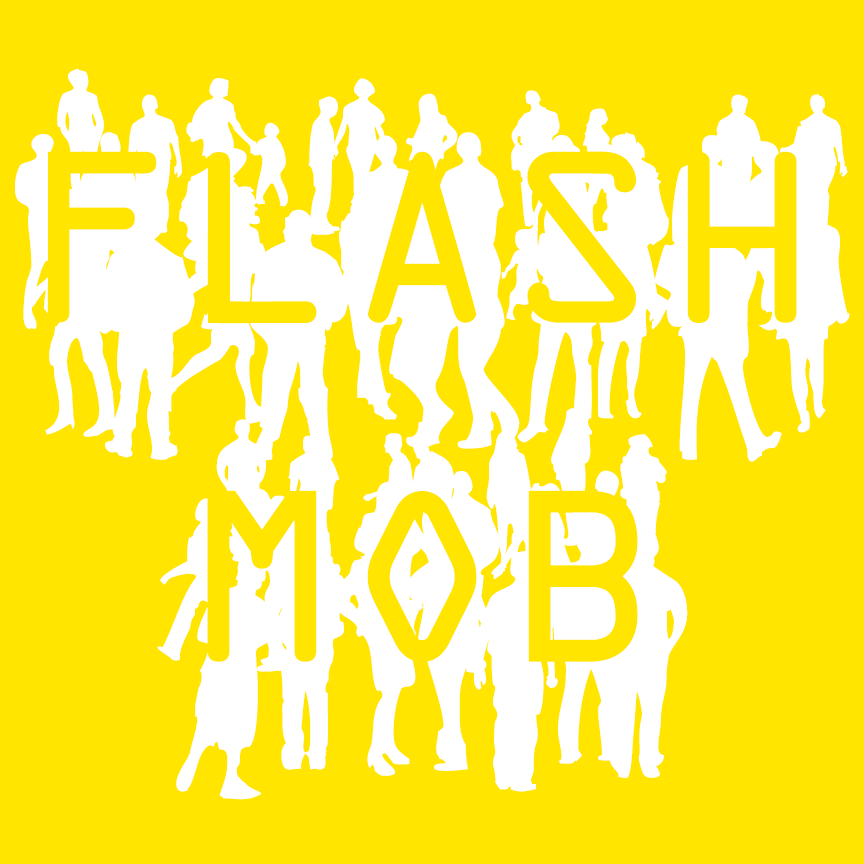

FLASH MOB is a fun font that combines silhouettes of walking figures with letters inspired by OCR-A, the machine-readable font from 1960. As you type, a crowd appears! Version 1.5 includes an expanded character set.
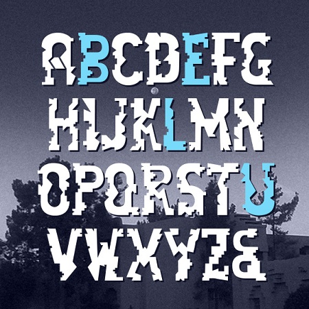
BLUELAKEHAWK is a collaboration with my friend, Jason Martinez, an artist and teacher. Jason is inspired by his love of Southwest Pueblo pottery patterns and tribal art. He is a registered member of the Taos Pueblo and takes inspiration from his heritage. I started with 8 letters from Jason and developed the rest. Now Jason is recovering from brain tumor surgery. Please consider making a small donation to his fund when you download this free font. https://www.youcaring.com/jason-martinez-480855

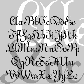
Quirky UPBEAT could be categorized as a latin uncial. “Uncial” because it has one case, of x-height plus ascenders and descenders in the style of so-called uncial and half-uncial fonts. “Latin” because of the triangular serifs which give the font a lively texture. I love alternate characters and UPBEAT has its share. Use these to create variety in your lettering. Located in the lowercase positions. Each font (Regular, Demi, Bold) includes single case letters plus alternates, numbers, punctuation, and international characters.

RINGPIN was inspired by the style of body piercing. Not my own style, but interesting to observe. In designing this font, I was rather limited to geometric components, and drew each with a crisp highlight. Most letters take the lowercase form, sometimes with alternates. The letters did not want to align neatly, so they assume a variegated arrangment. Includes 1-3 versions of each letter, plus numbers, punctuation, international characters, and many fanciful extras.
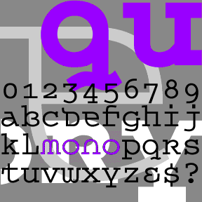
QUEER THEORY is my attempt to make a monospaced font with a less predictable feel. I was thinking about fonts like Envision, Democratica and Rotis Semi Serif, with their hybrid letterforms and irregular application of serifs. The basic letterforms of Queer Theory were derived from the invisible classic Courier, fusing upper and lowercase in a way that suggests an uncial. Unlike your average Courier though, this font has very square–not rounded–slab serifs. Includes single case letters, numbers, punctuation, and international characters.
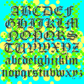
PALIMPSEST is an experimental font combining the letterforms of a traditional blackletter font with the texture of a Benday or halftone dot screen. Modern + Medieval. Pop + Parchment. At first glance it appears somewhat blurred or faded but is very cleanly rendered from vector drawings for smooth edges at any size. (Bigger is better.) Includes upper and lowercase, numbers, punctuation, and international characters. PALIMPSEST comes in four weights: Light, Regular, Dark, and Black, which can be mixed and matched for interesting effects. The graphics above show only the Regular weight; at left are all four for comparison.

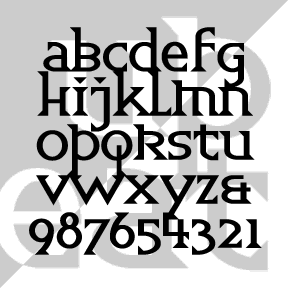
The KOMBINE FONTS are experiments in crossing fonts, font mashups. My inspiration was found in Blackletter: Type and National Identity (Cooper Union, 1998, p.33), a most interesting book for anyone keen on fraktur. There was a small illustration (below) of a font called “Centralschrift (C. G. Schoppe Foundry) 1853, a 19th c. hybrid of fraktur and a neo-classical roman”. The upper parts–those which most enable reading–are the more familiar roman, producing a more legible font for those (like me) unfamiliar with the fraktur. I used as my models a Wittenberger fraktur and various members of the Century family, recognized for… continued
ALSACE-LORRAINE is an experiment. My idea was to combine aspects of a vertical French script and a German fraktur. For the most part, the top is the German and the bottom is the French. A font “mash-up” before that word was coined. Named for the region from which my father’s father’s family emigrated. Includes caps, lower case, numbers, punctuation, and international characters.
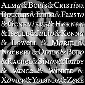
WILLING RACE is my adaptation of the opening credits of the TV show Will & Grace, originally designed by Number Seventeen. Like those, I’ve mixed large and small caps with roman and italic lowercase, all based on Times Roman. There are alternates of each x-height character for nearly infinite variation. As suggested by Sara, I have added a more accurate (to the show credits) engraved “Modern” style ampersand. BTW, the names in the graphic above were the names projected for 2002 Eastern North Pacific storms. These are all worked out for years in advance with alternating male and female names… continued
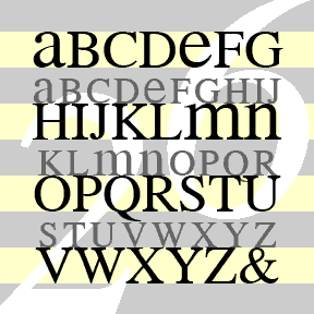
MEAN 26 was inspired by Alphabet 26, Bradbury Thompson’s famous 1950 proposal for redesigning the alphabet. The idea was that there would be just one case, favoring the uppercase forms except for a, e, m and n, totaling 26. There would be a large and small version of each to use as capitals. Thompson used the distinctive Baskerville for his prototype, and Alphabet 26 owes it much of its beauty to that choice. For my fonts, I’ve retooled public-domain versions of 3 popular text fonts and adjusted the weights in an attempt to balance the big and little letters. Avoid… continued