
-Free-
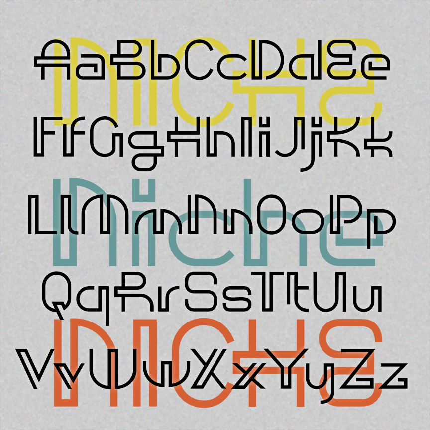

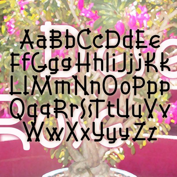
NICHE has the playful and decorative geometry of mid-century modern design. Used sparingly, these letters give add a dash of retro-future style. Inspired by a caps-only design in Ben & Ed C. Hunt’s 100 Alphabets from 1954. Version 1.5 has an expanded character set and improved spacing and kerning.
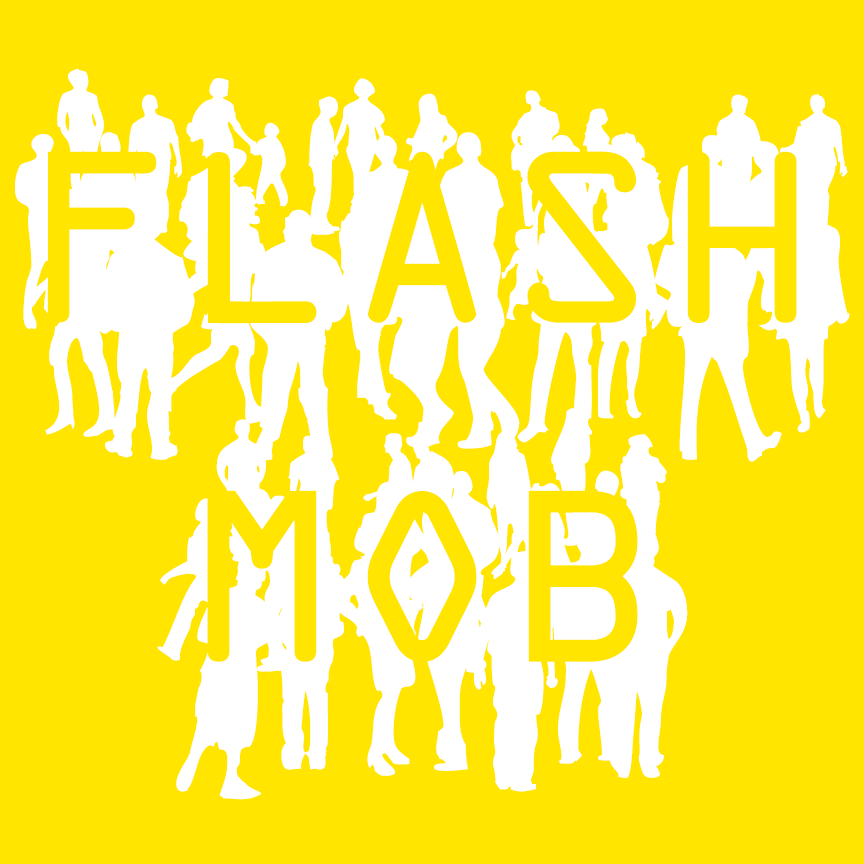
FLASH MOB is a fun font that combines silhouettes of walking figures with letters inspired by OCR-A, the machine-readable font from 1960. As you type, a crowd appears! Version 1.5 includes an expanded character set.
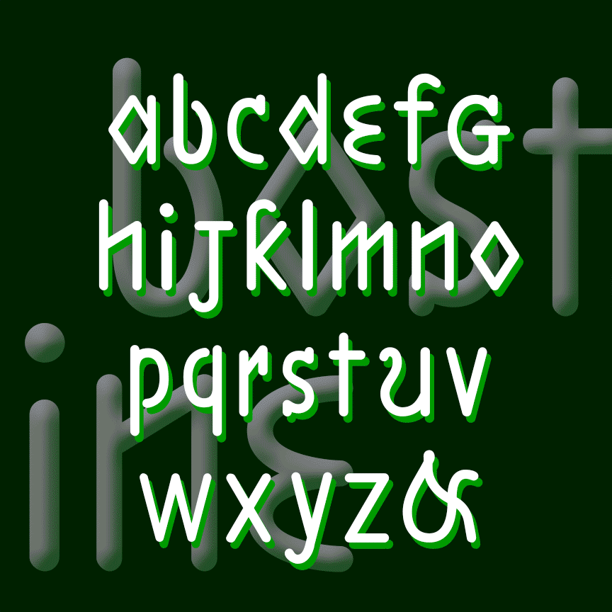
BOSTON LINE and PHILADELPHIA LINE fonts each have an unusual sanserif design, quirky letterforms, and rounded mechanical strokes that suggest template lettering or machine-readable fonts. Boston is lowercase only, Philadelphia is a bit more conventional including upper and lowercase. These were inspired by 2 different 19th-century educators’ attempts to make a raised-letter alphabet for the blind. Eventually, the dot grid of Braille would prove easier to use, but Samuel Gridley Howe’s legacy lives on at Boston’s Perkins School, as does Julius Friedlander’s at Philadelphia’s Overbrook School. Version 1.5 has an expanded character set and improved spacing and kerning. In the… continued
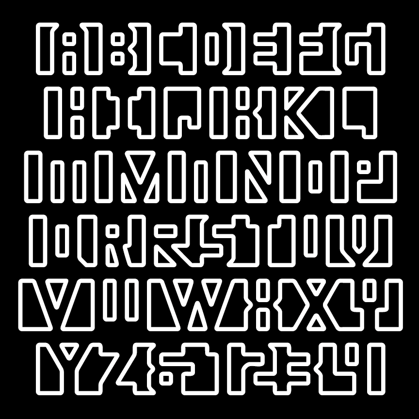
APERTURE is a special-effects font, especially designed to be difficult to read! Use for a puzzling or comic effect or to suggest an alien script that only some can read. There are outline and solid fonts that can be used separately or layered together; each includes alternate letterforms for further play with legibility. Version 1.5 has an expanded character set.
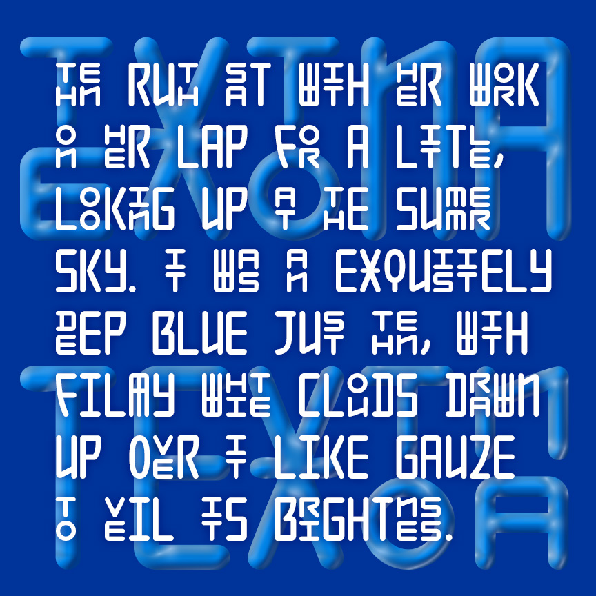
TEXTONA has a unique mix of large and small, stacking letters in a sleek geometric style. Using the Discretionary Ligatures feature of Opentype, composed pairs of stacking letters are automatically substituted, creating a rich and engaging texture as in the example above. Full details for using this unique pair of fonts are given in a separate file. An earlier version of this font was released as Seoul; Hangul, the fascinating and beautiful Korean alphabet, was one of my inspirations.
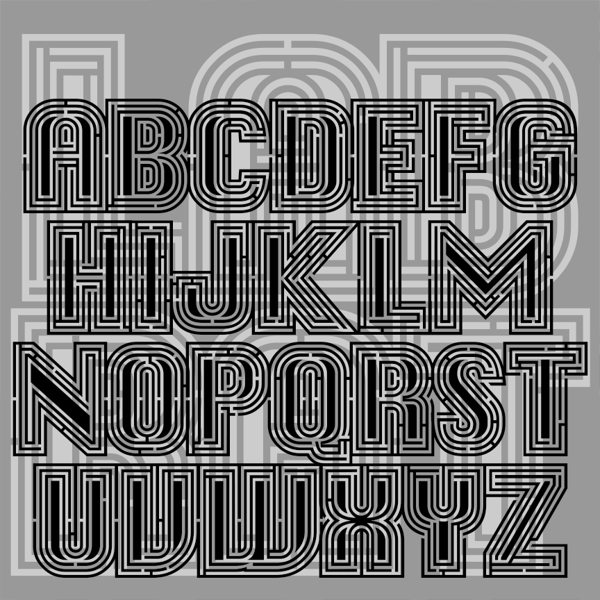
LAB RAT is a special-effects font designed to create custom working mazes. Print them big so you can traces the paths through each letter and word! The basic letterforms were inspired by the classic Mac system font, Chicago, designed by Susan Kare. Version 1.5 has an improved character set and some technical issues resolved.
DESERT ROSE is sleek and stylish with letterforms composed of graceful repeating elements. Deceptively simple and elegant, DESERT ROSE was inspired by an example of hand-lettering included in Alphabets: Ancient & Modern, compiled by J. B. Russell (Padell, 1946).
SUBTEXT is designed to obscure your words, make them less legible, less straightforward, less obvious. Suppose you’re a spy, a lawyer, or an offbeat poet. The basic letterforms are bold sans serif with a serif letter subtracted from each. As you type, a second, seemingly random character also appears. The earlier version of this font did not have lowercase; version 1.5 has an expanded character set and improved spacing and kerning.
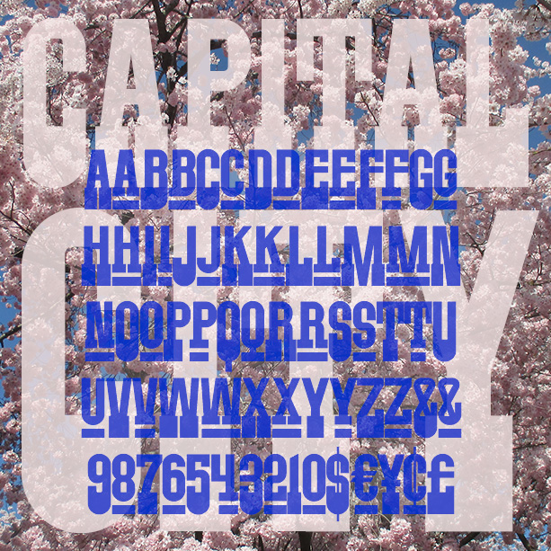
CAPITAL CITY is a bold font with an all-American spirit. Inspired by a poster from the 1960s or 70s, Capital City has heavy slab serifs at the bottom but is sans-serif at the top. With superscript small caps in the lowercase positions. Using the stylistic alternates feature of Opentype, you can also access superscript numbers and currency symbols. Version 1.1 has an expanded character set.
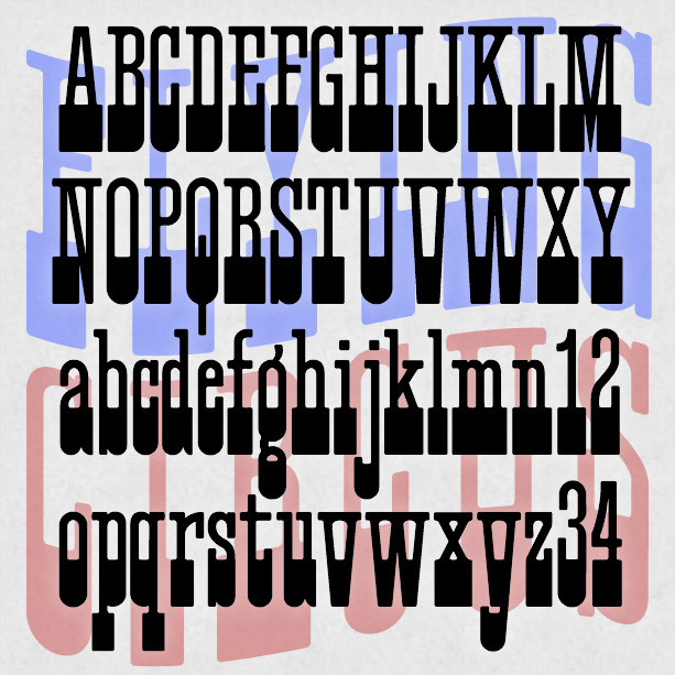
FLYING CIRCUS is a playful, slab-serif font that can suggest Americana, the West, the carnival or circus. It was inspired by a “lost” analog font, Cirque, and has a full lowercase unlike many similar fonts. Version 1.1 has an expanded character set.