
-Free-
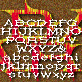

BARBECUE was inspired by the font BARB, illustrated in the great Dan X. Solo books from Dover. It’s in “100 Ornamental Alphabets” and in the “theme, topical” section of the “Solotype Catalog.” Other than that, I know nothing about Barb. To me, it has a Western feel, wide-set like a wood type, spiky like barb wire. I’ve recreated the caps with a few changes, and added everything else. Includes upper and lowercase, numbers, punctuation, and international characters.
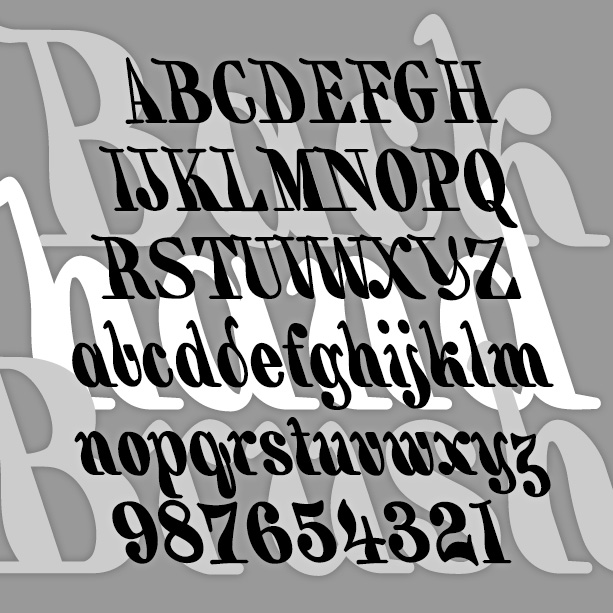
BACKHAND BRUSH is my re-creation of a classic 19th-century style of hand lettering, also known as a “marking” alphabet. Like some Victoriana and Art Nouveau fonts, it was revived in the psychedelic era. My font is completely redrawn from an antique guide to hand lettering. I have regularized it somewhat (maintaining a constant 18-degree slant) but also tried to keep a slightly random brush feel. Version 1.5 has an expanded character set and improved spacing and kerning.
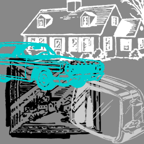
16 wonderfully cheesy clip-art style pictures of passé pop Americana, each depicted wrapped in plastic. It is adapted from the uncredited tissue paper backing from clear vinyl, still sold by the yard, although the illustrations here are older. The Read Me file contains a full list of the images. Couch! Typewriter! Lamp! Barbecue grill! Endless ideas for the home…
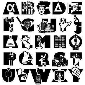
My first dingbat font in a long time, ALPHA BRAVO is based on the “phonetic alphabet” used on radio for clearly indicating letters. Read more about this at the International Telecommunication Union, and many other sites. For each letter-word, I’ve devised an illustrative icon, in a variety of styles and degrees of success. But you may have some fun with it, learning the “phonetic alphabet” or writing hieroglyphic code. The capital positions A-Z include the letter itself (adapted from Gill Sans Ultra); the lowercase a-z do not. Refer to the enclosed text file for more information about the individual dingbats.
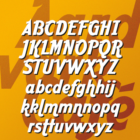
AARDVARK CAFÉ was inspired by the famous Hard Rock Café logo. It’s a worldwide pop classic and seems to have been originally hand lettered. In imagining the rest of the alphabet, I strove to work the little upstroke “wings” into all the caps and the swashy descenders on the h, m, and n to match the k. Version 1.5 makes use of the stylistic alternates feature of Opentype; unswashed characters are included as alternates now and the character set has been extended.

This font is called 12 TO THE MOON, after the movie of the same name. Not sure what you would ever do with it, but I had fun making it and working with it. The movie is one of very many black-and-white 1950s sci-fi movies that would end up on Mystery Science Theater 3000. Three times a strange message appears on the screen on the ship, like the animation on this page. Luckily, the ship’s “astrophotographer and pharmacist” (played by Michi Kobi, left) is able to translate it. The alien language translation thing is always problematic; one could fill a… continued