
-Free-
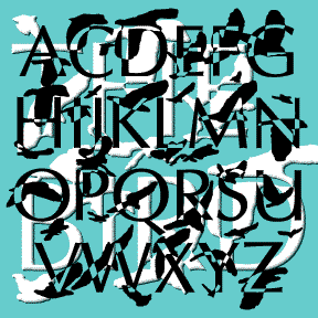

Alfred Hitchock’s The Birds (1963) is one of my favorite films. This font was inspired by its opening titles which were designed by James S. Pollak. Each name appears in a serifless roman font, then is broken up and reassembled by the images of birds flapping past. The letterforms are my own variation on Optima with certain letters altered to match the film’s. The bird shapes are based on my own photos of swarming crows on Thanksgiving 2004. The result doesn’t match the individual film titles, but suggests the entire sequence of breaking letters and passing birds. An interesting contrast… continued
SUNSET is another special effects font, simulating letters sinking into water and making rippled reflections. The basic letterforms are based on an unreleased condensed version of my Bride of the Monster font. It pushes legibility but could be very effective in the right context. Includes caps, lower case, numbers, punctuation, numbers, and international characters. Oops! Sometimes these special effects fonts have letterforms that can be misread. I was honored and embarrassed to see the Photoshop Disaster at left, in which Sunset played a role. Not every font is good for every word or phrase!
The Regular and Jumbled versions of STAMP ACT were made from scans of cheap commercial rubber stamps. The awkward design of the letters suggests a vintage packing crate. A big font company sells something called Rubber Stamp but this, and my other rubber stamp fonts which can be found on this site, are more like real stamping. The jumbled version has randomized placement. These fonts have been revised to include two of each uppercase letter, plus numbers, punctuation, and international characters.
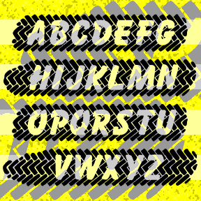
SKIDZ was inspired by a sticker in which the letters where superimposed over a tire tread pattern. I’ve created my own tread pattern, subtracting letters based on Max Kaufmann’s classic font Balloon. When you type, the letters align to form an entire tire mark with white letters. The brackets and underscore can be used to create natural-shaped ends and patterned space between words. SKIDZ contains caps, numbers, punctuation, and international characters. But they’re a bit lost in the edge of the tread, so I’ve made a separate font, SKIDZ EXTRA, with an extra line of somewhat sharper tread pattern to… continued
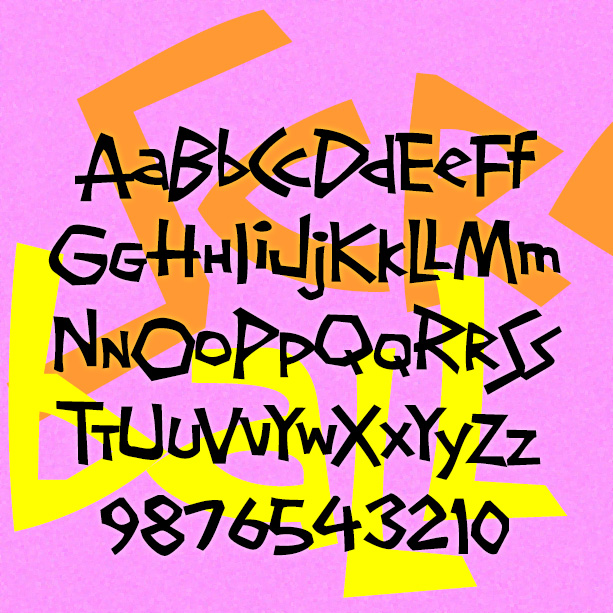
SCREWBALL looks like whimsical hand-lettering. It’s unpredictable with lots of close-fitting pairs. It was inspired by the hand-lettered titles of the movie What’s Up, Doc? (1972), designed by The Golds West Inc. Version 1.5 includes an expanded character set and many alternate characters that make use of Opentype features to create a more hand-lettered look, as well as improved spacing and kerning. What’s Up, Doc? is a personal favorite, directed by Peter Bogdanovich, starring Barbra Streisand, Ryan O’Neal, and, in her first film, the late Madeline Kahn, to whose memory this font is dedicated.
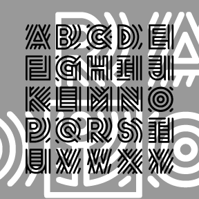
RADIO was inspired by the old logo of NPR, National Public Radio. Obviously, the line pattern suggests broadcasting. The letters are square and of a uniform width, great for short headings, drop caps, and the like. Includes caps, numbers, punctuation, and international characters.
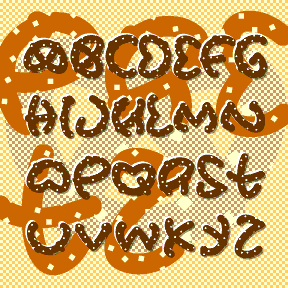
Instead of making something that people want, that I could sell, I made this silly experiment: PRETZ. The idea is that each letter has been broken, cut, or chewed out of a conventional twisted pretzel shape. As I only cheated on a couple of characters ($ ¢ ¥ Œ Æ), you have to use a bit of imagination to read them all. It comes in both Salted and Unsalted varieties. Each font contains caps, numbers, punctuation, and international characters.
POPSTARS was inspired by the hand lettering on the cover of the classic Beatles album, Magical Mystery Tour. The B from Beatles is about actual size at left; weren’t vinyl album covers great? This pair of fonts can be used separately or layered as in the animation on this page. Each font includes caps, lower case, numbers, punctuation, and international characters.

PIECES is designed to look like a partially assembled jigsaw puzzle. The letters interlock automatically as you type. Use _ | or \ instead of a space to connect your words. The basic letterforms are my “unicase” takeoff on Freeman Craw’s ubiquitous Ad Lib font (1961). This font has the letters on the white background in the uppercase positions and with the black background in the lowercase positions. TyPiNg LiKe ThIs creates an alternating effect. Due to space limitations, it does not contain the complete character set in both black and white. There’s a separate complete font in Black and… continued
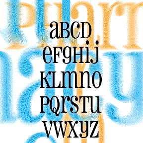
PHARMACY was inspired by the sign at a local (Albany, NY) drugstore. Waiting at the red light, I’d often stared at the sign, admiring its jolly and curious mix of upper and lowercase, and of course the peculiar asymmetrical capital A. This font design has become a crafter’s favorite, as rubber stamps, die cuts and more. I’m still offering it here as a free download. PHARMACY MMX has an expanded character set and other refinements. Includes caps and alternates, numbers, punctuation and international characters. Another of my Albany-inspired fonts is TRUDEAU.