
-Distressed + Rustic-

It is after the apocalypse. All that was shiny and new is scratched and broken. The future has passed. This is a world of PROLE. Sleek lines and modern shapes now bear the evidence of deterioration. What will be your message?
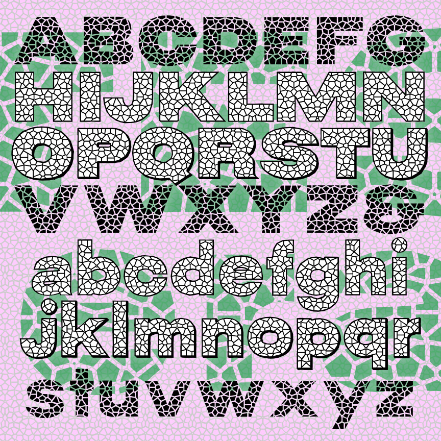
TESSERA is a big bold sans serif that looks like broken-plate mosaic. Separate Tile, Grout, and Deep Grout fonts make realistic mosaic effects easy, and there’s a companion Fill font that can be layered behind the Grout fonts in a contrasting color or a colorful photo. You can type ^^^ in any of the fonts to make a continuous matching pattern. If you need a matching font without the mosaic effect, please check out my Wood Shed font. If you want a more formal mosaic style—serif, square tiles, please check out my Subway Mosaic font.
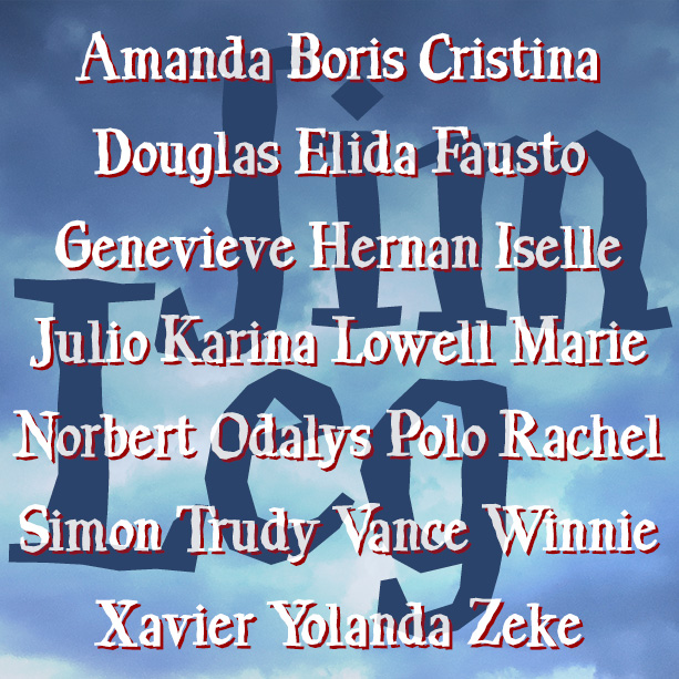
JIMMY LEG is a serif font that mixes formality and casualness. The overall letterforms are solid and serious, but on closer look are abuzz with energy. For a more elegant version of this style, check out Poignant and Poignant Italic.
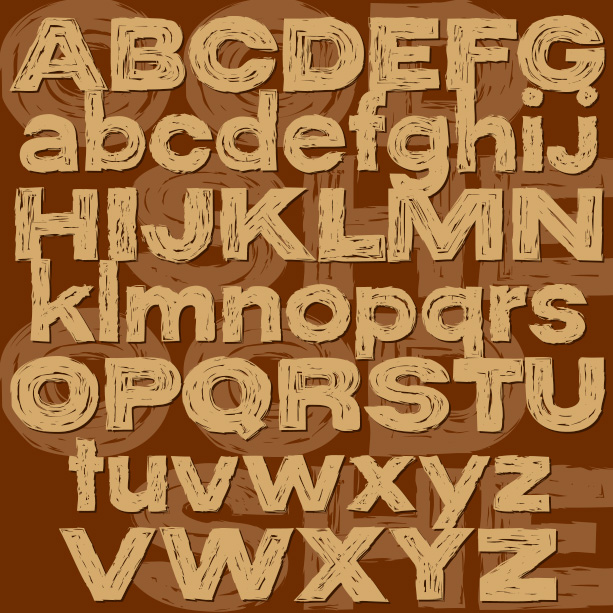
WOOD SHED is a bold sans serif inspired by examples of hand lettering from the 1940s, familiar with just enough unusual letterforms to make it distinctive. I’ve created 2 companion fonts with texture: a bold woodgrain and scratchy dry brush. Either can be used alone or layered with the solid font to create additional color effects.
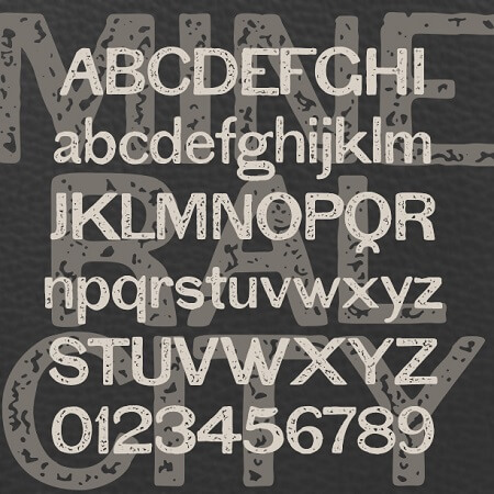
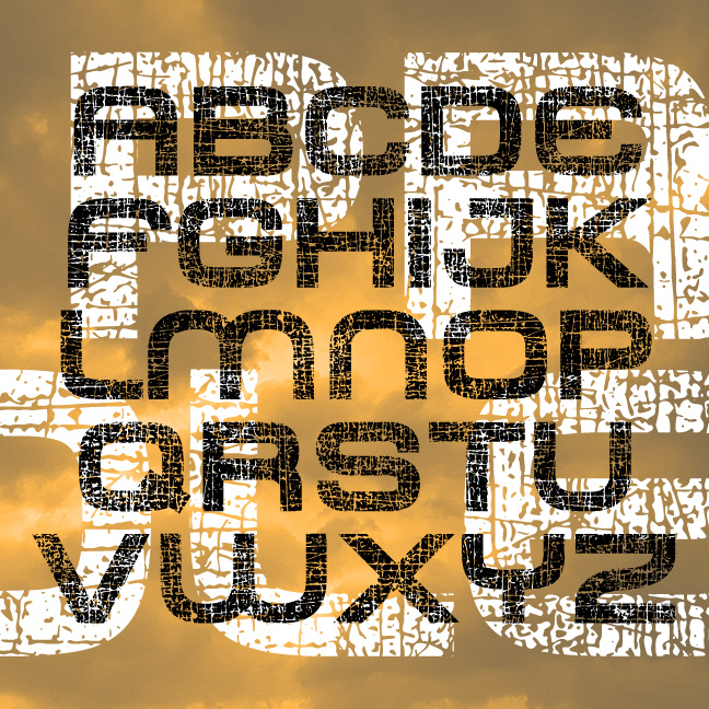
Mineral City was inspired by an example of 19th-century sans serif typography. Around that time, type designers took a cue from sign painters, omitting the finicky serifs and making the strokes more uniform. These early sans serifs fonts were categorized as “grotesques” or “gothics” and this is a particularly awkward one. (Later these would be refined into fonts like Franklin Gothic, and then neo-grotesques like Helvetica.) I’ve added more texture to give it the rustic flavor of crude printing, rough paper, worn surfaces, or even a hand-panted sign.
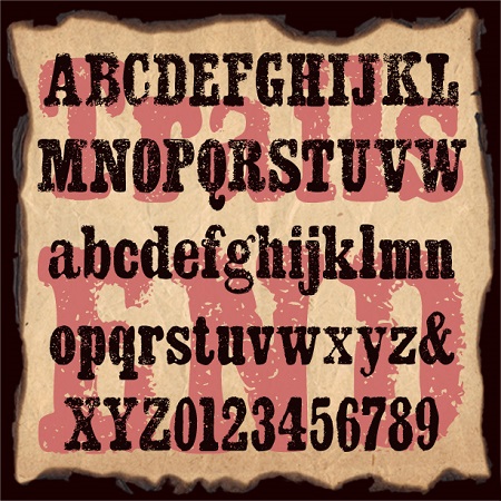
Trails End began as a bold slab-serif font. To that, I’ve added a rough edge and grainy texture producing a unique rustic style. Trails End suggests crude letterpress printing on rough paper, a weathered sign, or a well-worn T-shirt.
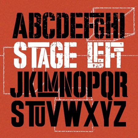
STAGE LEFT was inspired by the iconic poster for the movie version of “West Side Story.” Designed by Joe Caroff—not Saul Bass as is often stated—the poster suggests a gritty but playful urban energy. It’s basically large and small caps but I’ve designed it so the big T, L, and F interlock with other small letters.And it comes in three finishes: Solid, Stencil, and Stressed, the latter most resembling the original.
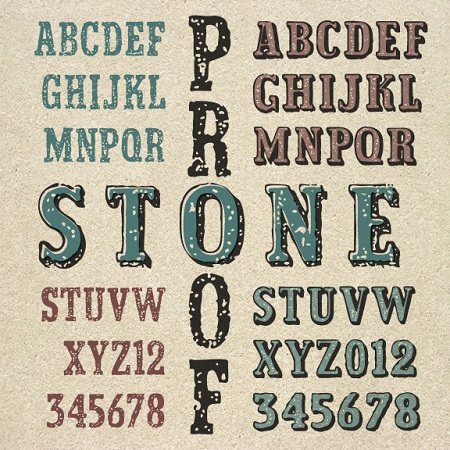
The Stone Proof fonts are weathered and worn, suggesting primitive typeset, rough paper, and aged surfaces. The set includes Regular, 3-D, and a special Fill font to work with the 3-D. Its cousin, Handbill, has the jumbled style of rubber stamps, if you prefer that. A stone proof is a simple proof made without a press, using a mallet and composing stone. Thanks, Vista Bill, for the name suggestion!

Bootstrap has a rough-hewn Western feel, like letters were made by an old-time blacksmith. The letterforms are bold and simple, with spurs and a rough texture. Bootstrap’s roots are in my Tapeworm font, reimagined for a new old look.
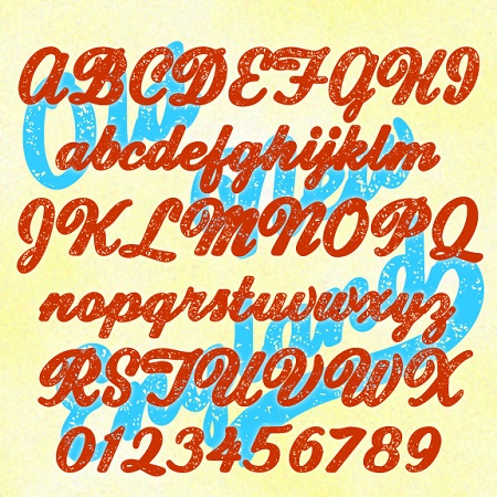
Old New England is a bold and stylish script font with a speckled texture reminiscent of a well-worn T-shirt or salvaged sign, comfortably worn. It’s a companion to New England, the lighter and smoother original.