
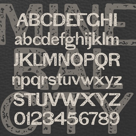

Mineral City was inspired by an example of 19th-century sans serif typography. Around that time, type designers took a cue from sign painters, omitting the finicky serifs and making the strokes more uniform.
These early sans serifs fonts were categorized as “grotesques” or “gothics” and this is a particularly awkward one. (Later these would be refined into fonts like Franklin Gothic, and then neo-grotesques like Helvetica.) I’ve added more texture to give it the rustic flavor of crude printing, rough paper, worn surfaces, or even a hand-panted sign.
