
-Woodtype-
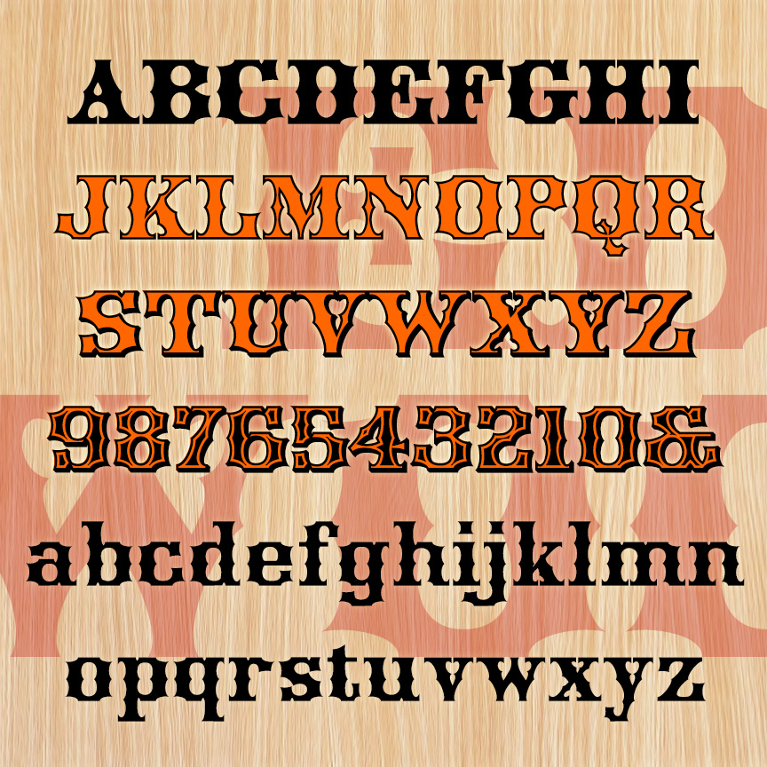

EDGEWOOD is a bold and fancy woodtype style font. It has unique concave styling and more spurs than a rodeo. EDGEWOOD was inspired by 19th-century examples with some characters revised for modern reading. The set of 4 fonts includes Regular, Outline, Shadow, and Ultra varieties (rows 1-4) that can be mixed and layered to capture the ornate design sensibility of the period, with full lowercase and character set throughout.
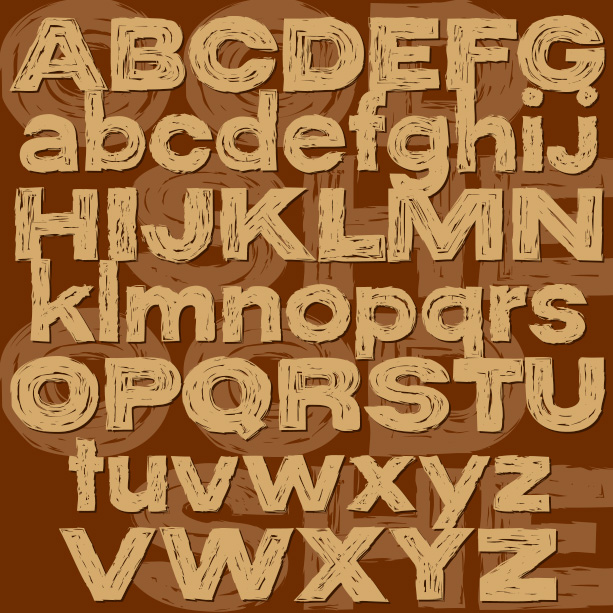
WOOD SHED is a bold sans serif inspired by examples of hand lettering from the 1940s, familiar with just enough unusual letterforms to make it distinctive. I’ve created 2 companion fonts with texture: a bold woodgrain and scratchy dry brush. Either can be used alone or layered with the solid font to create additional color effects.
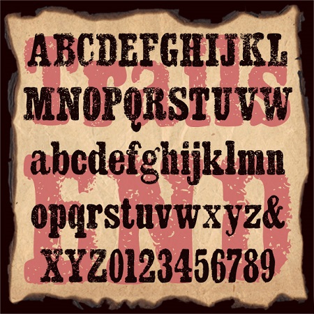
Trails End began as a bold slab-serif font. To that, I’ve added a rough edge and grainy texture producing a unique rustic style. Trails End suggests crude letterpress printing on rough paper, a weathered sign, or a well-worn T-shirt.
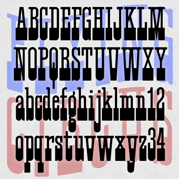

FLYING CIRCUS is a playful, slab-serif font that can suggest Americana, the West, the carnival or circus. It was inspired by a “lost” analog font, Cirque, and has a full lowercase unlike many similar fonts. Version 1.1 has an expanded character set.
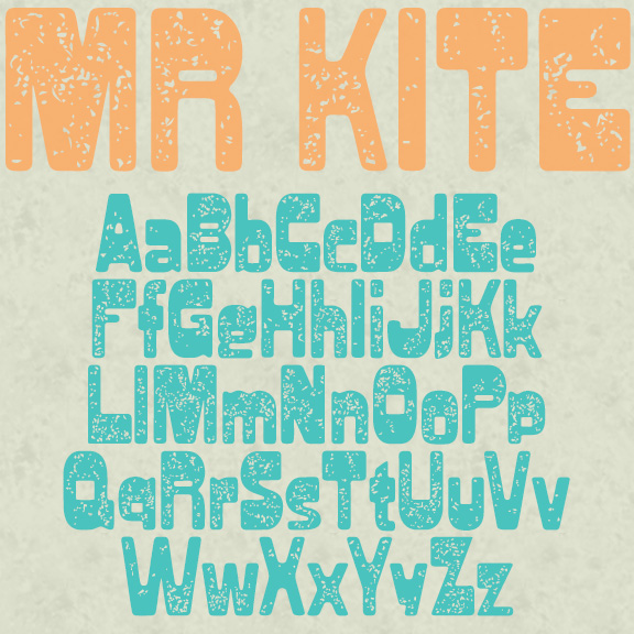
MR KITE began with a 19th-century woodtype font variously known as Jubilee and Gothic Bold. The heavy weight at the top gives it an offbeat character. My original version of that is called Blacktop, rounded out with lowercase. For this variation, I added a distressed texture that suggests a weathered sign or a well-worn T-shirt. Some may say this font has a groovy vibe, given the letterforms. I think this reaction is related to the familiar appropriation of Victoriana and Art Nouveau in the 1960s and 70s. Elements of those styles became so entwined with “mod” pop culture that it’s… continued
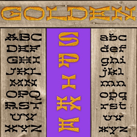
Golden Spike is a unique font that combines the bold serifs of a Western woodtype with dramatic wedge shapes for an exotic texture. Golden Spike was inspired by this tiny image of unknown origin, sent to me by Vista Bill. Also available in “Deep,” a three-dimensional version.
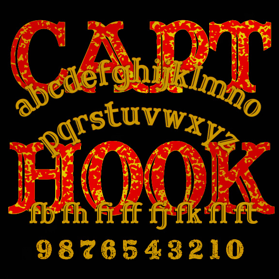
CAPTAIN HOOK is a bold and jolly woodtype font with curved serifs and engraved highlights. (Its predecessor, Captain Howdy, was all caps and inspired by the lettering on a classic Ouija board.) Captain Hook offers more flexibility and now has a companion font, CAPTAIN HOOK CRACKLE, with a rough and ready texture built in. Get the rustic look of a faded t-shirt or weathered sign. Version 1.1 has an expanded character set and improved spacing and kerning.
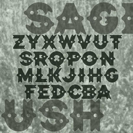
SAGEBRUSH is a decorative font with a Western flavor, its distinctive dots and curves and suggesting silver conchos, sheriffs’ badges, cowhides and spurs. In reality, it was inspired by the logo of the legendary NYC punk club CBGB OMFUG. When you learn that CBGB stood for “country, bluegrass, blues,” it’s easier to see what they were going for with this design, so far from punk typography.
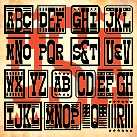
A unique font to make custom 1-, 2-, 3-, or 4-letter monograms in a Western woodtype style with optional stars and stripes decorations.
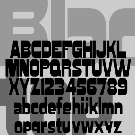
Blacktop has been tweaked, expanded and reissued in celebration of National Woodtype Day on March 15. The uppercase and numbers were originally inspired by a woodtype font variously known as Gothic Bold, Jubilee, or Skidoo Caps, and completely redrawn for clean edges. The lowercase is my own invention, following the example of certain fonts (Hobo, Publicity Gothic, Broadway) in which the descenders do not go below the baseline.