
-Woodtype-

WOODWIND was inspired by the opening titles of the classic 1939 film Gone With The Wind, directed by Victor Fleming, production designed by William Cameron Menzies, art direction by Lyle R. Wheeler. As you can see from the frame at left, the title appears on screen very large, a word at a time, blowing from right to left. WOODWIND is an ornate 19th-century style font that can suggest the Old South as well as Western Saloon or Circus Wagon. For flexible use, I’ve created a Regular font plus West and East “moving” fonts. Includes caps, lowercase, numbers, punctuation and international… continued
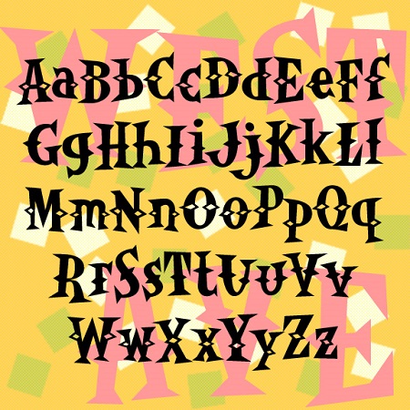
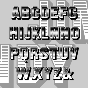
WESTERN AVENUE is a pair of fun fonts with triangular “latin” serifs and spurs. The bouncy irregularity befits their inspiration: the unsigned 1950s album cover at left. Includes upper and lowercase, numbers, punctuation and international characters. OpenType features include stylistic alternates and discretionary ligatures for a more random, hand-lettered feel. An earlier caps-only version in this style was called Western Egg.
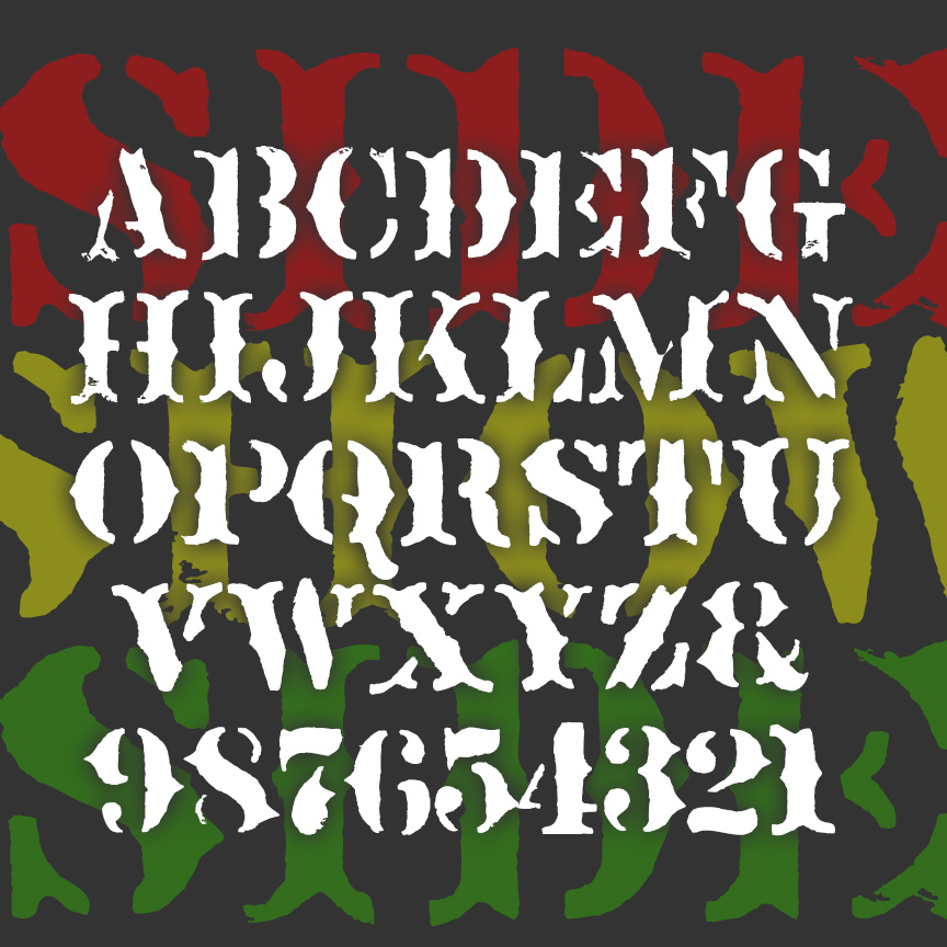
SIDESHOW is a fanciful font with the overall feel of rough stencil printing. Imagine the cart for a medicine show or signs for a traveling circus. SIDESHOW is my second font inspired by Ouija® boards; the other is Captain Howdy. This older board was rather primitively stenciled, adding to its creepy attraction. Version 2.0 includes a greatly expanded character set, improved spacing and kerning.
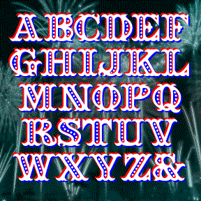
SEAFARE is a jolly 19th-century style font. It’s bold and decorative with a hint of sea waves was inspired by the hand-lettered titles of Alfred Hitchcock’s 1949 costume drama Under Capricorn, art directed by Thomas N. Morahan. Available in solid, outline and beaded varieties which can be layered as in the image on this page. Includes caps, numbers, punctuation and international characters After creating the font, I found these examples of a similar but sloped font in Rob Roy Kelly’s “American Wood Type 1828-1900.” You could create this effect with Seafare, if desired.
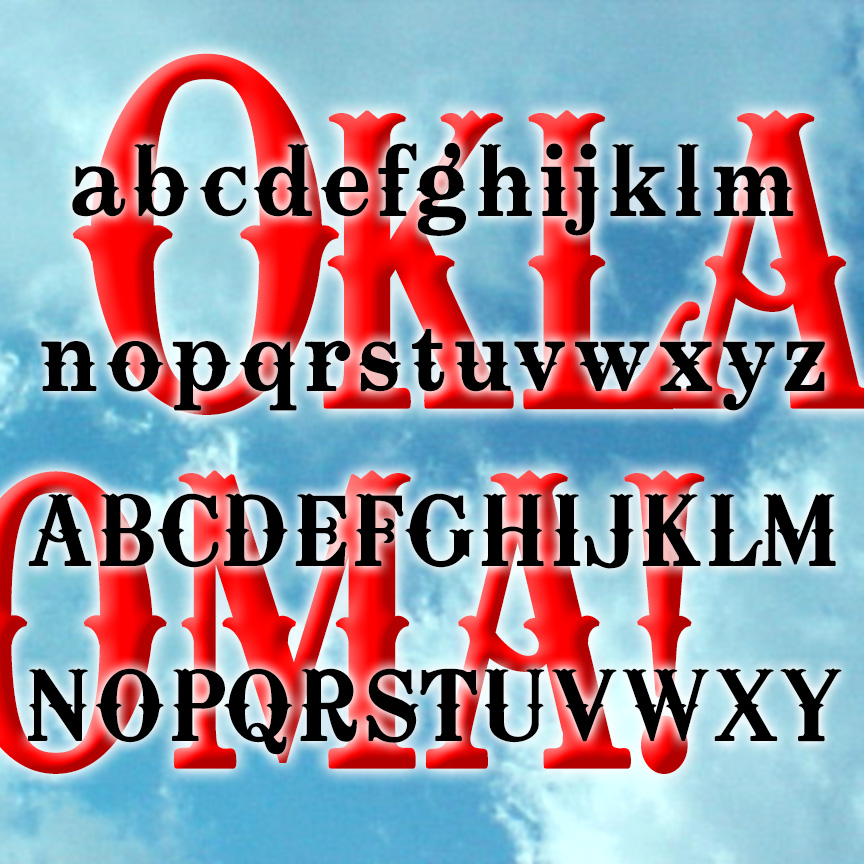
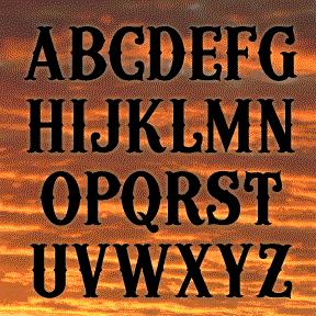
OKLAHOMA is a fancy Western-style font, inspired by the opening titles of the classic musical film of the same name (1955, directed by Fred Zinnemann, art direction by Joseph C. Wright.) A graceful wood type that sings, a nice complement to the early 1900s setting of the story. Version 1.5 includes an expanded character set and improved spacing and kerning.
JIM DANDY is my interpretation of a font that originated in the 1850’s as Gothic Shade from the Dickinson Type Foundry. It boldly suggests a political broadside, a circus poster, or a Western sign. Later this font would be known as Tombstone and Jim Crow as it was subsequently issued by other foundries in other formats. Jeff Levine jogged my memory with a scan of this gem from a 1970s dry-transfer catalog; thanks, Jeff. The Regular font is equivalent to the original. I’ve also created component fonts for the shading, shadows, and other elements that can be used separately or… continued
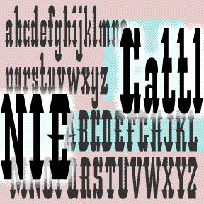
CATTLE ANNIE is my unauthorized digital interpretation of the analog font “Les Catalanes.” According to ABZ: More alphabets and other signs by Rothenstein and Gooding, it was designed n 1952 by Enric Crous-Vidal (1908-1987) but was never produced. Other Crous-Vidal fonts include Paris, Flash, and Ilerda from Fundición Tipográfica Bauer. The original source (with an incomplete character set) says Crous-Vidal’s Paris show was “the graphic hit of the ’52 season” and refers to Les Catalanes as “this flamboyant character of Mediterranean inspiration.” You may imagine hooves, horns, heels, hats and moustaches in its distinctive features. Many such wood-type fonts have… continued

CAPTAIN HOWDY was inspired by the font often seen on classic Ouija® boards. Yet another woodtype, “circus,” or “Western” font. Cleanly redrawn using my 70s-vintage wooden Ouija® board as a model. I never cared much for playing with it, I just liked the way it looks! Includes caps, numbers, punctuation, and international characters.

MADFONT was one inspired by the great MAD magazine logo, the older, un-italicized one of course. It was one of my first fonts, released back in 1998, the work of a fan who grew up reading MAD and loving its parodies and graphics. MADFONT was retired but now it’s come back and brought two friends: Bars and Thorns. The two previously unreleased fonts are standard wood type variations that increase the value of this cheerful, circus, Wild West design. Each font includes caps, numbers, punctuation and international characters. Check out this fun furniture commercial. It’s worth watching all the way… continued
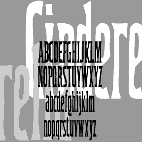
CINDERELLA was inspired by a font in one of the great Dan X. Solo 100 font books. The lowercase g first caught my eye; it’s ultra-condensed which can be very useful. The font has been retired for a number of years now. I had reason to use it recently and thought it was time to dust it off and round it out. Includes upper and lowercase, numbers, punctuation, and international characters.