
-Premium-


ARRIACA is a bold and exotic display font inspired by a 1940s lettering guide. This makes me think of Spanish “mudéjar” design, with some middle eastern flavor and the feel of wrought iron. Or maybe the points suggest spurs for a Western theme, or spikes for a metal application.
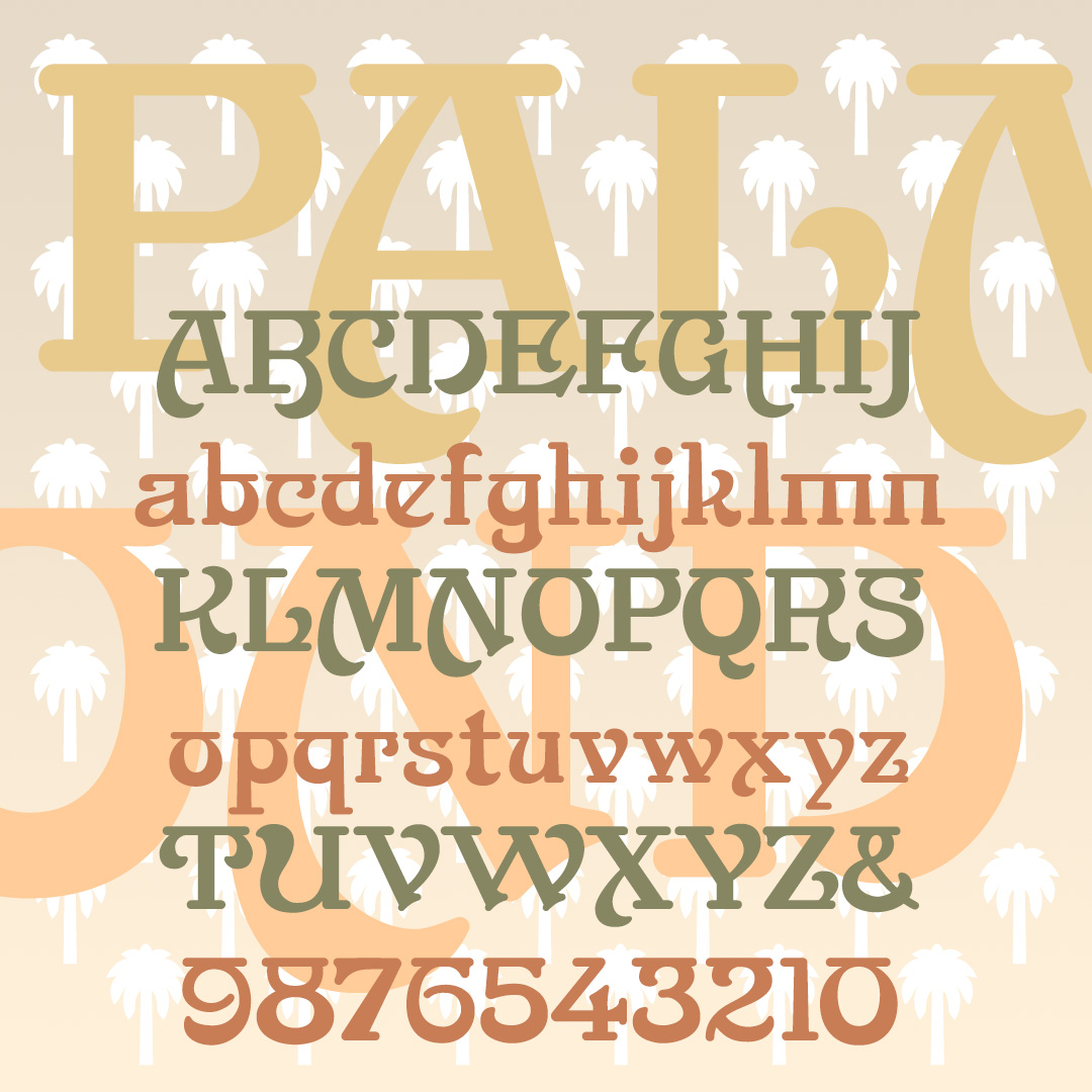
PALM FROND is a stylish display font inspired by a 19th-century typeface. Broad swashes give a feeling of Art Nouveau and horizontal strokes suggest Indian scripts.
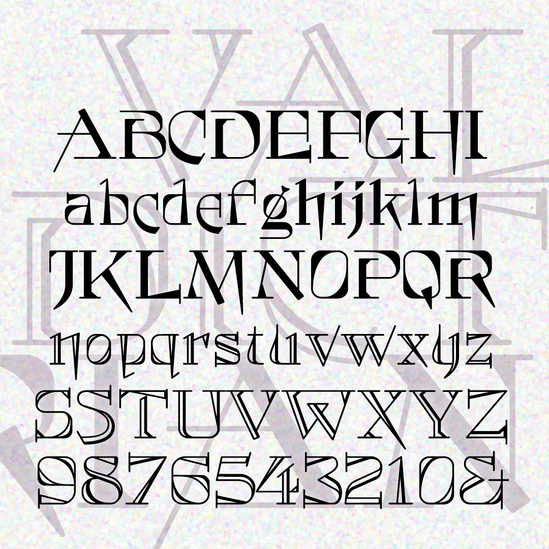
VALEDICTORIAN is both quirky and formal. The unusual letterforms give it a modern touch, while also conveying elegance and tradition. Two varieties, solid and shaded. VALEDICTORIAN was inspired by a typeface called Vassar that appeared in the 1889 catalog from Farmer, Little & Co.
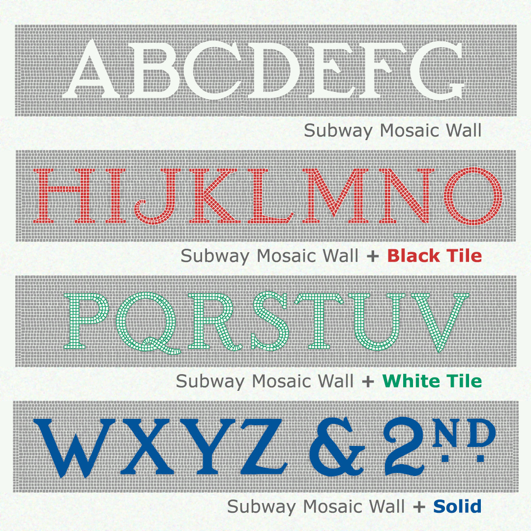
Like the originals, the fonts of SUBWAY MOSAIC WALL were inspired by the classic NYC subway signs. This version includes the mosaic background around each letter. Black Tile, White Tile, and Solid fonts can be layered in other colors for a realistic mosaic look. If you don’t want the mosaic background, use the original Subway Mosaic fonts which employ kerning.
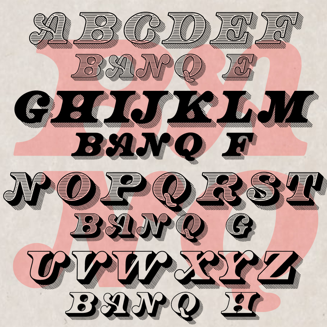
BANQ is big bold italic capitals. With the feel of Gilded Age banknotes and certificates, BANQ announces itself with big ball terminals and graceful swashes. The full set of 8 fonts includes solid and shaded, three-dimensional and shadowed versions. BANQ was inspired by two fonts: Bob Gill’s hand-lettered Cheque as seen in “New Alphabets A to Z” by Herbert Spencer & Colin Forbes from 1973 and another, more mechanical font also called Cheque from Dan X. Solo’s collection. My fonts are completely reimagined and redrawn, harkening back to the letterpress examples that no doubt informed both Cheques. Thanks to Jeff… continued
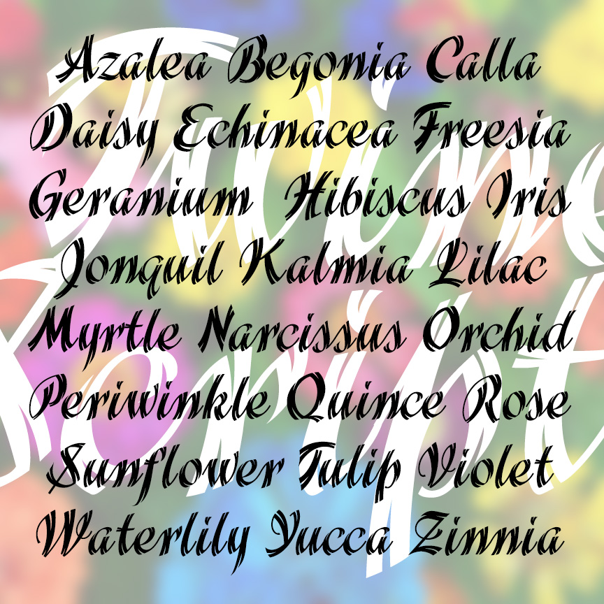
TWINE SCRIPT is a bold and stylish cursive font with a unique feature: “split ends” that give it a light and energetic twinkle! TWINE SCRIPT was inspired by examples in a 1930s Speedball lettering guide by Ross F. George who inspired so many people’s love of lettering.
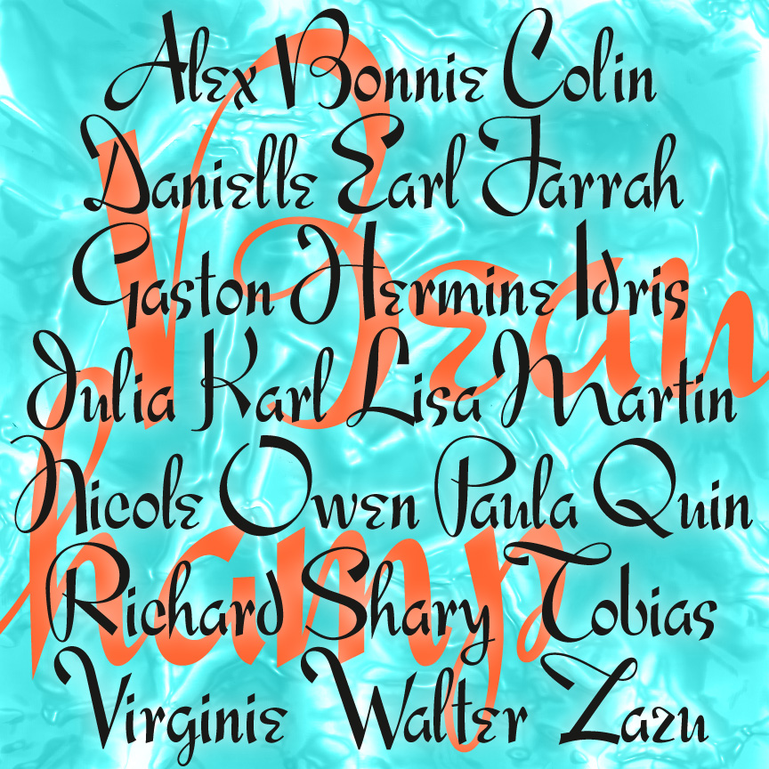
BEAUCHAMP is a script style font with energy and elegance. Inspired by vintage French showcard lettering of the 1940s, BEAUCHAMP is crisp and legible with a lot of unpredictable character. My friend Jeff Levine started this and turned it over to me for completion.
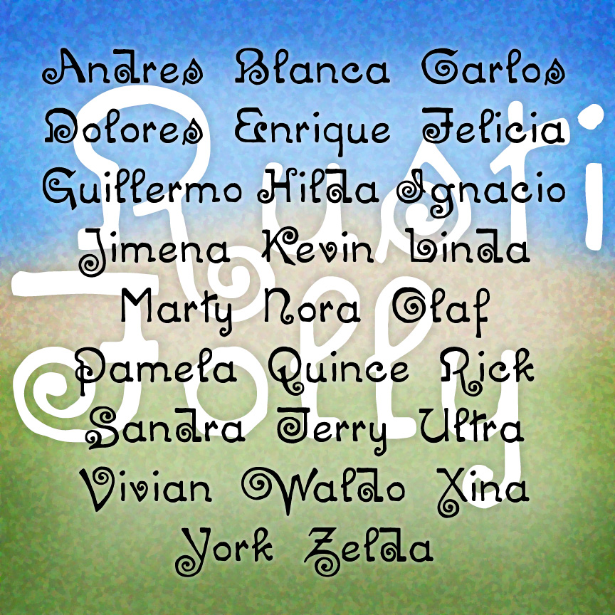
RUSTIC FOLLY is a curious font: eccentric letterforms and a bumpy texture give it the feel of artistic hand lettering. RUSTIC FOLLY was inspired by an early 20th-century typeface called “Chaucer.”
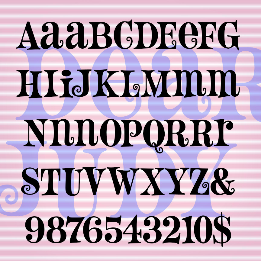
DEAR JUDY is a fun font with flair. This unicase font has its roots in 1960s design: quirky, bouncy serifed letterforms, all caps with cap-sized lowercase versions of some letters (AEMNR). Extra curls on some alternates too! DEAR JUDY was inspired by a hand-lettered paperback cover from 1963 called “Cover Girl Nurse.”

ROYALITY is a fresh and elegant cursive font. With sharp edges and a light weight, ROYALITY feels like beautiful pen-drawn calligraphy you might find on a modern royal invitation. ROYALITY is one of a series of four vertical script fonts, including Scarlet Ribbons, Famous Label and Easter Parade, as seen in the Script Font Identification Guide. It was inspired by an example frkm 1946 and was released in an earlier form as “Roselyn,” named for my mother.