
-Premium-
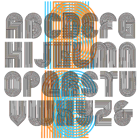

HARDLINE is an Op art font with a groovy, 60s/70s vibe, all geometric forms composed of parallel lines. It was inspired by the 3-letter logo at right, from an envelope my friend Dan gave me. (USU has apparently changed their logo.) This font is really fun when it’s used big and kerned so tightly that the letters overlap, creating cool moiré patterns as in the animation above. I’ve included a number of alternate letterforms in the lowercase positions for greater flexibility. Includes uppercase and alternates, punctuation, numbers, and international characters.
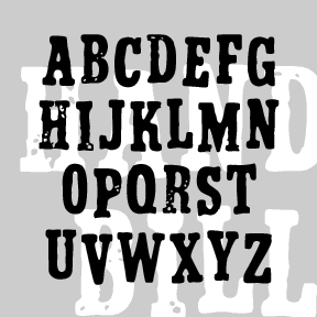
The set of four HANDBILL fonts were inspired by a double set of vintage rubber stamps (Thanks, Jeff!) The set is identified only as “Signprinter” from the TT.S.T Co.” and resembles Beton Bold Condensed) (Thanks, Bill!) The Rough font gives the impression of a drier stamp pad than the dark Regular. The 3-D font can be used alone or layered with the coordinated Fill font, which could also be used alone. As there are no lowercase letterforms, I’ve included an alternate impression or placement of each cap. Each font includes uppercase, numbers, punctuation, and international characters.
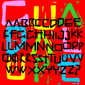
GUADALUPE is based on the architectural lettering at the Basilica of Guadalupe in Mexico City. The current building was built in 1974-1976 and was designed by the architect Pedro Ramírez Vásquez. What really appealed to me, of course, was the lettering inside and out. Rustic and random, it’s very different from the usual metal letters I’d seen on buildings. Suggests early Christian texts and incorporates Greek forms: the phi-like Q, the chi-rho Rs, the cruciform Ts. For my version, I redrew the letters and added missing characters. Then I carved and printed a linoleum cut; this added a hand-crafted texture… continued
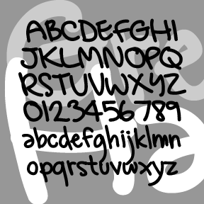
GREG’S HAND was developed in collaboration with artist GREG SMITH. Greg did the original lettering in Illustrator and then I made the font, adding and adjusting as needed. Looks like it was written with a Sharpie. Includes caps, lower case, numbers, punctuation, and international characters.
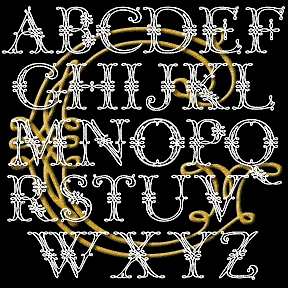
This ornamental, calligraphic font was suggested to me by Bruce Baryla, who also proposed the name GRACEFUL GHOST. Here is all the information I have about the original: Completely redrawn–not traced–for very smooth lines. Looks great reversed and, of course, BIG. Includes caps, limited punctuation, and international characters.
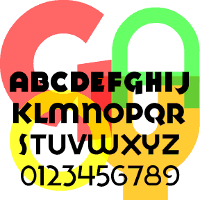
The GOYA fonts (including light, medium, heavy, ultra, and inline)were inspired by the logo of the GOYA® food products company. Another Art Deco font–like Red Circle–but this time with a preference for the circle over the square. GOYA 2.0 now includes small caps in the lowercase positions of each font (not just re-scaled but also re-weighted) plus a whole new font GOYA INLINE. Goya in use, by Alter
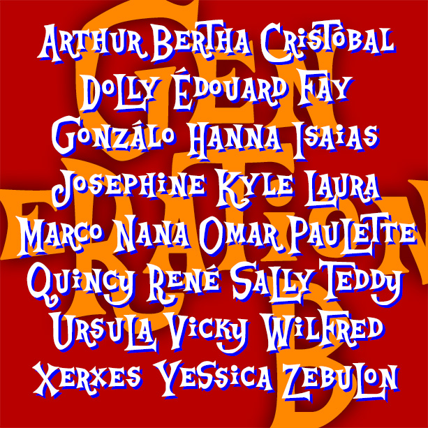
Playful and offbeat GENERATION B has a late 50s-early 60s vibe that goes from beatnik coffeehouse to rustic beach shack and beyond. It’s basically an all-caps font, with big and small versions of each letter plus some alternates, easily giving you the look of quirky hand-lettering. Inspired by the animated opening titles of the classic live-action Disney film, The Parent Trap (1961), designed by T. Hee, Bill Justice and Xavier Atencio. With its irregular alignment, letter shapes and pairs, this kind of lettering could be seen as a descendant of naïve sign painting or of the deliberate nonconformity of Beat… continued
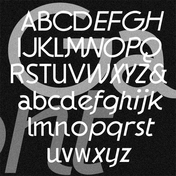
The GAUMONT fonts are elegant sans serif fonts in the Art Deco style. These were inspired by the hand-lettered titles of Alfred Hitchcock’s 1935 The 39 Steps, a Gaumont-British Picture. I’ve taken a few liberties, regularizing the characters but preserving the quirkier letterforms and rounding out the font in the same spirit. In Regular, Italic, and Light varieties. Version 1.5 has the alternate characters accessed as Stylistic Alternates, an expanded character set, and improved spacing and kerning.
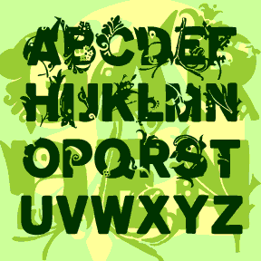
The GARDEN fonts began with a sans serif, then sprouted and grew! Inspired in part by the early Walt Whitman cover at left. Plant motifs were adapted from a variety of historic sources* and incorporated into bold, wide grotesque letters in three degrees of vegetation: Full, Two-Thirds, and One-Third. Set also includes Empty (without sprouts) for cross-pollination. (Shown in descending lines above.) Each font includes capitals, punctuation, numbers, and international characters. PATTERN SOURCES Pattern Design: An Introduction to the study of formal ornament, Archibald H. Christie Palm from a woven silk fabric. Italian, 13th century. Berlin, p117 Pattern from a… continued
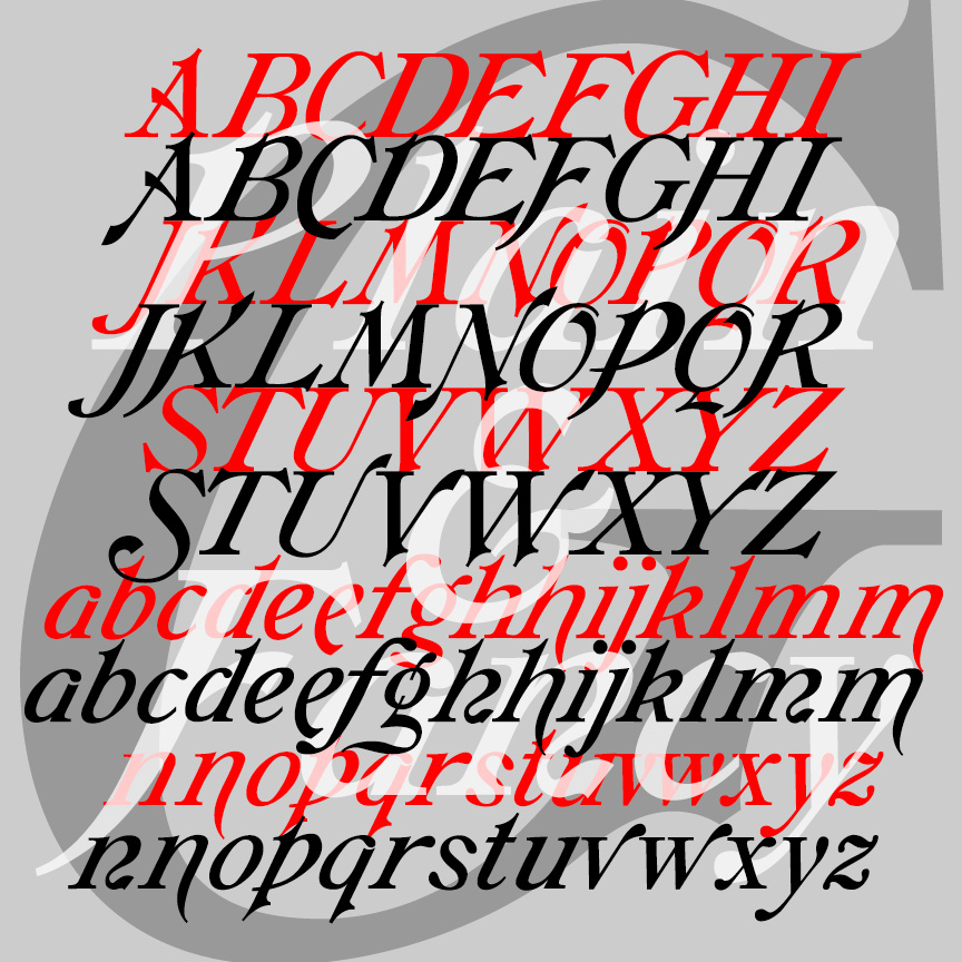
GALATHEA is an elegant italics-only font. My digital font was inspired by a 19th-century typeface from Schelter & Giesecke. After designing my version of Galathea, I found examples of another, very similar S&G font called “Italique Moyen-Age Demi-Grasse.” I’ve now recreated that second font, calling it simply GALATHEA PLAIN, as it shares so much with its sister, now called GALATHEA FANCY.