
-Premium-
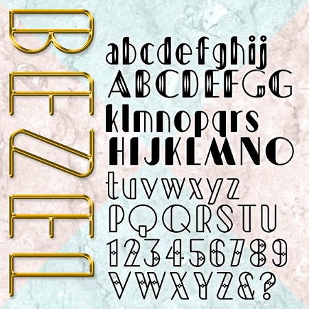

Bezel is an Art Deco font with a contemporary twist. Bezel starts with geometric forms but adds modern proportions and a sleek curve for a fresh feel. The set Bevel was inspired by this TV ad for Las Vegas and then expanded to include 4 decorative variations: Black, White, Diamond, and Shimmer.
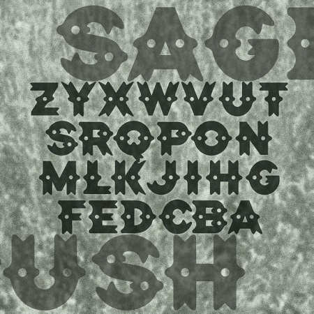
SAGEBRUSH is a decorative font with a Western flavor, its distinctive dots and curves and suggesting silver conchos, sheriffs’ badges, cowhides and spurs. In reality, it was inspired by the logo of the legendary NYC punk club CBGB OMFUG. When you learn that CBGB stood for “country, bluegrass, blues,” it’s easier to see what they were going for with this design, so far from punk typography.
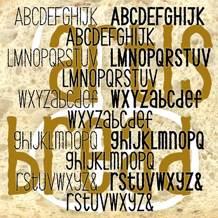
ARTISAN BREAD is a set of three fonts with the feel of earnest, informal hand-craftsmanship. Each combines an “organic” texture with a whimsical approach to letter shapes and case. Available in 3 weights, Thin, Thick and Regular.
AFFICHE is a set of fonts that resemble hand-painted signs, somewhat casual but with a distinctive and professional style. The direct inspiration for AFFICHE is the hand-lettered titles of François Truffaut’s classic 1959 New Wave film “Les Quatre Cents Coups” (The 400 Blows). I love the squarish shape of the Q and O and the slight incline. There is no lower case; use small caps as they did in the film. These fonts contain an extended character set to accommodate most all the languages of Europe that use the Latin, Greek and Cyrillic alphabets. Available in Regular, Light and 3-D.
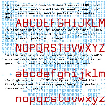
Tech Elite is a square sans-serif monospaced font, a stylish alternative to Courier or other typewriter-style fonts. Tech Elite was inspired by one of the styles offered on the classic, collectible Hermes 3000 Swiss-made typewriter. This is completely redrawn; I did not want it to have the uneven texture of vintage typing. I’ve expanded its usefulness with Bold, Oblique and Bold Oblique variations. A friend of mine had a similar typewriter in high school and it was so cool. You see, kids, back in the typewriter days, you were basically stuck with one size and one font, so a document… continued
POPSTREET is a pair of fonts inspired by the work of Keith Haring (1958-1990) an artist whose work referenced both Pop and street art. Haring first became known for his graffiti-style drawings done in the subway, but was also respected for his gallery work and public art, his accessible, affordable design, and his social activism. The set includes an Outline and a Fill font that can be used separately or layered together in different colors.
SPLUNGE is the font to use when you want to make a splash. It was inspired by the classic font Franklin Gothic, but each letter has been redrawn, then rounded, splashed and splattered. Depending on your choice of color, it could go from playful to rebellious to horrific. The set includes the companion font Splunge Dry without the splatters. The name will be known to Monty Python fans; it means “it’s a great idea but possibly not.”
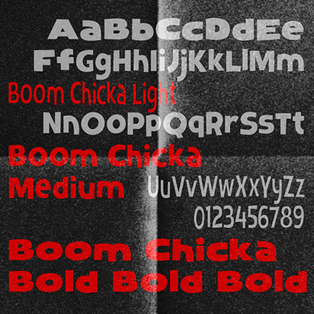
BOOM CHICKA is a set of three fonts with a friendly, bouncy informality, inspired by a the poster for the film The Prince and the Showgirl (1957) designed by Bill Gold. Comes in 3 weights, Light, Medium and Boom Chick Bold.
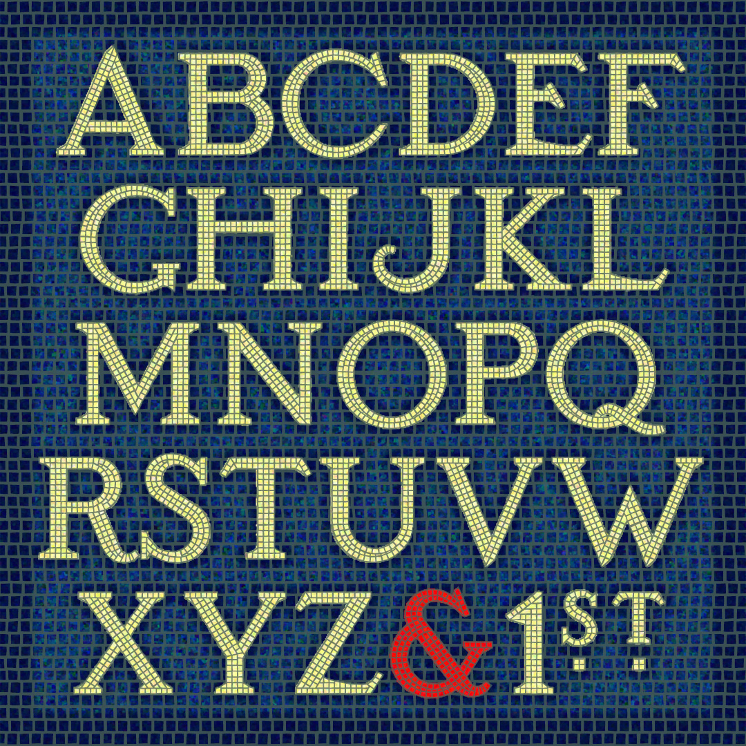
The SUBWAY MOSAIC fonts were inspired by the classic mosaic tile signs of the New York City subway system, dating to the early 20th century. I’ve tried to maintain the somewhat quaint letterforms while regularizing them for contemporary use. There are 3 fonts (White, Black and Solid) that can be used independently or layered in different colors for endless variation. Version 1.5 includes an expanded character set and improved kerning. If you prefer to have the wall space around the letters tiled too, check out the new SUBWAY MOSAIC WALL fonts!
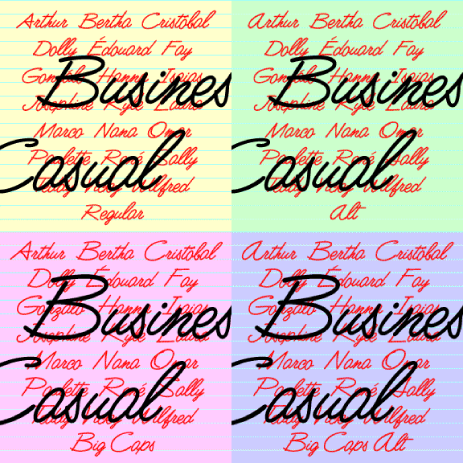
Business Casual is a lively, legible script font that can be both professional and informal. It was inspired by the “lost” analog font Delight (or Delite), produced by Formatt in the 1970s. I’ve kept the basic letterforms, but went for a more uniform stroke with rounded ends, like a felt-tip. The set includes Big Caps and Alternate variations, more closely resembling the original forms but somewhat less contemporary in feel.