
-Premium-
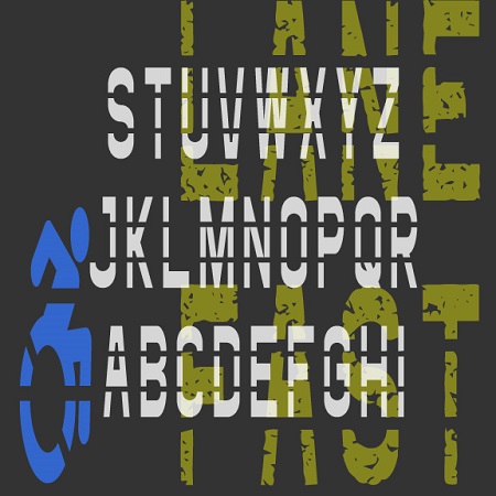

The Fast Lane fonts were inspired by roadway and parking lot markings, reflecting both the stencil style and the stretched form that looks normal when viewed at an angle. The Icons fonts includes symbols and arrows to accompany the letters and numbers. The regular fonts could be used to make printable stencils; I’ve also created Rough versions with a pavement texture for other applications.
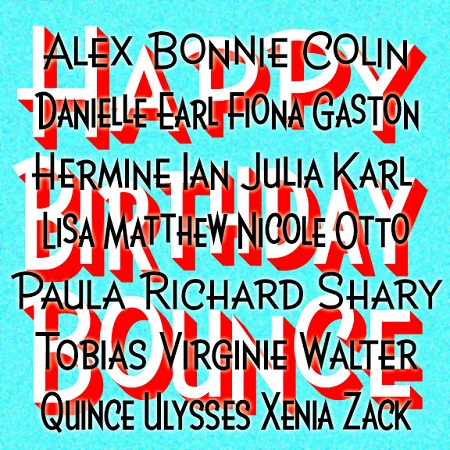
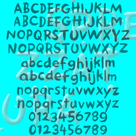
BIRTHDAY is a bright and lively sans serif available in three widths. Version 2.0 now includes upper- and lowercase as well as separate small caps fonts. BIRTHDAY was inspired by the hand-lettered titles of the film “The Band Wagon” (1953), directed by Vincente Minnelli, art directed by Preston Ames and Cedric Gibbons.
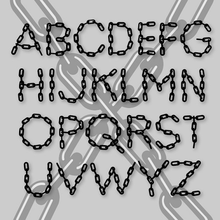
LINX is a pair of fonts designed to look like letters formed with chain. A companion to my Bead Chain font, this one is looser and feels more like it’s been arranged by hand. One version is solid, the other has highlights for a more three-dimensional look.
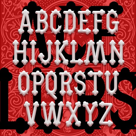
ACE OF CLUBS is a decorative display font with its roots in the 19th century. The unique trefoil or club-shaped terminals give it a certain jolliness, inspired by the former “lollipop” logo of the A&P supermarket chain. Starting with just 2 letters, I expanded it into a complete font with upper- and lowercase, numbers, punctuation, and the rest.
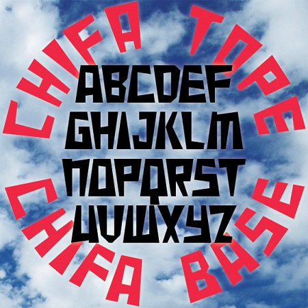
Chifa is a set of fonts combining the trapezoid of Inca architecture with wedge-shaped strokes. Chifa Base has the wide side at the base and Chifa Tope has the weight at the top, making them well-suited for arranging text in a circle. Chifa Combo combines both styles in a single, easy-to-use font; if you TyPe LiKe ThIs—that is, alternating caps and lowercase—the letters automatically fit together. In Peru, I saw several examples of lettering that used the trapezoid, such as this monument in Cusco seen below that also incorporates a trapezoidal aperture like those at Machu Picchu and elsewhere. “Chifa”… continued
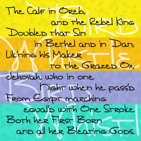
BIRDWHISTLE is a handwriting font with an artistic flair. Inspired by notes from the artist Willie Marlowe, Birdwhistle is like its namesake: pretty, playful, distinctive and a little unpredictable. Birdwhistle mixes upper- and lowercase in a creative way, and includes alternate characters for an even more spontaneous look. Willie is a dear friend, longtime colleague, and marvelous artist with an international reputation; please check out her paintings. Using 25 years of her notes and letters to me, I made Birdwhistle, striving to keep some of the whimsy and spontaneity of the original. Here is a sample of her handwriting.
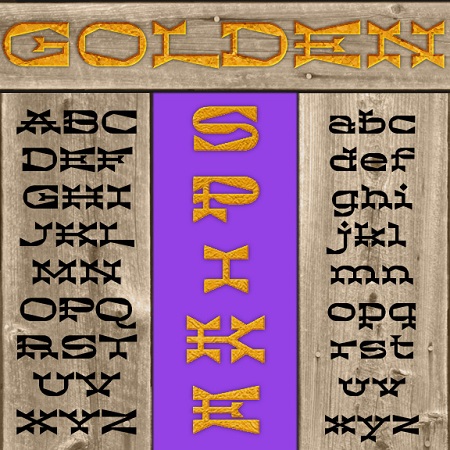
Golden Spike is a unique font that combines the bold serifs of a Western woodtype with dramatic wedge shapes for an exotic texture. Golden Spike was inspired by this tiny image of unknown origin, sent to me by Vista Bill. Also available in “Deep,” a three-dimensional version.

The Gilded Age is a set of ornate fonts with decorative details reminiscent of that period, the late 19th century in the US. Tricked out with “mustachio” serifs, spurs, and inlines, the Gilded Age captures the flashy ornamentation the name suggests. The set includes upper- and lowercase, with and without the engraved lines, and a large and small caps version including extra fancy large caps. Gilded Age was inspired by the titles of the film “Casque d’Or” (1952, directed by Jacques Becker). The film is set in La Belle Époque, the French equivalent of the Gilded Age.
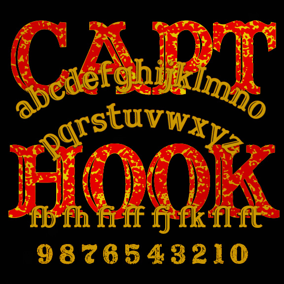
CAPTAIN HOOK is a bold and jolly woodtype font with curved serifs and engraved highlights. (Its predecessor, Captain Howdy, was all caps and inspired by the lettering on a classic Ouija board.) Captain Hook offers more flexibility and now has a companion font, CAPTAIN HOOK CRACKLE, with a rough and ready texture built in. Get the rustic look of a faded t-shirt or weathered sign. Version 1.1 has an expanded character set and improved spacing and kerning.
SPREZZATURA is a fun, casual font with the whimsy of a love note and the boldness of a protest sign. Sprezzatura looks like brush and ink lettering because that’s how it started. The OpenType font also makes use stylistic alternates and ligatures for a totally hand-lettered effect. Available with and without the spatters.