
-Premium-

Minaret is a bold display font with a rather exotic feel. Instead of mimicking foreign text, Minaret’s swirled tops suggest the rooftops of far-off lands. Or maybe it looks like whipped cream and icing! Minaret was inspired by examples of hand-lettering from 1922.
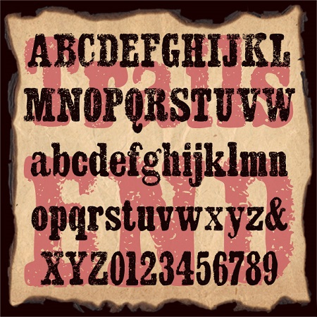
Trails End began as a bold slab-serif font. To that, I’ve added a rough edge and grainy texture producing a unique rustic style. Trails End suggests crude letterpress printing on rough paper, a weathered sign, or a well-worn T-shirt.
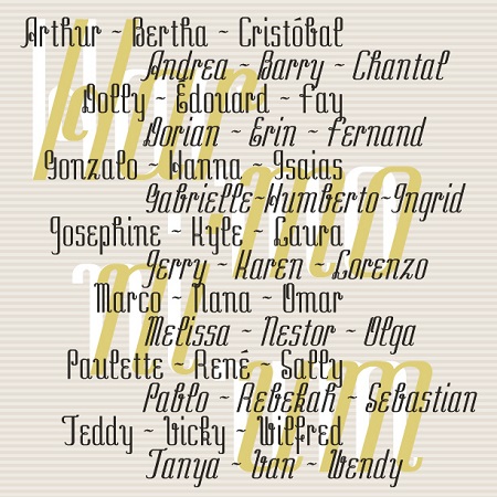
Harmonium is a beautiful and unusual pair of fonts. With the flare of cursive, Harmonium adds exotic elegance in a narrow format. It was inspired by an entry in a 1954 lettering guide. The original design, in only the very sloped style, was recommended for “modern advertising.” I also created a Regular (roman) style for more versatility.
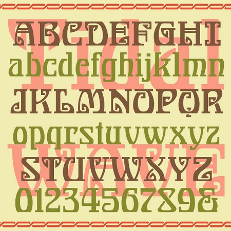
Tidal Wave is part “tribal”, part “groovy”, and part “Art Nouveau,” although its roots predate all those design labels. Tidal Wave has an exciting look that transcends time and geography. It was inspired by this page of lettering from J. M. Bergling’s 1923 Art “Alphabets & Lettering”. The “Grecian” label must have something to do with the squarish spirals.
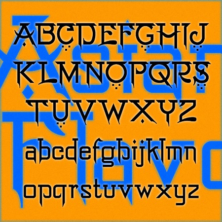
Asian Flavor is a pan-Asian pastiche. Borrowing from multiple Asian scripts—dots from the Middle East, bars from South Asia, strokes from the Far East—this font attempts to suggest Asian languages while still writing in the Latin alphabet. About as authentically “Asian” as my homemade lettuce wraps with some ginger, rice vinegar, soy sauce and sesame oil: tasty and accessible but not really Asian. Asian Flavor was inspired by this vintage hand-lettered sign at the American Museum of Natural History in New York City.
DECOY is a bright geometric font with Art Deco flair. The Stencil version is solid, the Template is outlined. Both also come in an alternate version without all the decorative circles on the caps. Decoy was inspired by one style of signature by the popular American artist, Norman Rockwell.
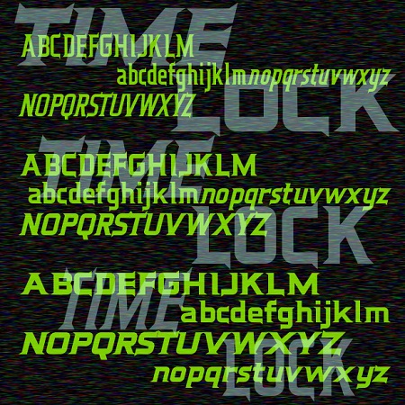
Time Lock is a 6-font family with a retro-futuristic feel. Sleek and streamlined, with distinctive triangular serifs strategically placed like fins. In three weights with matching oblique fonts for even better aerodynamics. Time Lock was inspired by the trailer for the film “The Time Machine,” 1960, very different from the poster or the main titles. Here is the full trailer, you can see I’ve expanded the design to include lowercase.
Traftoon is a set of three fonts that look like neat, slightly sloped hand lettering done with a brush and ink. Casual but not child-like, with full upper and lowercase, Traftoon offers an attractive and flexible alternative to many similar fonts such as Balloon and Comic Sans. Traftoon was inspired by Howard Trafton’s Cartoon Light and Cartoon Bold of 1936. My friend Vista Bill got me started on this. Cartoon Bold exists in digital form under various names. The Light had not been previously digitized and neither included lowercase originally. In creating these, I maintained the quirks of the originals… continued
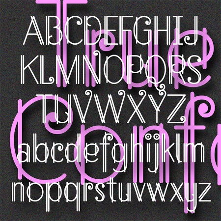
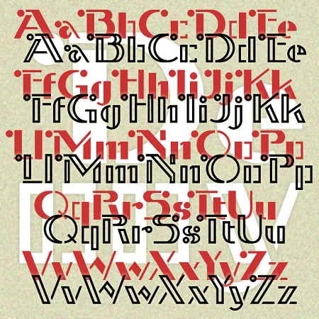
True Confession is a delicate and lively font that suggests Art Deco metalwork. Inspired by the hand-lettered main title of the 1937 film of the same name starring Carole Lombard, art directed by Hans Dreir and Robert Usher. Want this look in a handy monogram font? Check out my Art Deco Monograms.
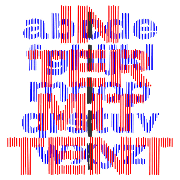
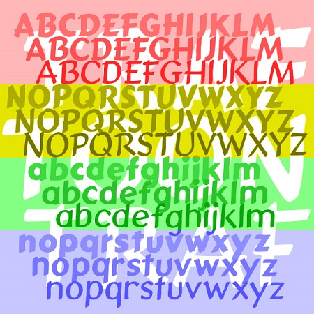
INTERMITTENT was inspired by some of the titles for the movie “West Side Story,” designed by the legendary Saul Bass. Bass’ titles take several different turns; this style was used for the title and intermission cards. Composed of slightly irregular parallel lines that suggest a bold, wide sans serif, Intermittent is like a sketch of a font, bold and wide but with a gentle sparkle. This font can be condensed, expanded, layered, and negatively spaced to great effect. This font can be condensed, expanded, layered, and negatively spaced to great effect.