
-Premium-


HANGOVER SQUARE is a set of 3 fonts with an early-1960s style. They were inspired by the handlettered titles of the 1964 mad-ventriloquist thriller Devil Doll, set in London as it was beginning to swing. The Regular font is a smooth sans serif with offbeat details. Hangover Square Stones has the same distinctive letterforms, with a rocky edge suggestive of horror or decay. Hangover Square Sticks is a condensed version, composed of rough vertical lines with a hand-drawn feel. Each font lends itself to all-caps or mixed-case usage.
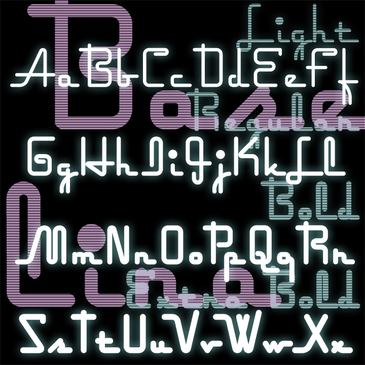
Baselina is a stylish, squarish font that hugs the baseline, suggestive of Art Deco and neon signs. In four weights: Light, Regular, Bold and Extra Bold. Inspired by the hand-lettered titles of the Fleischer brothers’ animated film “Mr. Bug Goes to Town” (1941)
XOXO was inspired by a shopping bag I picked up in Tlaquepaque, México. The quirky lettering and imperfect printing on plastic were irresistible. With two versions of each letter for a more random feel as you can see in “XOXO” in the image on this page. XOXO is, of course, the way you type “hugs and kisses.” But if you prefer, you can pretend it’s an exotic word and pronounce it “sho-sho.” Includes uppercase, punctuation, numbers, and international characters.
WOODWIND was inspired by the opening titles of the classic 1939 film Gone With The Wind, directed by Victor Fleming, production designed by William Cameron Menzies, art direction by Lyle R. Wheeler. As you can see from the frame at left, the title appears on screen very large, a word at a time, blowing from right to left. WOODWIND is an ornate 19th-century style font that can suggest the Old South as well as Western Saloon or Circus Wagon. For flexible use, I’ve created a Regular font plus West and East “moving” fonts. Includes caps, lowercase, numbers, punctuation and international… continued

WEXLEY is my digital interpretation of a rather forgotten analog font set called Wexford, very much in the geometric Bauhaus tradition. The original was designed by Richard A Schlatter and released by VGC in 1972. (Thanks, Bill, for the research.) Working from period sources, I’ve made my versions of four weights, expanding the character set and including a couple alternate characters. The Inline is an invention in the 70s spirit. If you like this general style, check out the Bowfin Guide to “Bauhaus” fonts.
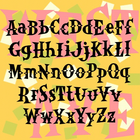
WESTERN AVENUE is a pair of fun fonts with triangular “latin” serifs and spurs. The bouncy irregularity befits their inspiration: the unsigned 1950s album cover at left. Includes upper and lowercase, numbers, punctuation and international characters. OpenType features include stylistic alternates and discretionary ligatures for a more random, hand-lettered feel. An earlier caps-only version in this style was called Western Egg.
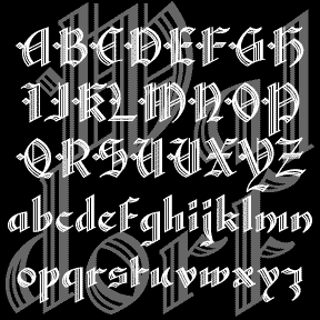
WALDORF TEXT is my digital revival of a classic “lost” font of the same name. An elegant blackletter font with details that spell luxury. Waldorf Text was produced by Barnhart Brothers and Spindler Type Foundry in 1914. When American Type Founders acquired BBB&S, they continued to produce it, including it in their 1934 and 1941 catalogs. And then it was gone, never making the transition from type to film or digital. (Thanks, Bill, for all your help!) I’ve completely redrawn the font, maintaining the graceful lines while expanding the font and making other slight changes for modern use. There are… continued
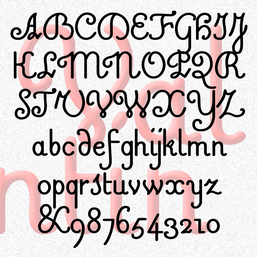
VALENTIN is a sweet and simple cursive font. A mix of friendly and formal, Valentin’s vertical letterforms are in the French style. Valentin was inspired by 18th-century experiments in raised-letter printing for the blind. Designed by Valentin Haüy, this style is beautiful on the page and could be read by both blind and untrained sighted readers. Later designers would create more simplified raised-letter designs, eventually leading to the dot grid of the Braille system. VALENTIN 1.5 has an expanded character set and improved spacing and kerning. More legible versions of a few characters have been substituted and the originals moved… continued
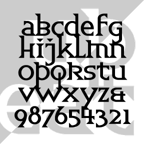
Quirky UPBEAT could be categorized as a latin uncial. “Uncial” because it has one case, of x-height plus ascenders and descenders in the style of so-called uncial and half-uncial fonts. “Latin” because of the triangular serifs which give the font a lively texture. I love alternate characters and UPBEAT has its share. Use these to create variety in your lettering. Located in the lowercase positions. Each font (Regular, Demi, Bold) includes single case letters plus alternates, numbers, punctuation, and international characters.
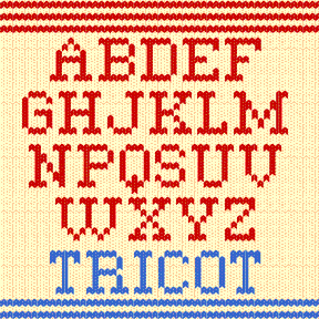
TRICOT was inspired by the 2007 US holiday stamps, designed by Nancy Stahl (left). I liked them so much that I designed my Christmas cards to match (at right) and developed the Tricot font for the greeting inside. A knitted design has much in common with a bitmap image, but the pairs of oval stitches combine to suggest the warm and fuzzy feeling of a handmade sweater. Includes upper and lowercase, numbers, punctuation and international characters. No accent marks on uppercase. Plus knit-style patterns using special keys (below).