
-Premium-
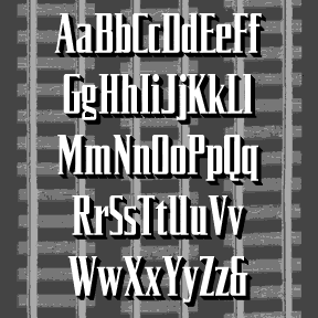

The SILVERLINER fonts were inspired by the opening titles of (and trailer for) Strangers on a Train, a 1951 Warner Bros film directed by Alfred Hitchcock, art directed by Ted Haworth. The fonts–Regular, Oblique, Wide and Wide Oblique–suggest the sleek style of rail travel of the period. Each font includes upper and lower case, numbers, punctuation, and international characters.
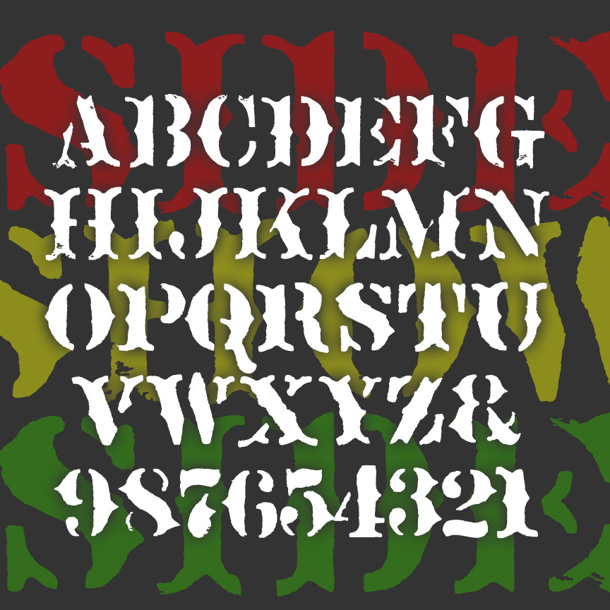
SIDESHOW is a fanciful font with the overall feel of rough stencil printing. Imagine the cart for a medicine show or signs for a traveling circus. SIDESHOW is my second font inspired by Ouija® boards; the other is Captain Howdy. This older board was rather primitively stenciled, adding to its creepy attraction. Version 2.0 includes a greatly expanded character set, improved spacing and kerning.
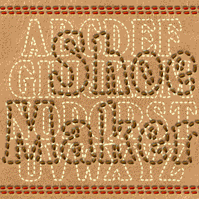
SHOEMAKER is designed to look like top-stitched letters, great for a fun, friendly, hand-crafted look. The basic letterforms were inspired by the classic Windsor fonts, favored by Woody Allen (most all his films’ title-cards) and Timberland (logotype). I’ve reduced it to a carefully “stitched” outline. Includes upper and lowercase, numbers, punctuation and international characters. For more fun, I’ve included top-stiched versions of some Harold’s Pips (below, with key locations in red).
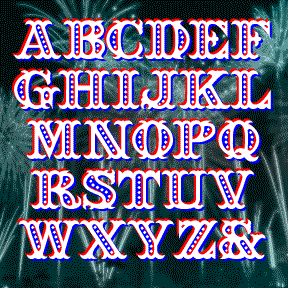
SEAFARE is a jolly 19th-century style font. It’s bold and decorative with a hint of sea waves was inspired by the hand-lettered titles of Alfred Hitchcock’s 1949 costume drama Under Capricorn, art directed by Thomas N. Morahan. Available in solid, outline and beaded varieties which can be layered as in the image on this page. Includes caps, numbers, punctuation and international characters After creating the font, I found these examples of a similar but sloped font in Rob Roy Kelly’s “American Wood Type 1828-1900.” You could create this effect with Seafare, if desired.
SCARLET RIBBONS is a fancy, friendly script, inspired by a Speedball lettering book from the 30s by Ross F. George. The original was called simply Vertical Script and needed a lot of work. As seen in the Script Font Identification Guide! Its name comes from an old song (words and music by Jack Segal and Evelyn Danzig), performed by Jo Stafford, Harry Belafonte, Sinéad O’Connor, and many others. This favorite font is part of a series of retro vertical scripts, Easter Parade, Roselyn, and Famous Label. Includes caps, lowercase, punctuation, numbers, and international characters.
BARRYMORE is a sleek and stylish geometric font with an Art Deco influence. With rounded ends that suggest neon tubes, BARRYMORE comes in 3 weights. Inspired by vintage Pepsodent packaging. Formerly known as Sanitary.
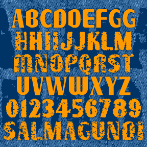
SALMAGUNDI is a quirky font, a tasty melange of various typestyles, tossed together for homemade flavor. SALMAGUNDI was inspired by the sign on the left, on the bus line between Oakland and Berkeley. After staring at it every day, intrigued by the earnest signmaker’s combination of various fonts and his own imagination, I had to get a picture of it and later expand it to a full font. The Regular is very clean. I’ve also made Chewy and Crispy varieties for those who like some texture. I should have named this after a Mexican dish, but they’d all been used… continued
SAFETY PIN was inspired by the cover of the June 1946 Ladies Home Journal. Click on the O at left to see the whole word. From the mildewy examples I found, it appears their logotype was different for each issue in those days. I started with J-O-U-R-N-A-L and imagined safety pins bent and twised to form the other characters. May be the first font that appeals to both crafters and punks. The Regular version of the font has white highlights like Ringpin; the Solid version does not so you can create your own effects and shadows.
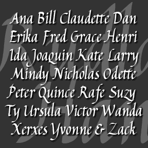
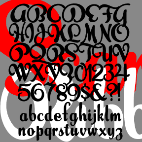
RUDLAND HAND is a calligraphic font, inspired by the work of the British artist and designer Peter Rudland. As explained in his book From Scribble to Script (John De Graff, 1956) Rudland was an advocate of this style of script–italic hand–as a way to improve one’s handwriting. So although it may seem like ornamental calligraphy, Rudland intended that ordinary people would develop this beautiful, flowing, pen lettering. You could use the font as a resource for practicing your own script or, if your handwriting is as hopeless as mine, a convenient substitute. I’ve created two fonts, one with the fancier… continued
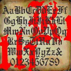
RUDE GOTH began with a set of “Old English” stencils. I used a natural sponge to print them and get an authentic texture. Goth, but also for perfect for a Halloween, pirate, or rough historic feel. Includes upper and lowercase, numbers, punctuation, and international characters.