
-Premium-
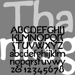

THANKSGIVING was inspired by this handlettered “Buzza-type” motto (left). Grandma would have had a couple of these homilies tacked up in little frames. My partner, Al, collects them and I became interested in the lettering on this one in particular. The feel is of handlettering in imitation of print, rather than the other way around. Includes upper and lowercase, numbers, punctuation, and international characters.
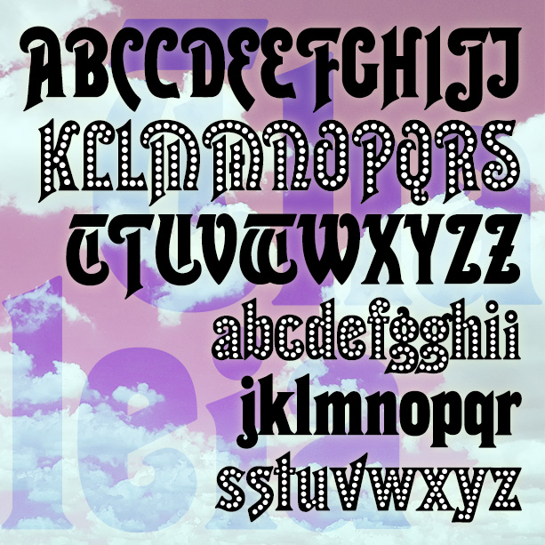
THALEIA is a bold and curvy font, suggestive of both the 1920s and the 1970s. This is my digital interpretation of an analog commissioned by a client who could no long find the original in a usual form. The new THALEIA LIGHTS font has is set with white dots, suggesting an old music hall marquee. Version 1.6 includes an expanded character set, improved spacing and kerning.
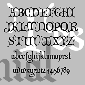
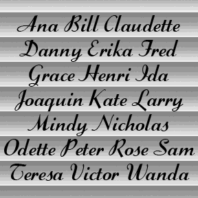
Formerly called “Christmas Card,” TESTIMONIAL was inspired by the hand-lettered titles of the classic holiday film It’s a Wonderful Life (1946, directed by Frank Capra, art direction by Jack Okey.) The caps are in a decorative versal style, the lowercase a more traditional blackletter. Pair it with Director’s Script for the total look of the original. This font retired a while ago but, at Jordi’s prompting, it’s back with a more complete character set including Arabic numbers. (The Roman numerals have been moved; please see the Read Me file.) Includes caps, lower case, numbers, punctuation, and international characters.
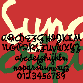
SYNCOPATED SCRIPT was loosely inspired by the work of the painter Stuart Davis. His jazzy canvases bridge Cubism and Pop Art, often featuring words, written in this style and others. Davis’s work always seems fresh and inventive to me. After looking at all the reproductions of Davis’s paintings I could find, I used some of his writings and my own intuition to fill out the alphabet. I’ve tried to maintain both the erratic, jumpy quality and the continuous linking. The originals were painted; these feel as if they were cut out of paper. Includes caps, lowercase, punctuation, numbers, several alternates… continued
SWIZZLE SCRIPT is my digital interpretation of the classic analog font “Stylescript”, designed by Sol Hess in 1940 for the Lanston Monotype Company. Elegant and low-slung, in the manner of Trafton (designed byHoward Trafton, cast by Bauer, 1933) and Coronet (R. H. Middleton for Ludlow, 1937). But it’s bolder with a thin-thick contrasting stroke and a higher x-height. I worked from a print reference (VGC Alphabet Library, 14th Edition, 1988) and some metal type (left) for certain characters. Thanks, Bill, for the inspiration and research! Includes caps, lowercase, punctuation, numbers, and international characters.
SWEET SPIRIT is a cousin to my Graceful Ghost font. Similarly composed of graceful curving lines, but somewhat more compressed than its predecessor. Completely redrawn for a historical source–not traced–for very smooth edges. Looks great reversed and, of course, BIG. Includes caps, limited punctuation, and international characters.
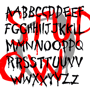
STUPID COW is a rustic font that looks hand painted. It suggests weak sign-painting skills rather than ignorance, as backward letters do. In the right context, the drips might suggest horror, but this a basically a fun font with an urge to communicate, albeit crudely. There are variants of each letter; TyPiNg LiKe ThIs produces a fine, random effect. Includes uppercase with alternates, punctuation, numbers, and international characters.
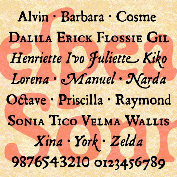
SONNET is a set of fonts with the look of early letterpress printing; the bold and beautiful letterforms contrast with the roughness of the technology and paper of the time. This would be a good alternative to the overused and ahistoric Caslon Antique. Sonnet was inspired by a facsimile of Shakespeare’s First Folio as published by Thomas Thorpe in 1609. The full series includes many typographic features of the original, including italics, swash italics, small caps, old-style figures, long s, and more. Version 2.0 makes use of Opentype features for easier use. Now the Regular font also includes the Small… continued
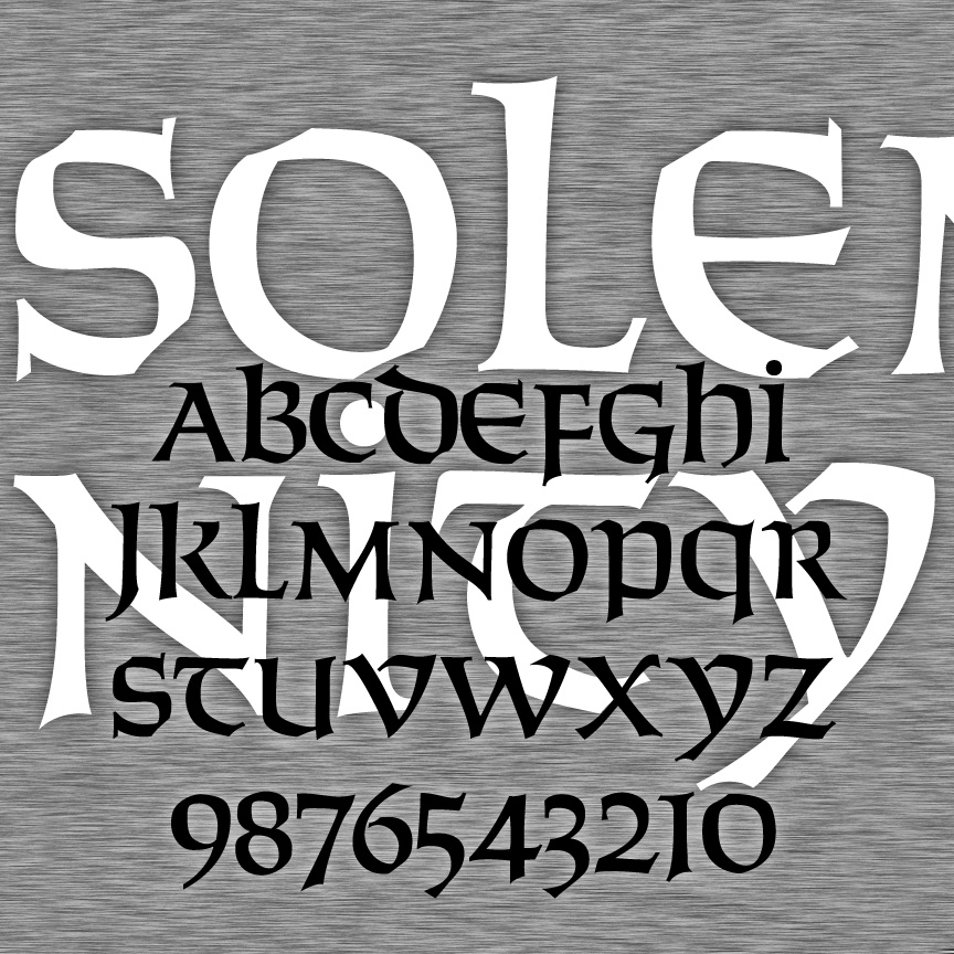
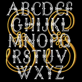
SOLEMNITY is a bold calligraphic font. It’s an uncial, having a single case that has aspects of upper-and lowercase forms. SOLEMNITY was inspired by Solemnis, designed by Günter Gerhard Lange in 1952. I drew my font fresh using analog examples and invention as needed, and the name was chosen to honor its origin without misusing any trademarks. Version 2.0 has refined letters and numbers, an expanded character set, and improved spacing and kerning.

SMELVETICA was made from scans of rubber stamps I carved a long, long time ago. They were based on Helvetica and once included caps and everything. But they’ve disappeared and all I’m left with is the lowercase and in a degraded state. Each letter is more clearly stamped at its right side. At the lowercase positions there is an alternate stamping, more erratically placed. There’s also an outline version with the letters more clearly delineated. Limited character set includes 2 versions of each lowercase letter and some punctuation