
-Blackletter-
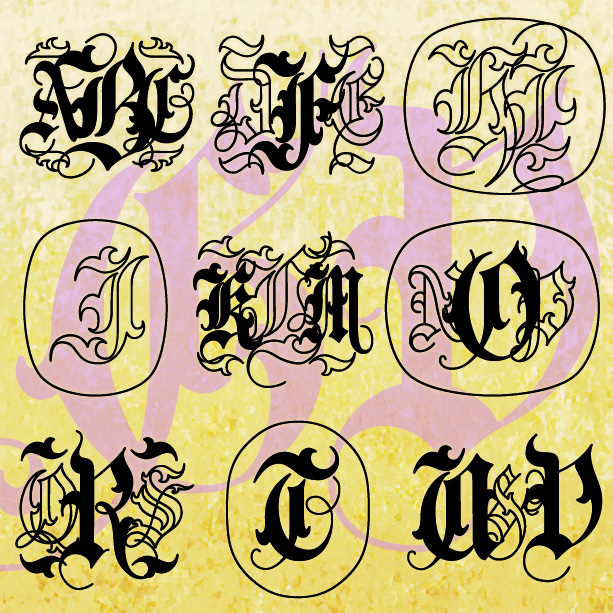

GOTHIC VINE MONOGRAMS® lets you make custom monograms in a dramatic and distinctive “Old English” style. Solid and Outline fonts, plus mixes and decorative elements, give you great flexibility in creating your 1-, 2-, or 3-letter monograms.
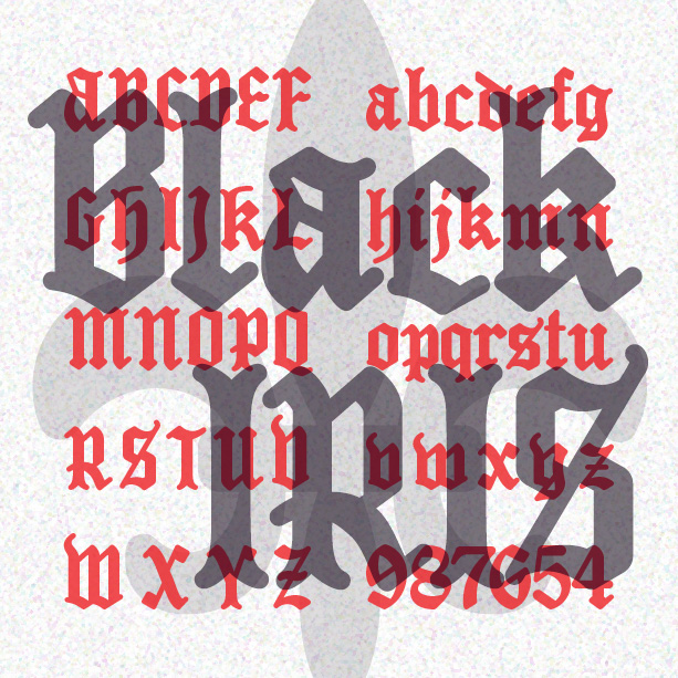
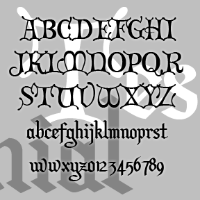
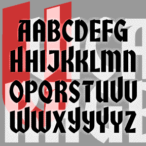
BLACK IRIS is a bold blackletter font with rounded strokes for a unique texture. The lowercase follows conventional letterforms, but I’ve designed the uppercase to be more legible to modern eyes. And it works great in ALL CAPS.
SCHNAPPS is a lively calligraphic font that captures a jolly German character. Could be used to suggest Oktoberfest, Christmas, or Old World tradition. Bolder and more legible than many blackletter fonts. SCHNAPPS was inspired by the hand-lettered titles of Carol Reed’s 1940 film “Night Train to Munich,” art directed by Alex Vetchinsky. Version 1.5 includes an expanded character set, improved spacing and kerning.
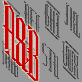
Set of 4 fonts that let you make custom 3-letter monograms in an elegant, narrow diagonal shape. There are 2 styles (Holmes, a blackletter, and Watson, a deco sans serif) and a Regular and Inline version of each. There are 9 decorative frames that you might use and combine for more variety.
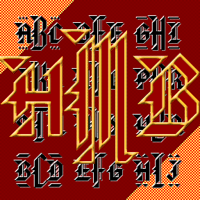
The BARONIAL MONOGRAMS fonts are designed to create unique blackletter style monograms. Optional decorative elements tie in the smaller, outside letters; see the Read Me file in the download. The letterforms were inspired by the analog font “American Text” as reproduced in Dan X. Solo’s Gothic and Old English Fonts (Dover, 1984.) I’ve redrawn the font with only 90- and 45-degree angles, and reshaped a number of other letters completely to fit the monogram format. Could be used as a matching titling font; large and small caps only. Version 1.1 now includes an Outline font, plus two mixtures of the… continued
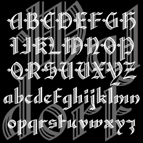
WALDORF TEXT is my digital revival of a classic “lost” font of the same name. An elegant blackletter font with details that spell luxury. Waldorf Text was produced by Barnhart Brothers and Spindler Type Foundry in 1914. When American Type Founders acquired BBB&S, they continued to produce it, including it in their 1934 and 1941 catalogs. And then it was gone, never making the transition from type to film or digital. (Thanks, Bill, for all your help!) I’ve completely redrawn the font, maintaining the graceful lines while expanding the font and making other slight changes for modern use. There are… continued
Formerly called “Christmas Card,” TESTIMONIAL was inspired by the hand-lettered titles of the classic holiday film It’s a Wonderful Life (1946, directed by Frank Capra, art direction by Jack Okey.) The caps are in a decorative versal style, the lowercase a more traditional blackletter. Pair it with Director’s Script for the total look of the original. This font retired a while ago but, at Jordi’s prompting, it’s back with a more complete character set including Arabic numbers. (The Roman numerals have been moved; please see the Read Me file.) Includes caps, lower case, numbers, punctuation, and international characters.
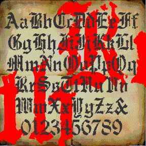
RUDE GOTH began with a set of “Old English” stencils. I used a natural sponge to print them and get an authentic texture. Goth, but also for perfect for a Halloween, pirate, or rough historic feel. Includes upper and lowercase, numbers, punctuation, and international characters.
VICARAGE, RECTORY and PARSONAGE are separate but related decorative fonts, each with a romantic, historical feel and inspired by hand-lettered film titles. Each could also be used to suggest Olde Worlde gentility, holiday festivity, or spirituality. Each font is all caps with many alternate forms for more variety and looks great as LARGE and SMALL CAPS. VICARAGE, the boldest of the three, was inspired by the trailer of the film The Private Lives of Elizabeth and Essex (1939), art directed by Anton Grot. RECTORY, suggestive of pen calligraphy, was inspired by the opening credits of Going My Way (1944), art… continued
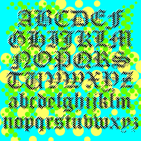
PALIMPSEST is an experimental font combining the letterforms of a traditional blackletter font with the texture of a Benday or halftone dot screen. Modern + Medieval. Pop + Parchment. At first glance it appears somewhat blurred or faded but is very cleanly rendered from vector drawings for smooth edges at any size. (Bigger is better.) Includes upper and lowercase, numbers, punctuation, and international characters. PALIMPSEST comes in four weights: Light, Regular, Dark, and Black, which can be mixed and matched for interesting effects. The graphics above show only the Regular weight; at left are all four for comparison.