
-Dimensional-
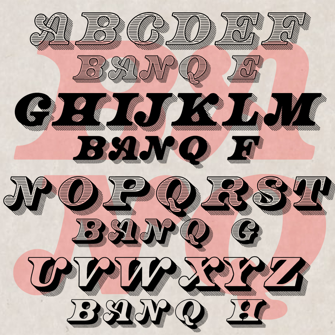

BANQ is big bold italic capitals. With the feel of Gilded Age banknotes and certificates, BANQ announces itself with big ball terminals and graceful swashes. The full set of 8 fonts includes solid and shaded, three-dimensional and shadowed versions. BANQ was inspired by two fonts: Bob Gill’s hand-lettered Cheque as seen in “New Alphabets A to Z” by Herbert Spencer & Colin Forbes from 1973 and another, more mechanical font also called Cheque from Dan X. Solo’s collection. My fonts are completely reimagined and redrawn, harkening back to the letterpress examples that no doubt informed both Cheques. Thanks to Jeff… continued
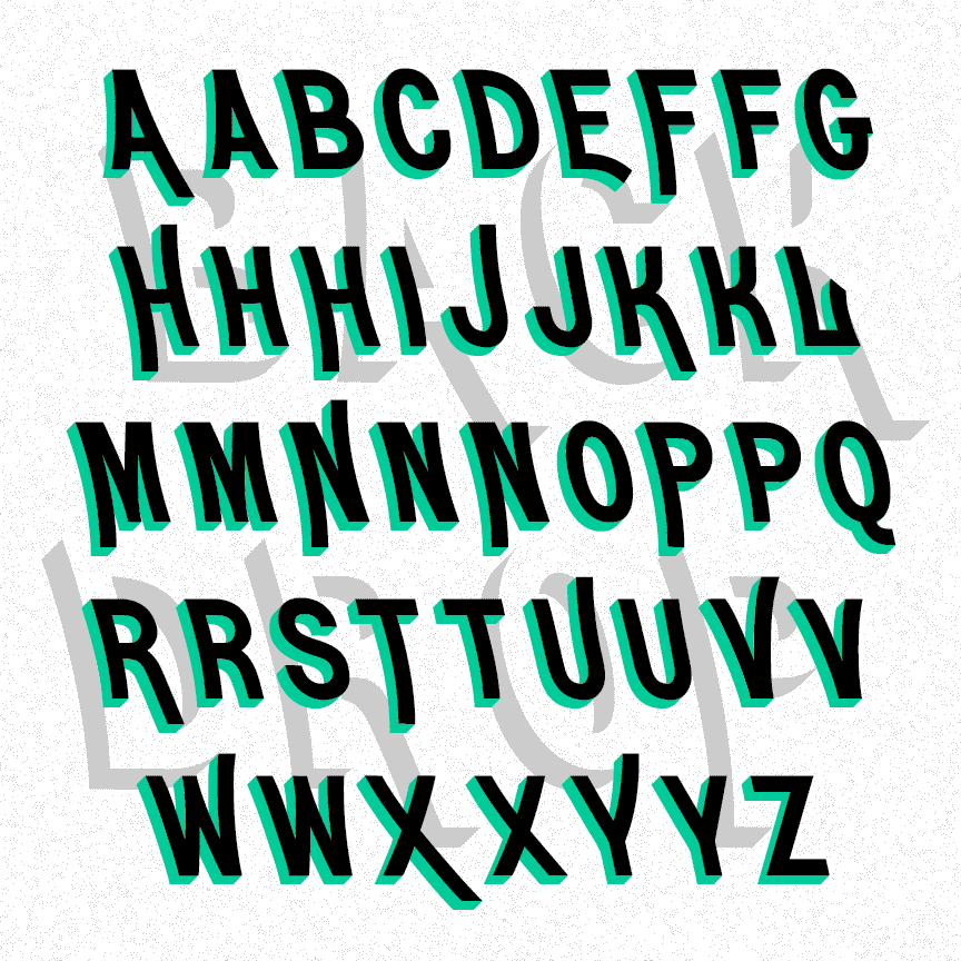
BACKDROP is a pair of fonts with dimension. The graceful caps of the Regular font lean back. The Shadow font suggests 3-dimensional letters. Use them separately or layered together in different colors or patterns. Inspired by a pair of analog fonts, Erebus and Hades, from the 1892 Central & Boston Type Catalog.
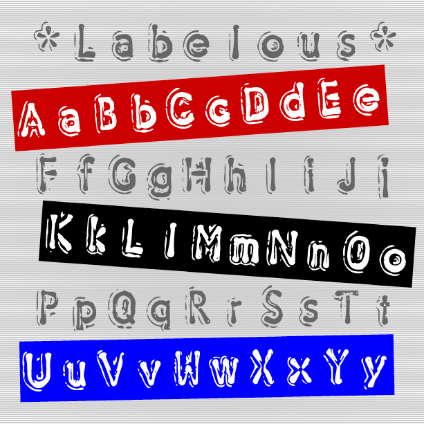
LABELOUS looks like embossed tape labels, a low-tech classic. But unlike other such fonts, Labelous is narrower and includes upper and lowercase, full punctuation, and international characters. There are two versions of the font, one with black letters and the other with black tape and white letters. For the look of continuous tape, just type an underscore for blank tape between letters.
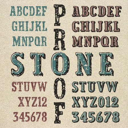
The Stone Proof fonts are weathered and worn, suggesting primitive typeset, rough paper, and aged surfaces. The set includes Regular, 3-D, and a special Fill font to work with the 3-D. Its cousin, Handbill, has the jumbled style of rubber stamps, if you prefer that. A stone proof is a simple proof made without a press, using a mallet and composing stone. Thanks, Vista Bill, for the name suggestion!
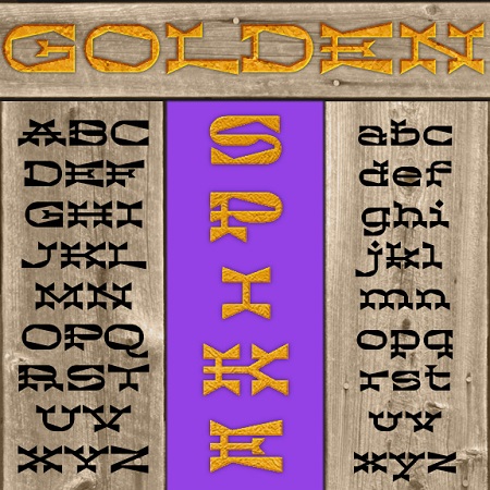
Golden Spike is a unique font that combines the bold serifs of a Western woodtype with dramatic wedge shapes for an exotic texture. Golden Spike was inspired by this tiny image of unknown origin, sent to me by Vista Bill. Also available in “Deep,” a three-dimensional version.
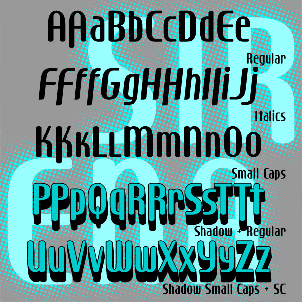
Sleek and stylish with modern curves, SIRENA was inspired by the hand-lettered opening titles of the film I Married a Witch (1942, art directed by Hans Dreier and Ernst Fegté, starring iconic screen siren Veronica Lake. I’ve expanded the font to include lowercase and created Small Caps and 3-D Shadow versions. And now there’s a companion Italic version! Version 1.5 includes an expanded character set including alternate letterforms as shown.
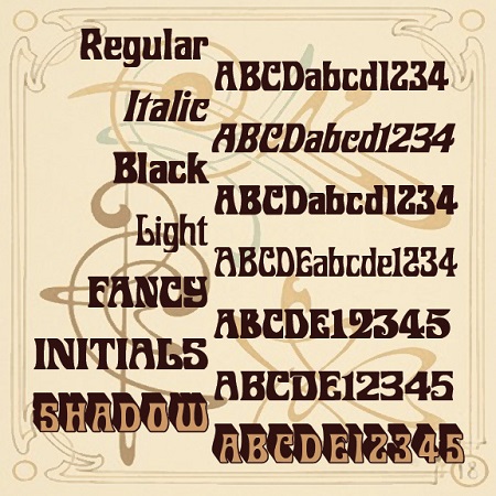
ROBERTA is a digital interpretation of Bob Trogman’s delightful Art Nouveau analog original. This classic font suggests elegance and fun, exoticism and friendliness. Bob’s story: “I originally hand cut this font in 1962. It is based on a Belgian restaurant sign. I named it after my daughter Roberta. Many Mexican food companies used this font, but they didn’t know it was from Europe. Dan Solo was going to digitize it for me, but he retired from the font business last year. Just give me credit for the design and it is all yours to do what you want.” And you… continued
The five PROJECT fonts were inspired by the hand-lettered titles of the film Project Moon Base (1953). Tucker brought them to my attention with a couple of very clean stills. I only knew the film from a grainy tape of when they lampooned it on Mystery Science Theater 3000. It’s my favorite kind of scifi: laughably dated, fake, and earnest. (Also used in Crash of Moons.) I’ve made a set of five fonts–Light, Medium, Bold, Bold Inline, and 3000 (the 3-D style)–for a variety of uses. Out of the Moon Base context, it can have a very diferent feel, almost… continued
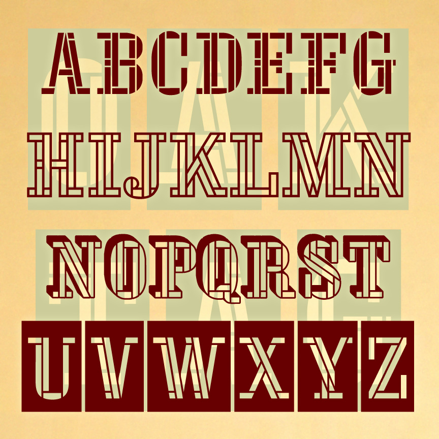
OAKTAG is a set of 4 stencil fonts with a unique woven, serif design. The full set includes 4 fonts. The Regular and Outline can be used separately or layered together. The Blocks and Tiles varieties provide even more creative possibilities. OAKTAG was inspired by the one-character logo of Channel Four UK. I love the challenge of starting with one letter or number and imagining the rest of the characters. I recently learned that amazing icon was designed by Martin Lambie-Nairn. Version 2.0 has an expanded character set, and improved spacing and kerning.

NATIONAL DEBT is a bold, squarish design with the solid curves of a vintage car or a retro refrigerator. I originally designed this back in 1998 for a 1940s-themed event when I couldn’t find quite what I was looking for. Now there are three versions: the solid original, Hilite, and ThreeD that can be used separately or layered together. Version 1.5 includes an expanded character set, improved spacing and kerning. Another one of Dennis’ Font Play creations.