ROBERTA is a digital interpretation of Bob Trogman’s delightful Art Nouveau analog original. This classic font suggests elegance and fun, exoticism and friendliness.
Bob’s story: “I originally hand cut this font in 1962. It is based on a Belgian restaurant sign. I named it after my daughter Roberta. Many Mexican food companies used this font, but they didn’t know it was from Europe. Dan Solo was going to digitize it for me, but he retired from the font business last year. Just give me credit for the design and it is all yours to do what you want.” And you can hear Bob here: https://www.youtube.com/watch?v=D0PE0J5akDU
Thanks, Bob, for letting me taking a shot at recreating your beautiful fonts!
Later I found an example of ROBERTA RAISED SHADOW in a book and just had to make it too. I also made a special version of regular Roberta, adapted for use as a fill with the basic shadow font.
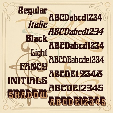
And now, thanks to the receipt of a scan from a vintage catalog and more assistance from Bob, I have recreated ROBERTA ITALIC, ROBERTA BLACK, ROBERTA FANCY, ROBERTA LIGHT (formerly Roberta II) and ROBERTA INITIALS (Roberta III) , all in the same curvilinear vein with some surprising differences.
Roberta Regular, Italic, Light, and Black contain full upper and lowercase, numbers, symbols and international characters. Like the originals, Roberta Raised Shadow & Fill, Roberta Fancy and Roberta Initials do not have lowercase; the Roberta Black can be paired with the latter two.
![]()


