
-Dingbats-
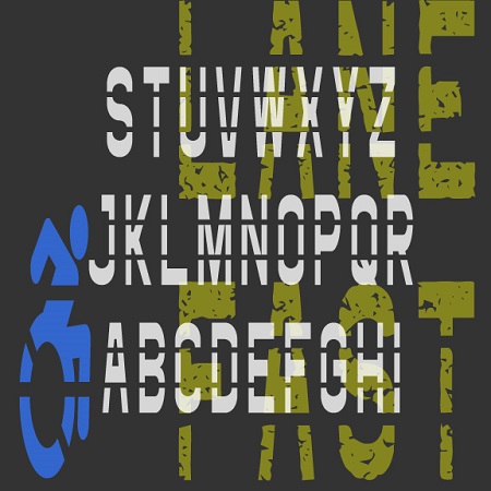

The Fast Lane fonts were inspired by roadway and parking lot markings, reflecting both the stencil style and the stretched form that looks normal when viewed at an angle. The Icons fonts includes symbols and arrows to accompany the letters and numbers. The regular fonts could be used to make printable stencils; I’ve also created Rough versions with a pavement texture for other applications.
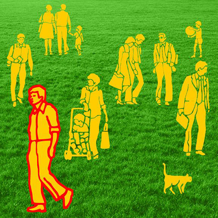

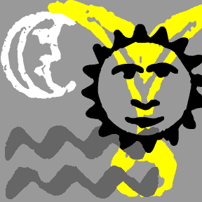
EVERYDAY PEOPLE is a pair of dingbat fonts inspired by vintage architectural illustration materials. Use them to populate your text and illustrations. Comes in Sun and Shade versions.
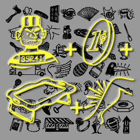
REBUS FONT is a dingbat font that contains a quirky variety of images in a snazzy retro style. They’re drawn from a couple of 1960s editions of the home version of the TV game show Concentration that featured rebus puzzles that had to be revealed and then solved. The rebus is as old as Egyptian hieroglyphics; a simple picture is substituted for all or part of a word. The new OpenType version of Rebus Font allows you to easily access any of the 130 images by simply typing its name. Easily accessed for use as clip art or to make… continued
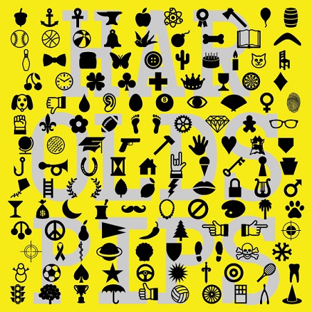
HAROLD’S PIPS is a dingbat font of 52 symbols that could be used to create a special card game or in any other way you use dingbats. It was inspired by an episode of The Simpsons* in which Fat Tony’s gang play cards with a special deck only aces in extra suits such as cherries and stars. So with this font (and perhaps my Card Characters letters) you could make a deck of 52 aces!The new OpenType version of has over 130 cool and useful dingbats. In applications that support the ligatures feature, now you simply type the name of… continued
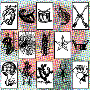
BINGO DINGO is a dingbat font inspired by the classic Mexican board game, Lotería. Similar to bingo, with pictures instead of numbers, there’s a fascinating assortment of characters, animals, and other things which I’ve rendered in an engraving-like style. The optional box around the image can be typed with an additional keystroke. 54 images in all. I have not included the names in the designs; label them as you will in any language.
These are derived from a pattern sheet provided with a set of Japanese wood-carving tools. The only thing I could read on the page: ’82 New Year. There are 22 charming graphics, including a few nice dogs, some handsome calligraphy, and some cute cartoony stuff. Julie tells me the blue character at left means “long life”; any help with the others?
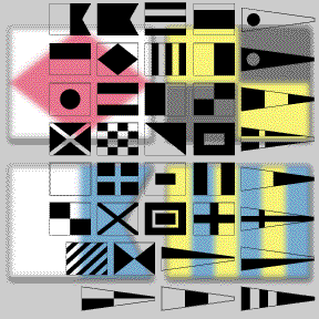
The MARITIME FLAGS fonts are based on the international flag code. Each flag represents a letter or number. These would be flown on board a vessel, not printed. However, the monochrome font can be used to add a decorative or nautical motif. The set includes the single-color font as shown in black on this page; plus separate red, yellow, blue and black fonts. It’s not possible to make a real color TrueType or OpenType font. But you can fake it by layering separate fonts! In a program that allows layering, type your text, then change it to the Black flag… continued
Rudolf Koch designed these nature-inspired images to coordinate with his rough-hewn classic Neuland. I’ve recreated them as a companion to my BRIDE OF THE MONSTER fonts. I’ve included all the available images, flipped and rotated some for easy use, and the original German accented characters–Ä, Ö, Ü–styled to match the “Bride” varieties.
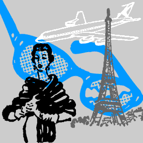
Like my Rebus Font, these images were culled from the parts of a long lost game. 15 stylish images ranging from the gag prize broken eyeglasses to the grand prize trip to Paris. Not recommended for commercial use as the owner of the images, if any, is unknown.
These 16 mysterious dingbats were culled from a small text called Ecce Orienti or Rites and Ceremonies of the Essenes. Published in 1894, this appears to be a ritual manual of a defunct, quasi-Masonic order. The symbols were integrated in the heavily contracted text to make it nearly unreadable to an outsider.