
-Hand-Lettered-
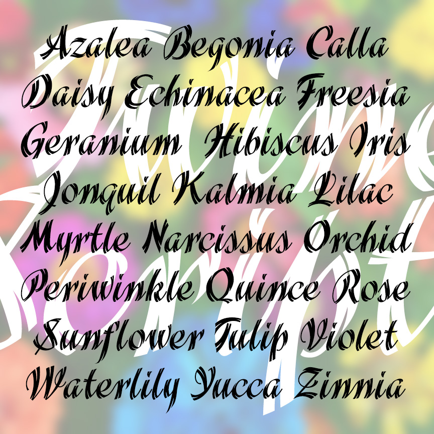

TWINE SCRIPT is a bold and stylish cursive font with a unique feature: “split ends” that give it a light and energetic twinkle! TWINE SCRIPT was inspired by examples in a 1930s Speedball lettering guide by Ross F. George who inspired so many people’s love of lettering.
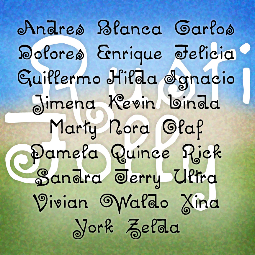
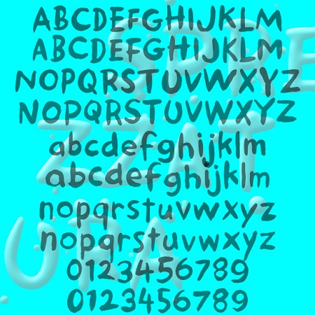
RUSTIC FOLLY is a curious font: eccentric letterforms and a bumpy texture give it the feel of artistic hand lettering. RUSTIC FOLLY was inspired by an early 20th-century typeface called “Chaucer.”

ROYALITY is a fresh and elegant cursive font. With sharp edges and a light weight, ROYALITY feels like beautiful pen-drawn calligraphy you might find on a modern royal invitation. ROYALITY is one of a series of four vertical script fonts, including Scarlet Ribbons, Famous Label and Easter Parade, as seen in the Script Font Identification Guide. It was inspired by an example frkm 1946 and was released in an earlier form as “Roselyn,” named for my mother.
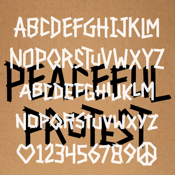
PEACEFUL PROTEST is a bold, impactful font. The straight lines and strong verticals are reminiscent of runes, but were inspired by this poster designed by the Milwaukee-based artist Francisco Ramirez. Using quickly torn masking tape and assembled with urgency, his poster captured both the message and the moment, and has now been acquired by the Whitney Museum of American Art. So grateful he let me make this font! Use this font to say your own message loud and proud. It has LARGE and small caps. You can use all of one or mix and match for a more hand-lettered feel…. continued
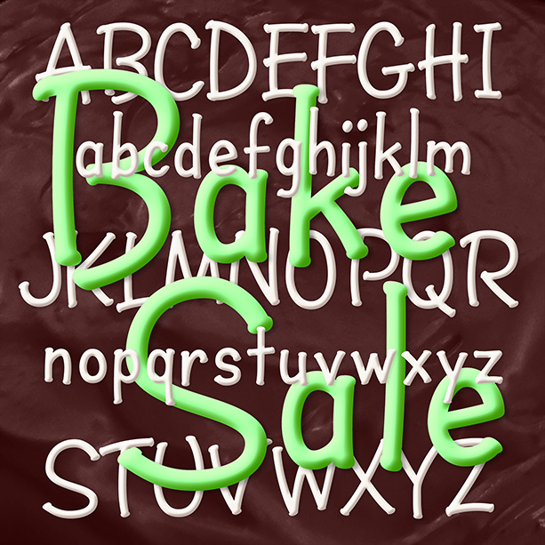
BAKE SALE is a fun font that feels like marker lettering. With the rhythm of handwritten “ball and stick” letters, Bake Sale could suggest a kid’s writing or writing for a kid: simple, direct, and fun. Instead of serifs, Bake Sale has little dots, like you get when you pause with a permanent marker.
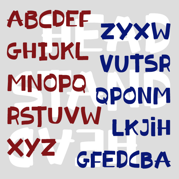
HEADSTAND is a playful font that looks like it was written for kids—boldly and deliberately—with a marker on a dry-erase board. Stroke weights vary in unexpected ways as the letters bounce along the baseline. All caps, but OpenType features replace double letters and numbers with alternate glyphs for a real hand-lettered feel. Headstand was inspired by the logo for Melania Trump’s “Be Best” campaign, reportedly designed by the First Lady herself.
Traftoon is a set of three fonts that look like neat, slightly sloped hand lettering done with a brush and ink. Casual but not child-like, with full upper and lowercase, Traftoon offers an attractive and flexible alternative to many similar fonts such as Balloon and Comic Sans. Traftoon was inspired by Howard Trafton’s Cartoon Light and Cartoon Bold of 1936. My friend Vista Bill got me started on this. Cartoon Bold exists in digital form under various names. The Light had not been previously digitized and neither included lowercase originally. In creating these, I maintained the quirks of the originals… continued
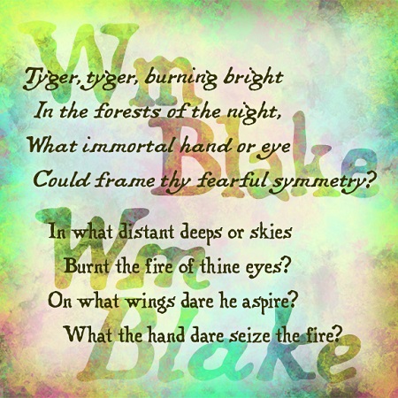
The Wm Blake fonts were inspired by the work of the great English poet and artist. William Blake (1757-1827) wrote, illustrated, lettered, printed, and hand-colored his “Songs of Innocence” and “Songs of Experience”, inventing a new form of printmaking along the way, all very inspirational to me as a printmaker and font designer. These fonts maintain the romantic charm of Blake’s original hand lettering—quite different from typeset—in both roman and italic forms as he used.
BIRDWHISTLE is a handwriting font with an artistic flair. Inspired by notes from the artist Willie Marlowe, Birdwhistle is like its namesake: pretty, playful, distinctive and a little unpredictable. Birdwhistle mixes upper- and lowercase in a creative way, and includes alternate characters for an even more spontaneous look. Willie is a dear friend, longtime colleague, and marvelous artist with an international reputation; please check out her paintings. Using 25 years of her notes and letters to me, I made Birdwhistle, striving to keep some of the whimsy and spontaneity of the original. Here is a sample of her handwriting.
SPREZZATURA is a fun, casual font with the whimsy of a love note and the boldness of a protest sign. Sprezzatura looks like brush and ink lettering because that’s how it started. The OpenType font also makes use stylistic alternates and ligatures for a totally hand-lettered effect. Available with and without the spatters.