
-Hand-Lettered-
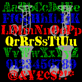

JJ STENCIL was inspired by the work of the great American Pop artist Jasper Johns. Perhaps best known for his flag and target series, Johns has also used the “found” look of stencils in many drawings and paintings, including “0-9” at left. My fonts were not made directly from Johns’ work, but from scans of my own similar stencil scratchings. There are four complete fonts, each with a different treatment of the letters. The fonts are designed to be mixed or layered or both. JJ STENCIL 3.0 now includes upper and lowercase. I finally found an appropriate lowercase stencil and… continued
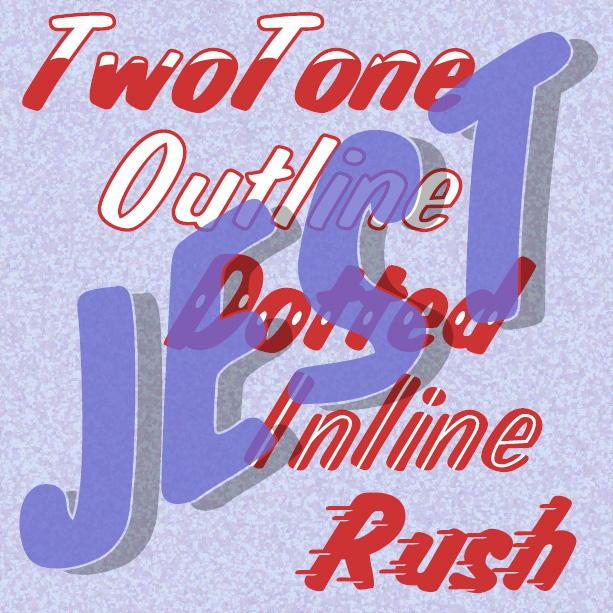
JEST is bold and gestural, as if painted with a brush by a skilled signpainter. It was inspired by a “lost” analog font, Jet, available in the 1970s as dry-transfer lettering. The original had a white inline; in recreating the font I added Solid, Dotted, TwoTone, and Shadow varieties. And now the newest member of the family, Jest Rush, uses another signpainter’s trick to suggest urgency.
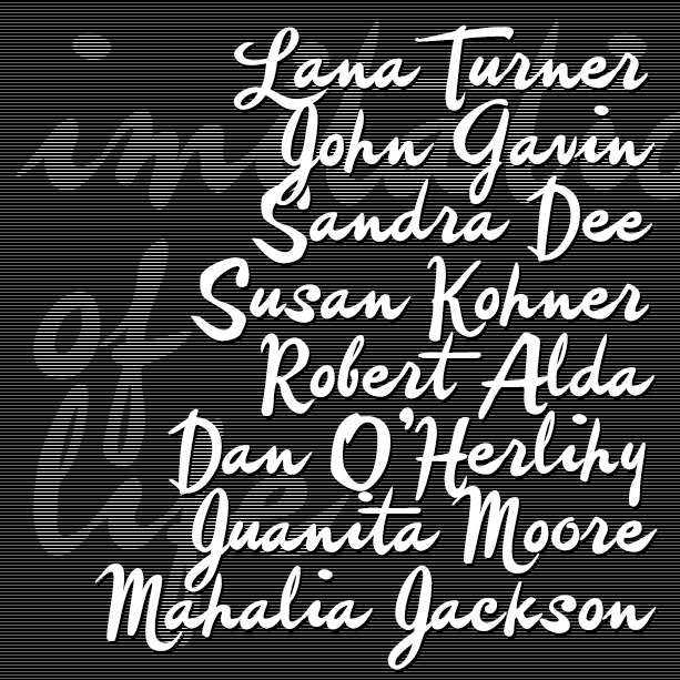
IMITATION is a free-spirited brush script, more a fashion statement than the work of a diligent signpainter. Imitation was inspired by the credits of two soapy Lana Turner films, Imitation of Life (1959) and Madame X (1963). They are credited to different art directors so I don’t know who originated the style. IMITATION includes many alternate characters so you can do an all-lowercase look that looks more hand-lettered, or choose from two sets of caps. VERSION 4.0 uses Opentype features to make these useful alternates easier to use, as well as an expanded character set and improved spacing and kerning…. continued
HONEYMOON is a retro, backhand script with a hand-written feel. It was inspired by the classic logo of the Holiday Inn hotel chain. Uniform weight, almost completely linking. Italicized it becomes a vertical script. Includes upper and lowercase, numbers, punctuation, and international characters.
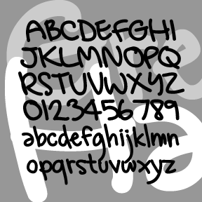
GREG’S HAND was developed in collaboration with artist GREG SMITH. Greg did the original lettering in Illustrator and then I made the font, adding and adjusting as needed. Looks like it was written with a Sharpie. Includes caps, lower case, numbers, punctuation, and international characters.
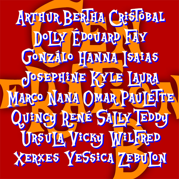
Playful and offbeat GENERATION B has a late 50s-early 60s vibe that goes from beatnik coffeehouse to rustic beach shack and beyond. It’s basically an all-caps font, with big and small versions of each letter plus some alternates, easily giving you the look of quirky hand-lettering. Inspired by the animated opening titles of the classic live-action Disney film, The Parent Trap (1961), designed by T. Hee, Bill Justice and Xavier Atencio. With its irregular alignment, letter shapes and pairs, this kind of lettering could be seen as a descendant of naïve sign painting or of the deliberate nonconformity of Beat… continued
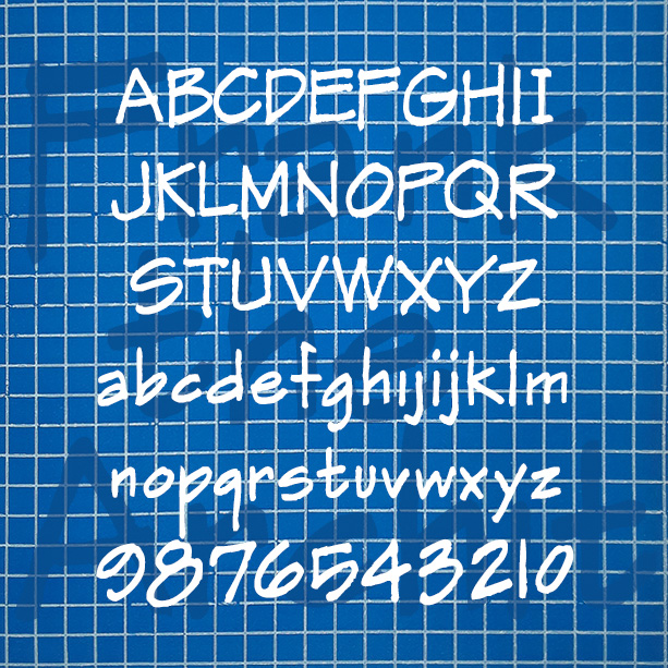
FRANK THE ARCHITECT was inspired the hand lettering in Frank Ching’s classic book Architectural Graphics (1975) that influenced so many draftspeople. In these fonts I’ve tried to evoke the idiosyncrasies of Ching’s beautiful original, including the texture. Version 1.5 combines the separate regular and alternate fonts into single fonts that use the stylistic alternates function of Opentype. Version 1.5 also features and expanded character set and improved spacing and kerning. More information I started this font years ago, then set it aside, releasing only the Markerman variant. Then I really needed a convincing “architect’s hand” font for a design project… continued
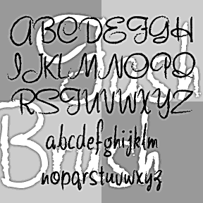
FASHION SCRIPTS are fraternal twins. The letterforms of each were inspired by an example of 1940s department store lettering. FASHION BRUSH has a rough, art brush texture; FASHION MARKER has the smooth line of a Sharpie®. The inspiration was this example of wood type formerly used by Thalheimers department stores. From examples in the collection of Virginia Commonwealth University, Richmond, VA. According to their information, “The type follows handlettering styles of the 1940s and is unique compared to 20th-century script typefaces in metal.” My Pen Script Monograms were also inspired by this wood type. Each font includes upper and lowercase,… continued

DYNAMOTOR is my hand-drawn take-off of the classic font Dynamo. Dynamotor has the texture of diagonal crayon strokes which complements the bold, active letterforms. Looks great reversed for a chalk or scratchboard look. Dynamo was designed by K. Sommer and first released in 1930. Its distinctive “fins” give it a touch of machine-age deco. Dynamo is available from many sources online; Dynamotor is NOT a Dynamo font. Includes uppercase, numbers, punctuation, and international characters. Dynamotor was inspired by this book cover, designer unknown, found on the delightful blog Awful Library Books.
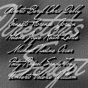
DIRECTORS SCRIPT was inspired by the sort of dramatic hand-drawn script used in 1940s film credits. As seen in classics like Crossfire, Laura, and Gilda, a very sloped cursive (about 45 degrees) is paired with a heavy roman. To approximate the style at left (from Crossfire), you could use Directors Script paired with my National Debt, Impact or similar. Add a drop shadow, and voilà. A second font has capitals that are 50% larger than the regular caps, re-weighted and aligned to harmonize with the lowercase for an even more dramatic look. Includes upper and lower case, numbers, punctuation, and… continued