
-Hand-Lettered-
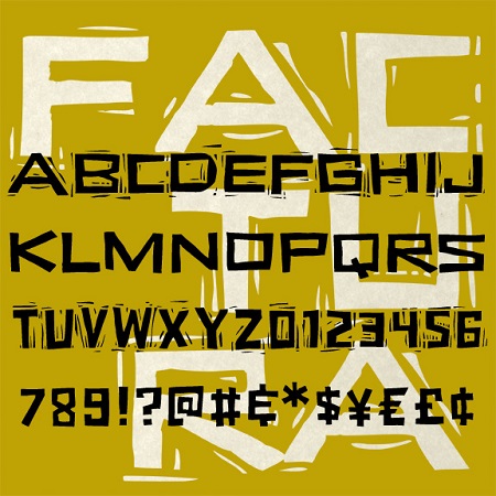

Factura is a set of fonts that looks hand-carved. The letters are drawn almost entirely with straight lines, with offbeat shapes and jagged edges that can seem alternately playful or sinister. Inspired by Saul Bass’s classic poster for “Vertigo,” Factura has two widths and full upper- and lowercase. The “Rough” version of each font reproduces the block print technique I used in the design process.
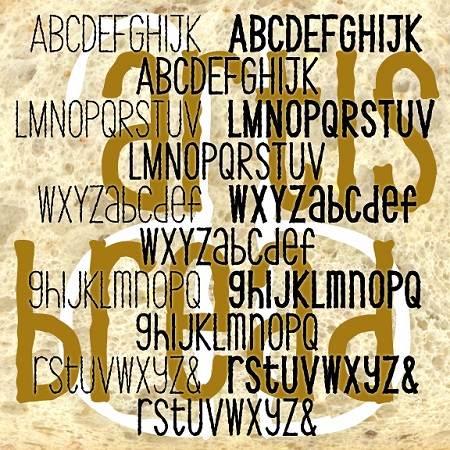
ARTISAN BREAD is a set of three fonts with the feel of earnest, informal hand-craftsmanship. Each combines an “organic” texture with a whimsical approach to letter shapes and case. Available in 3 weights, Thin, Thick and Regular.
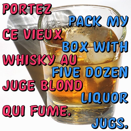
AFFICHE is a set of fonts that resemble hand-painted signs, somewhat casual but with a distinctive and professional style. The direct inspiration for AFFICHE is the hand-lettered titles of François Truffaut’s classic 1959 New Wave film “Les Quatre Cents Coups” (The 400 Blows). I love the squarish shape of the Q and O and the slight incline. There is no lower case; use small caps as they did in the film. These fonts contain an extended character set to accommodate most all the languages of Europe that use the Latin, Greek and Cyrillic alphabets. Available in Regular, Light and 3-D.
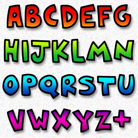
POPSTREET is a pair of fonts inspired by the work of Keith Haring (1958-1990) an artist whose work referenced both Pop and street art. Haring first became known for his graffiti-style drawings done in the subway, but was also respected for his gallery work and public art, his accessible, affordable design, and his social activism. The set includes an Outline and a Fill font that can be used separately or layered together in different colors.
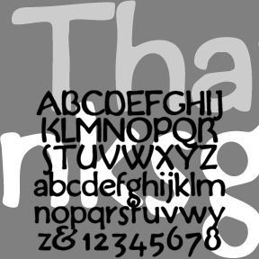
THANKSGIVING was inspired by this handlettered “Buzza-type” motto (left). Grandma would have had a couple of these homilies tacked up in little frames. My partner, Al, collects them and I became interested in the lettering on this one in particular. The feel is of handlettering in imitation of print, rather than the other way around. Includes upper and lowercase, numbers, punctuation, and international characters.
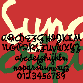
SYNCOPATED SCRIPT was loosely inspired by the work of the painter Stuart Davis. His jazzy canvases bridge Cubism and Pop Art, often featuring words, written in this style and others. Davis’s work always seems fresh and inventive to me. After looking at all the reproductions of Davis’s paintings I could find, I used some of his writings and my own intuition to fill out the alphabet. I’ve tried to maintain both the erratic, jumpy quality and the continuous linking. The originals were painted; these feel as if they were cut out of paper. Includes caps, lowercase, punctuation, numbers, several alternates… continued
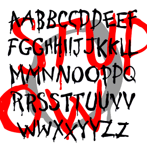
STUPID COW is a rustic font that looks hand painted. It suggests weak sign-painting skills rather than ignorance, as backward letters do. In the right context, the drips might suggest horror, but this a basically a fun font with an urge to communicate, albeit crudely. There are variants of each letter; TyPiNg LiKe ThIs produces a fine, random effect. Includes uppercase with alternates, punctuation, numbers, and international characters.
RUDLAND HAND is a calligraphic font, inspired by the work of the British artist and designer Peter Rudland. As explained in his book From Scribble to Script (John De Graff, 1956) Rudland was an advocate of this style of script–italic hand–as a way to improve one’s handwriting. So although it may seem like ornamental calligraphy, Rudland intended that ordinary people would develop this beautiful, flowing, pen lettering. You could use the font as a resource for practicing your own script or, if your handwriting is as hopeless as mine, a convenient substitute. I’ve created two fonts, one with the fancier… continued
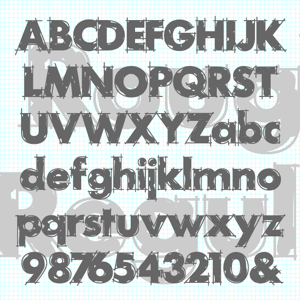
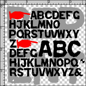
ROUGH DRAFT is designed to look like unfinished lettering; it seems like the outlines need to be cleaned up and the inking completed. A classic geometric sans serif with the hand-drawn elegance of a technical drawing. The Regular font has outlines loosely filled in. Other component fonts in the set—Outlines, Loose Fill, Solid Fill, and Solid—can be used separately or layered in different colors. Suggested in part by “Layout Gothic” in Dan X. Solo’s “100 Grunge Alphabets,” and by Greg Smith. Version 2.0 now has lowercase, an expanded character set, improved spacing and kerning.
REPENT was inspired by the work of Jesse Howard (1885-1983), a folk/outsider/naive artist. I first saw his work in Self-Taught Artists of the 20th Century, published as an exhibition catalog by the Museum of American Folk Art. What is striking to me about Howard’s work is the intense effort contained in his paintings-as-rants, and the overall texture of their deliberate lettering. Howard’s work can be seen in the collection of the Kansas City (MO) Art Institute. Jesse Howard’s obsessively lettered paintings and sculptures are the cousins of these signs (left) which appear from time to time nailed to telephone poles… continued