
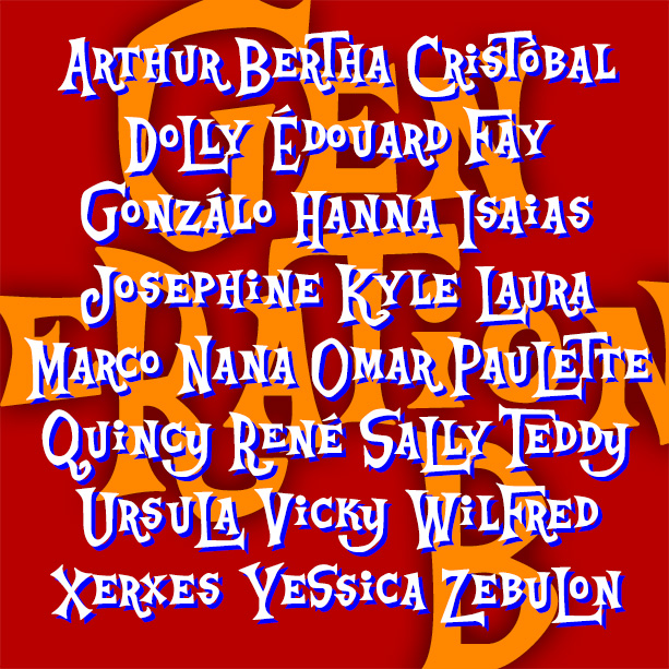

Playful and offbeat GENERATION B has a late 50s-early 60s vibe that goes from beatnik coffeehouse to rustic beach shack and beyond. It’s basically an all-caps font, with big and small versions of each letter plus some alternates, easily giving you the look of quirky hand-lettering.
Inspired by the animated opening titles of the classic live-action Disney film, The Parent Trap (1961), designed by T. Hee, Bill Justice and Xavier Atencio.
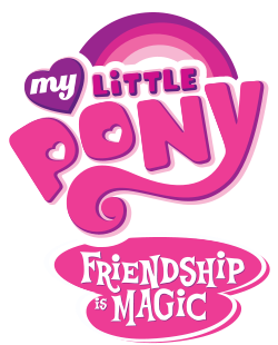
With its irregular alignment, letter shapes and pairs, this kind of lettering could be seen as a descendant of naïve sign painting or of the deliberate nonconformity of Beat sensibility. As often happens so often in design, the eccentric is co-opted into a mainstream style. For a few years, Generation B was used on My Little Pony merch and beloved by the bronies, eventually leading to a fan-made knock-off, so the Ouroboros nature of design is unending.
Version 1.5 makes great use of Opentype features to produce a better approximation of hand lettering, as well as an expanded character set and improved spacing and kerning.