
-Suitable For Text-
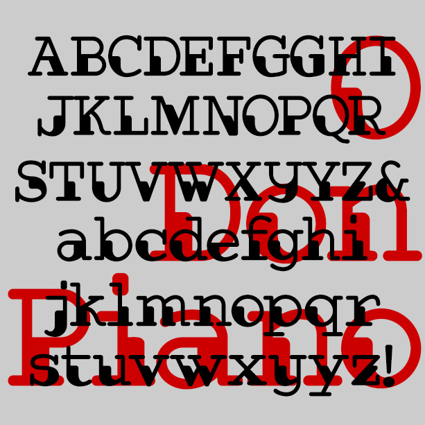

Don Piano is an unusual font that combines the look of two 20th-century technologies—punch cards and typewriters. Its dark shapes and lighter strokes give an interesting syncopation to the words, almost musical. Available in Regular, with proportional spacing, and Monospaced. Don Piano was inspired by a sketch in a lettering book from 1954 with this caption: “The authors were at a loss to give this alphabet a name except that it is different. It was made with a ball-point pen.” The name comes from this famous talking cat video that always makes me smile.
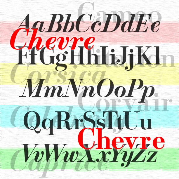
Stylish and graceful, the Chevre fonts are my digital interpretation of roman and italic fonts designed by Mortimer Leach for use by Chevrolet in print ads about 1957–1960. Leach borrowed aspects of Bodoni, Century Schoolbook, and Century Expanded to make his new creation and documented its development in his 1960 book “Letter Design in the Graphic Arts.” The beautiful italics, including a condensed version, seem to have found greater use at the time, particularly in magazine ads. I chose not to make condensed italics as Leach did, but did make bold versions to round out the set. Thanks, John, for… continued
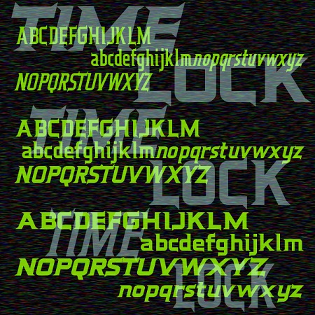
Time Lock is a 6-font family with a retro-futuristic feel. Sleek and streamlined, with distinctive triangular serifs strategically placed like fins. In three weights with matching oblique fonts for even better aerodynamics. Time Lock was inspired by the trailer for the film “The Time Machine,” 1960, very different from the poster or the main titles. Here is the full trailer, you can see I’ve expanded the design to include lowercase.
Traftoon is a set of three fonts that look like neat, slightly sloped hand lettering done with a brush and ink. Casual but not child-like, with full upper and lowercase, Traftoon offers an attractive and flexible alternative to many similar fonts such as Balloon and Comic Sans. Traftoon was inspired by Howard Trafton’s Cartoon Light and Cartoon Bold of 1936. My friend Vista Bill got me started on this. Cartoon Bold exists in digital form under various names. The Light had not been previously digitized and neither included lowercase originally. In creating these, I maintained the quirks of the originals… continued
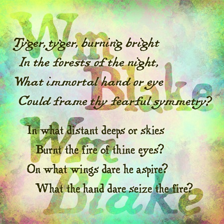
The Wm Blake fonts were inspired by the work of the great English poet and artist. William Blake (1757-1827) wrote, illustrated, lettered, printed, and hand-colored his “Songs of Innocence” and “Songs of Experience”, inventing a new form of printmaking along the way, all very inspirational to me as a printmaker and font designer. These fonts maintain the romantic charm of Blake’s original hand lettering—quite different from typeset—in both roman and italic forms as he used.
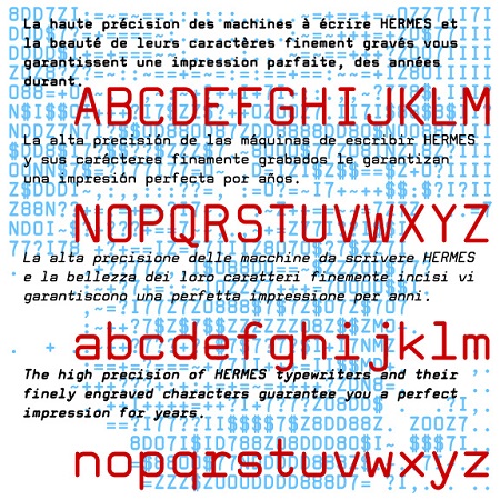
Tech Elite is a square sans-serif monospaced font, a stylish alternative to Courier or other typewriter-style fonts. Tech Elite was inspired by one of the styles offered on the classic, collectible Hermes 3000 Swiss-made typewriter. This is completely redrawn; I did not want it to have the uneven texture of vintage typing. I’ve expanded its usefulness with Bold, Oblique and Bold Oblique variations. A friend of mine had a similar typewriter in high school and it was so cool. You see, kids, back in the typewriter days, you were basically stuck with one size and one font, so a document… continued

HANGOVER SQUARE is a set of 3 fonts with an early-1960s style. They were inspired by the handlettered titles of the 1964 mad-ventriloquist thriller Devil Doll, set in London as it was beginning to swing. The Regular font is a smooth sans serif with offbeat details. Hangover Square Stones has the same distinctive letterforms, with a rocky edge suggestive of horror or decay. Hangover Square Sticks is a condensed version, composed of rough vertical lines with a hand-drawn feel. Each font lends itself to all-caps or mixed-case usage.
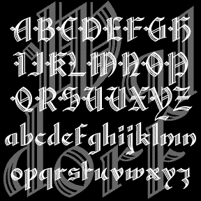
WALDORF TEXT is my digital revival of a classic “lost” font of the same name. An elegant blackletter font with details that spell luxury. Waldorf Text was produced by Barnhart Brothers and Spindler Type Foundry in 1914. When American Type Founders acquired BBB&S, they continued to produce it, including it in their 1934 and 1941 catalogs. And then it was gone, never making the transition from type to film or digital. (Thanks, Bill, for all your help!) I’ve completely redrawn the font, maintaining the graceful lines while expanding the font and making other slight changes for modern use. There are… continued
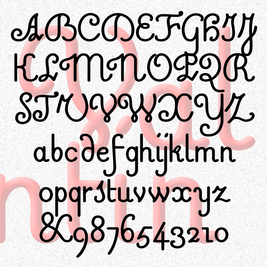
VALENTIN is a sweet and simple cursive font. A mix of friendly and formal, Valentin’s vertical letterforms are in the French style. Valentin was inspired by 18th-century experiments in raised-letter printing for the blind. Designed by Valentin Haüy, this style is beautiful on the page and could be read by both blind and untrained sighted readers. Later designers would create more simplified raised-letter designs, eventually leading to the dot grid of the Braille system. VALENTIN 1.5 has an expanded character set and improved spacing and kerning. More legible versions of a few characters have been substituted and the originals moved… continued
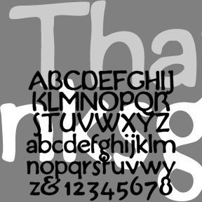
THANKSGIVING was inspired by this handlettered “Buzza-type” motto (left). Grandma would have had a couple of these homilies tacked up in little frames. My partner, Al, collects them and I became interested in the lettering on this one in particular. The feel is of handlettering in imitation of print, rather than the other way around. Includes upper and lowercase, numbers, punctuation, and international characters.