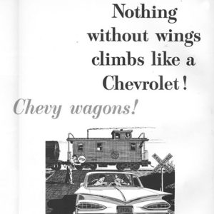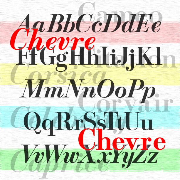

Stylish and graceful, the Chevre fonts are my digital interpretation of roman and italic fonts designed by Mortimer Leach for use by Chevrolet in print ads about 1957–1960. Leach borrowed aspects of Bodoni, Century Schoolbook, and Century Expanded to make his new creation and documented its development in his 1960 book “Letter Design in the Graphic Arts.” The beautiful italics, including a condensed version, seem to have found greater use at the time, particularly in magazine ads. I chose not to make condensed italics as Leach did, but did make bold versions to round out the set.
Thanks, John, for getting me started on this.