
-Fusion-
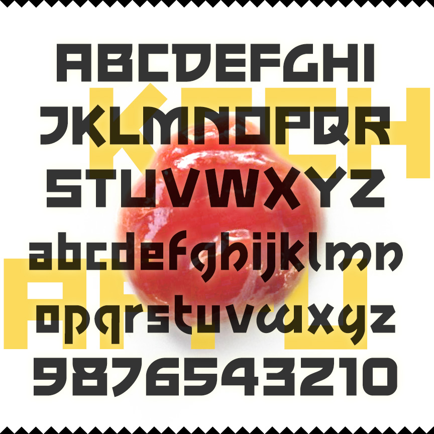

KECHAPPU is a bold font with squarish letters, monoweight strokes, and some unusual features that compare to modern Asian typographic styles. The fusion of East and West produces tasty results. For example, ketchup, that all-American food, began as a Malay (or maybe Chinese) sauce and word; kechappu is the Japanese translation. Kechappu was inspired by the print advertising for the 1959 film noir, The Crimson Kimono.
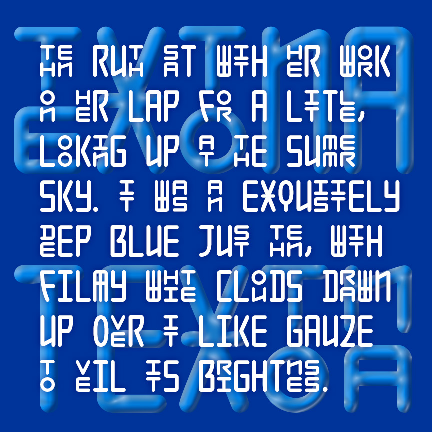

TEXTONA has a unique mix of large and small, stacking letters in a sleek geometric style. Using the Discretionary Ligatures feature of Opentype, composed pairs of stacking letters are automatically substituted, creating a rich and engaging texture as in the example above. Full details for using this unique pair of fonts are given in a separate file. An earlier version of this font was released as Seoul; Hangul, the fascinating and beautiful Korean alphabet, was one of my inspirations.
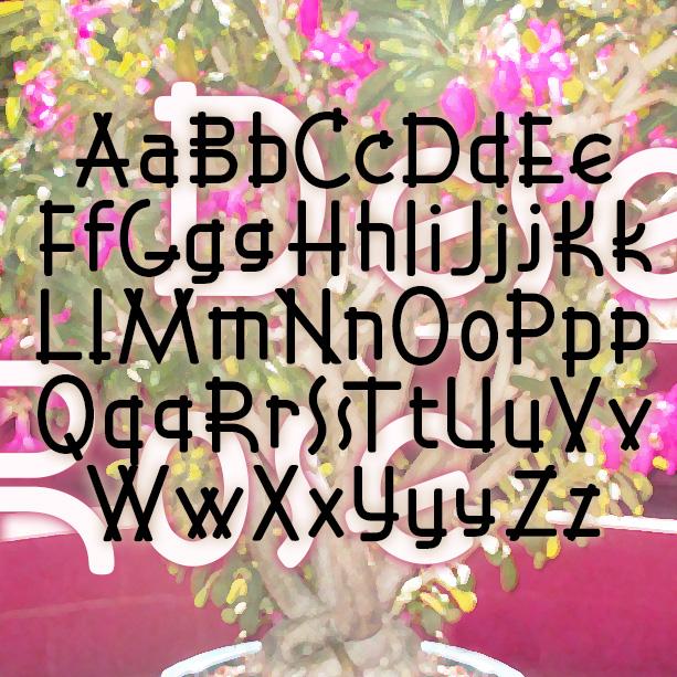
DESERT ROSE is sleek and stylish with letterforms composed of graceful repeating elements. Deceptively simple and elegant, DESERT ROSE was inspired by an example of hand-lettering included in Alphabets: Ancient & Modern, compiled by J. B. Russell (Padell, 1946).
Minaret is a bold display font with a rather exotic feel. Instead of mimicking foreign text, Minaret’s swirled tops suggest the rooftops of far-off lands. Or maybe it looks like whipped cream and icing! Minaret was inspired by examples of hand-lettering from 1922.
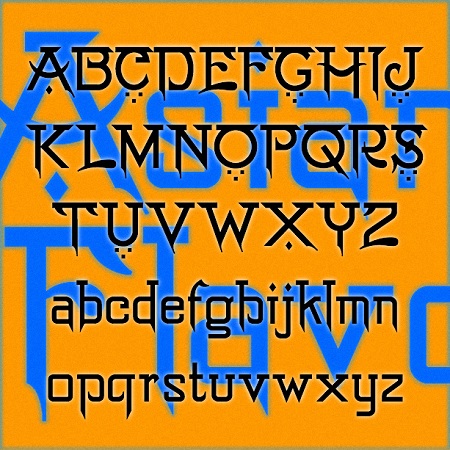
Asian Flavor is a pan-Asian pastiche. Borrowing from multiple Asian scripts—dots from the Middle East, bars from South Asia, strokes from the Far East—this font attempts to suggest Asian languages while still writing in the Latin alphabet. About as authentically “Asian” as my homemade lettuce wraps with some ginger, rice vinegar, soy sauce and sesame oil: tasty and accessible but not really Asian. Asian Flavor was inspired by this vintage hand-lettered sign at the American Museum of Natural History in New York City.
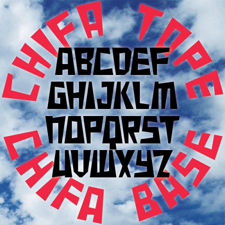
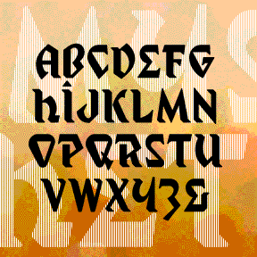
Chifa is a set of fonts combining the trapezoid of Inca architecture with wedge-shaped strokes. Chifa Base has the wide side at the base and Chifa Tope has the weight at the top, making them well-suited for arranging text in a circle. Chifa Combo combines both styles in a single, easy-to-use font; if you TyPe LiKe ThIs—that is, alternating caps and lowercase—the letters automatically fit together. In Peru, I saw several examples of lettering that used the trapezoid, such as this monument in Cusco seen below that also incorporates a trapezoidal aperture like those at Machu Picchu and elsewhere. “Chifa”… continued
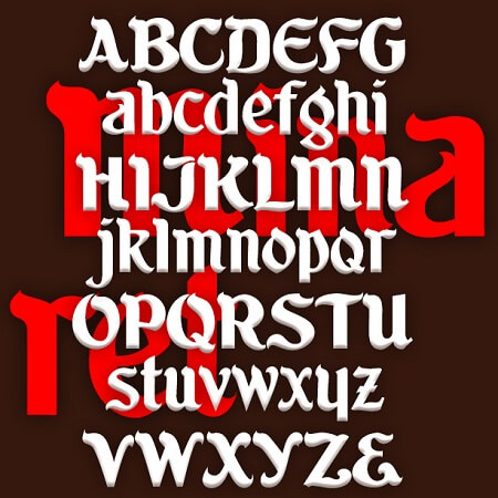
RUBAIYAT is based on this wonderful hand-lettered fruit-crate label with an exotic “Eastern” feel. I redrew the 7 letters, then invented the missing ones and other characters. I also created a set of six fonts–Engraved, Inline, Solid, Thin, Outline, and Shadow–that can be used together or separately.
BEERWOLF is a font of transformation, a blackletter that’s in the process of becoming something more dangerous. The wedge-shaped strokes resemble flames, wolf’s teeth and ears giving this blackletter font a curious difference. The Beerwolf is a creature of German folktales like the werewolf; you have been warned!
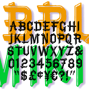
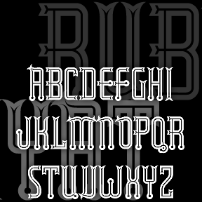
BRUCE MIKITA is my digital version of an analog font of the same name. It has a rustic, hand-crafted feel and suggests East Asian calligraphy. The highlight is a distinctive feature; I’ve also made an un-highlighted version, which Dan X. Solo identifies as “Lantern.” At long last, its origin has been revealed to me by Herman: “Since you ask, there is no Bruce Mikita. The type you digitized was issued by George Bruce’s Son & Co’s New-York Type-Foundry. It was patented 12 Feb 1867. It was called by them Ornamented no. 1048. When Phoenix typefounders got some mats they invented… continued
Exotic, “Egyptian” MYSTIC PROPHET is my third font inspired by Ouija boards, or, strictly speaking, talking boards. (This one is from another company, Haskelite, from the 1940s.) My friend Wink first brought it to my attention. The planchette (the divining tool) is shown here; you can find much more information at the Museum of Talking Boards. My other talking board fonts are Captain Howdy and Sideshow. Includes caps, numbers, punctuation, and international characters. Planchette image courtesy of the Museum of Talking Boards.