
-Historic-


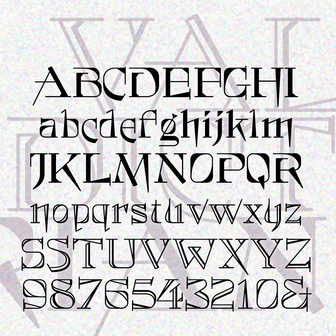
ARRIACA is a bold and exotic display font inspired by a 1940s lettering guide. This makes me think of Spanish “mudéjar” design, with some middle eastern flavor and the feel of wrought iron. Or maybe the points suggest spurs for a Western theme, or spikes for a metal application.
VALEDICTORIAN is both quirky and formal. The unusual letterforms give it a modern touch, while also conveying elegance and tradition. Two varieties, solid and shaded. VALEDICTORIAN was inspired by a typeface called Vassar that appeared in the 1889 catalog from Farmer, Little & Co.
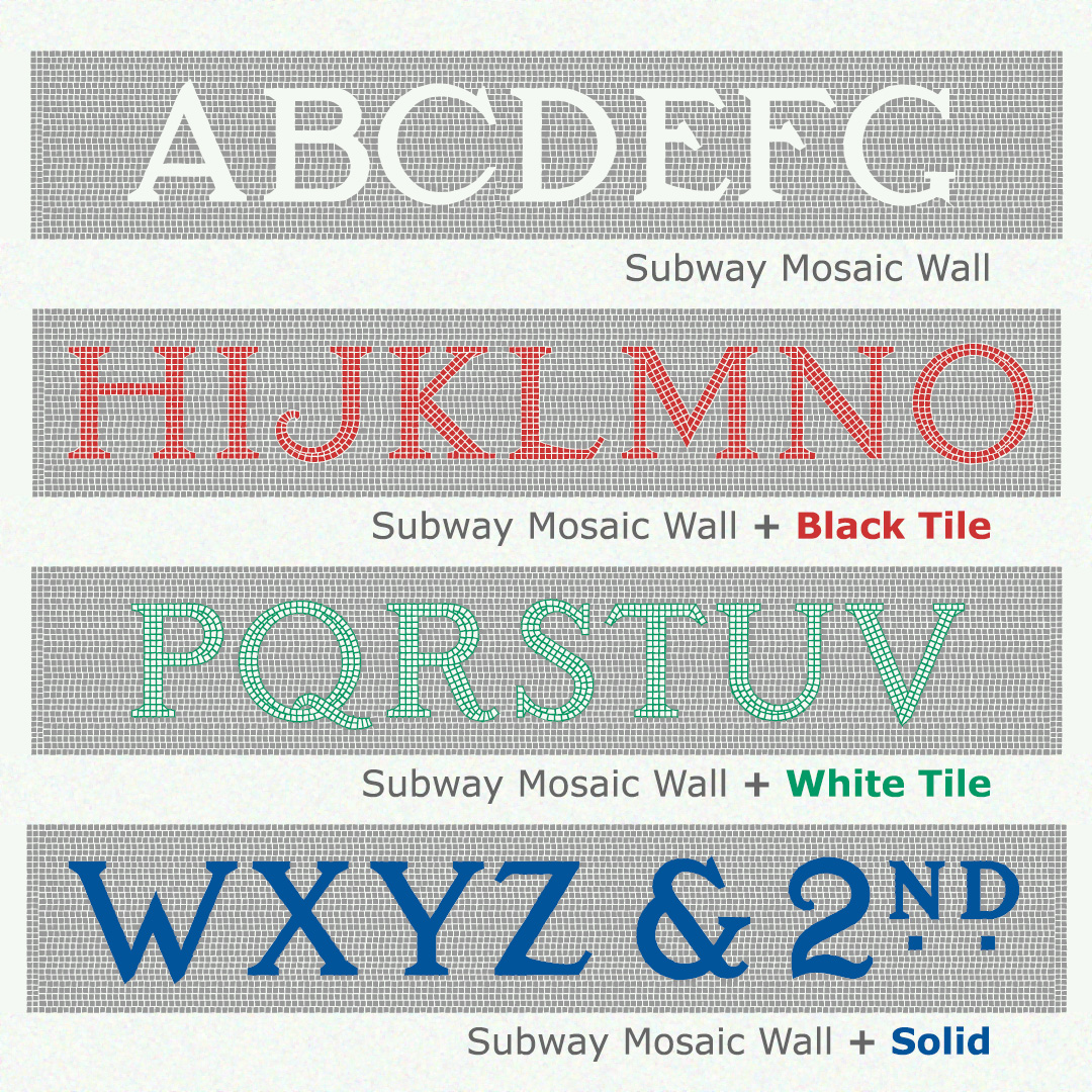
Like the originals, the fonts of SUBWAY MOSAIC WALL were inspired by the classic NYC subway signs. This version includes the mosaic background around each letter. Black Tile, White Tile, and Solid fonts can be layered in other colors for a realistic mosaic look. If you don’t want the mosaic background, use the original Subway Mosaic fonts which employ kerning.
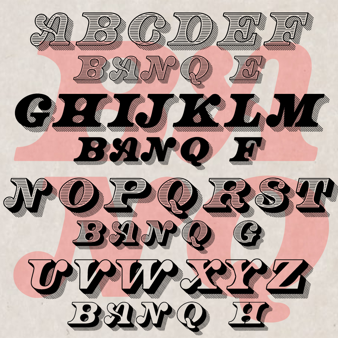
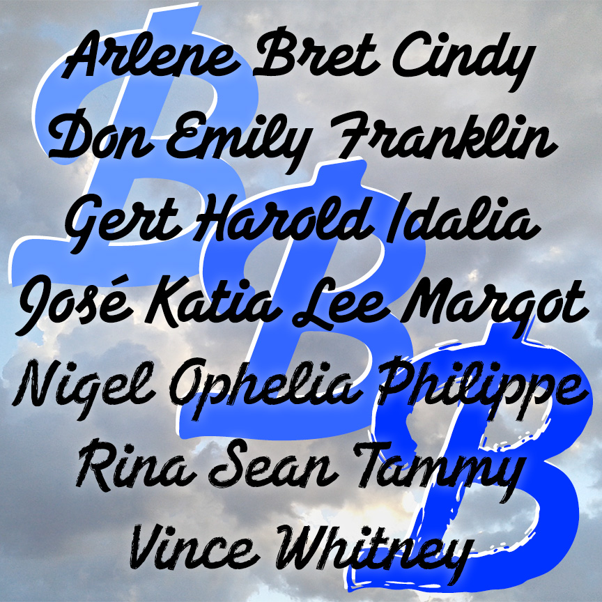
BANQ is big bold italic capitals. With the feel of Gilded Age banknotes and certificates, BANQ announces itself with big ball terminals and graceful swashes. The full set of 8 fonts includes solid and shaded, three-dimensional and shadowed versions. BANQ was inspired by two fonts: Bob Gill’s hand-lettered Cheque as seen in “New Alphabets A to Z” by Herbert Spencer & Colin Forbes from 1973 and another, more mechanical font also called Cheque from Dan X. Solo’s collection. My fonts are completely reimagined and redrawn, harkening back to the letterpress examples that no doubt informed both Cheques. Thanks to Jeff… continued
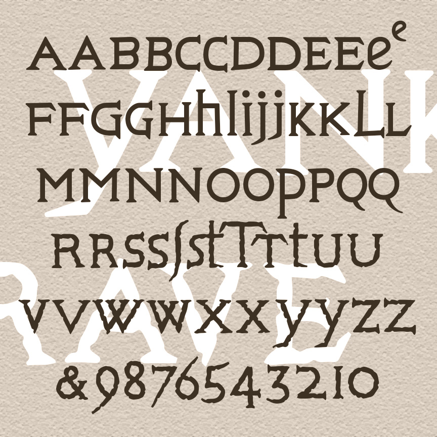
YANKEE GRAVE is rustic and quirky, with potential effects ranging from historic to horrific. YANKEE GRAVE was inspired by the engraved inscriptions on a number of gravestones in northern Connecticut, circa 1700. The carver used a mix of upper- and lowercase forms; each letter in my fonts has at least two forms as shown for a more hand-carved look. And there are other old-time goodies to give your work 300-year-old style. The Regular font has smooth outlines, the Rough has extra texture.
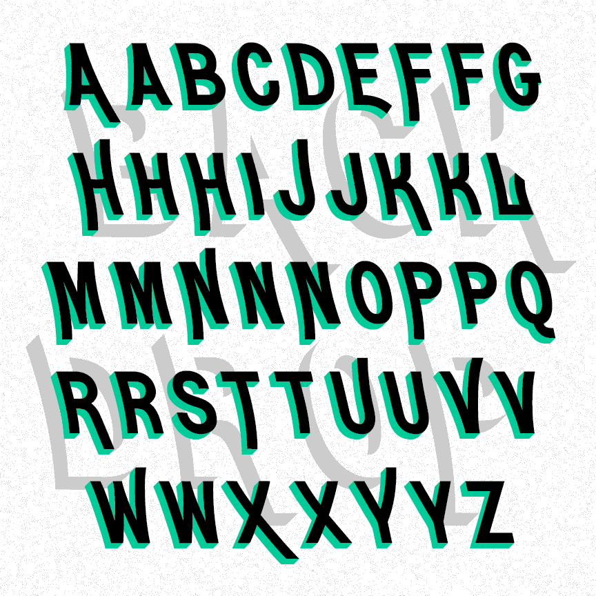
BACKDROP is a pair of fonts with dimension. The graceful caps of the Regular font lean back. The Shadow font suggests 3-dimensional letters. Use them separately or layered together in different colors or patterns. Inspired by a pair of analog fonts, Erebus and Hades, from the 1892 Central & Boston Type Catalog.
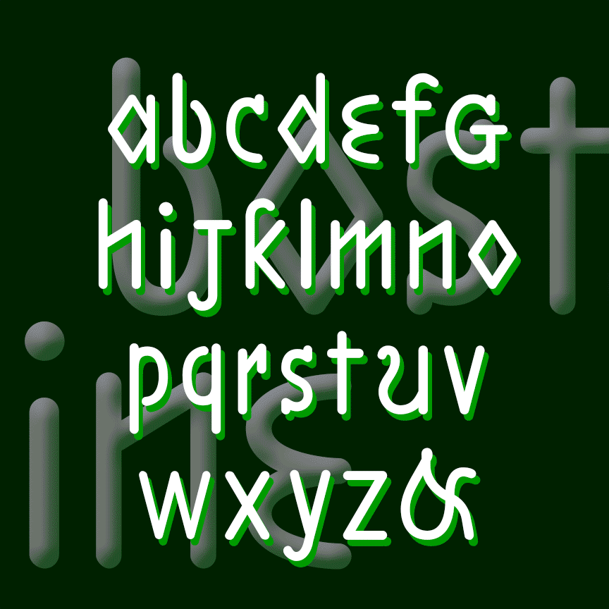
BREEZEBLOCK is a bold cursive font with the feel of hand-painted sign lettering. The Regular font has sharp corners; the Rounded and Brush varieties offer softer corners and edges. BREEZEBLOCK was inspired by film trailer lettering of the 1930s.
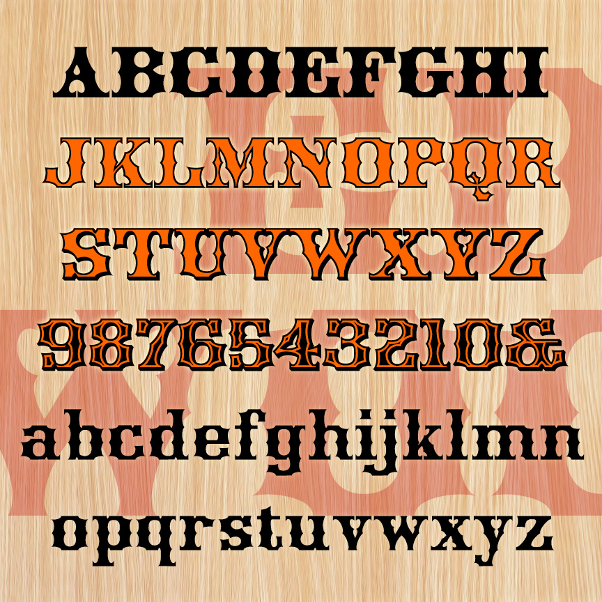
EDGEWOOD is a bold and fancy woodtype style font. It has unique concave styling and more spurs than a rodeo. EDGEWOOD was inspired by 19th-century examples with some characters revised for modern reading. The set of 4 fonts includes Regular, Outline, Shadow, and Ultra varieties (rows 1-4) that can be mixed and layered to capture the ornate design sensibility of the period, with full lowercase and character set throughout.
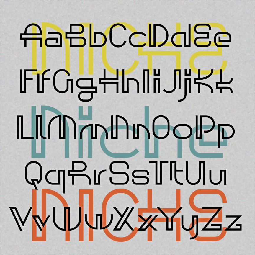

NICHE has the playful and decorative geometry of mid-century modern design. Used sparingly, these letters give add a dash of retro-future style. Inspired by a caps-only design in Ben & Ed C. Hunt’s 100 Alphabets from 1954. Version 1.5 has an expanded character set and improved spacing and kerning.
BOSTON LINE and PHILADELPHIA LINE fonts each have an unusual sanserif design, quirky letterforms, and rounded mechanical strokes that suggest template lettering or machine-readable fonts. Boston is lowercase only, Philadelphia is a bit more conventional including upper and lowercase. These were inspired by 2 different 19th-century educators’ attempts to make a raised-letter alphabet for the blind. Eventually, the dot grid of Braille would prove easier to use, but Samuel Gridley Howe’s legacy lives on at Boston’s Perkins School, as does Julius Friedlander’s at Philadelphia’s Overbrook School. Version 1.5 has an expanded character set and improved spacing and kerning. In the… continued