-Revivals-
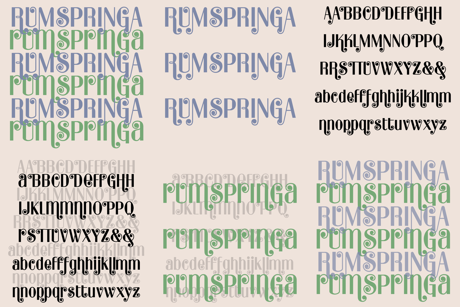
RUMSPRINGA is a bright and cheerful Modern font with energy and versatility. Contrasting thin and thick strokes are combined with bouncy ball terminals for a musical feel. And there are lots of alternate characters so you can determine how much bounce you want and discretionary ligatures to add variety automatically. RUMPRINGA PRIME is an alternate version of the font with some uppercase letters taking on lowercase forms, as seen in the bottom row, a popular mid-century typographic trope. RUMSPRINGA was inspired by an analog font of the 1960s called Spring.
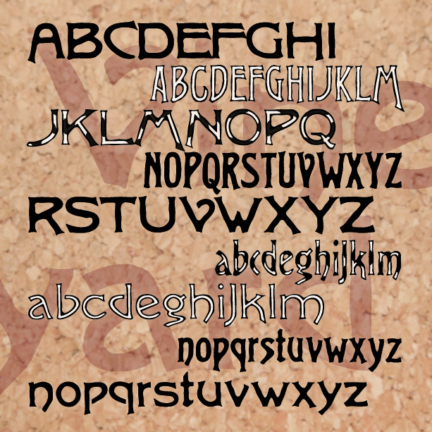
VINEYARD is a pairing of fonts with a rich, woody character. Featuring notes of bark and an earthy finish, Vineyard can be served at most any occasion. The Solid fonts can be used separately or, in a contrasting color, as a fill for the Regulars. And now there’s a third variety, Graft, a dynamic blend of outline and solid. Vineyard was inspired by two early 20th-century analog fonts from American Type Founders, Virile and Erratic Outline. I’ve married the two designs, expanding and refining them. At one time I offered my version of Virile; it has since been revised, and… continued
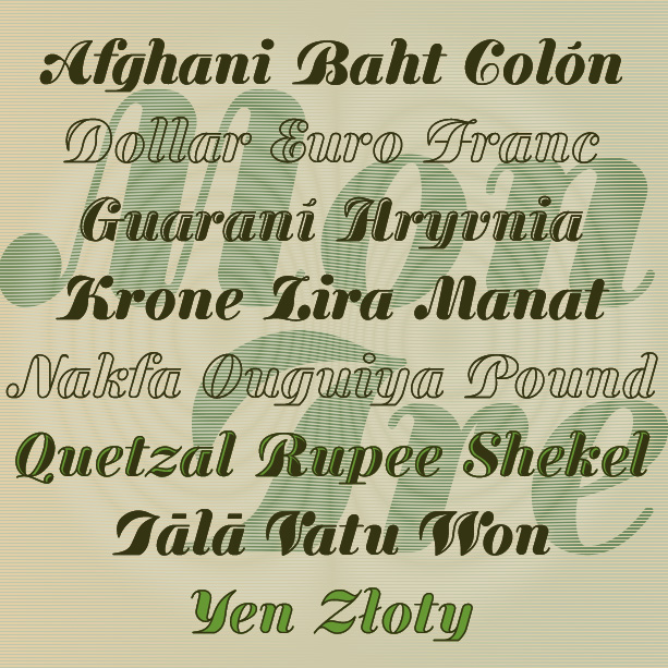
MONEY TREE is a bold and graceful font that mixes formality with forward motion. Inspired by “Currency,” an early 20th-century type by A. D. Farmer foundry, I’ve slightly modernized and expanded the letterforms, and created Outline and Hilite varieties.
VINEYARD is a pair of fonts with a rich, woody character. Featuring notes of bark and an earthy finish, Vineyard can be served at most any occasion. The Solid fonts can be used separately or, in a contrasting color, as a fill for the Regulars. Vineyard was inspired by two early 20th-century analog fonts from American Type Founders, Virile and Erratic Outline. I’ve married the two designs, expanding and refining them. At one time I offered my version of Virile; it has since been revised, and expanded, and renamed to become Vineyard.
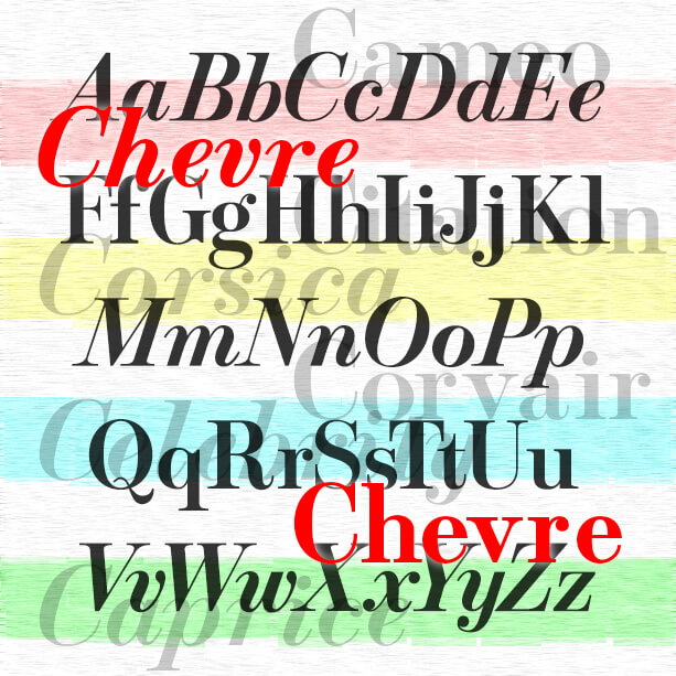
Stylish and graceful, the Chevre fonts are my digital interpretation of roman and italic fonts designed by Mortimer Leach for use by Chevrolet in print ads about 1957–1960. Leach borrowed aspects of Bodoni, Century Schoolbook, and Century Expanded to make his new creation and documented its development in his 1960 book “Letter Design in the Graphic Arts.” The beautiful italics, including a condensed version, seem to have found greater use at the time, particularly in magazine ads. I chose not to make condensed italics as Leach did, but did make bold versions to round out the set. Thanks, John, for… continued
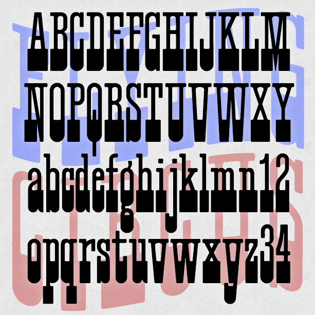
FLYING CIRCUS is a playful, slab-serif font that can suggest Americana, the West, the carnival or circus. It was inspired by a “lost” analog font, Cirque, and has a full lowercase unlike many similar fonts. Version 1.1 has an expanded character set.
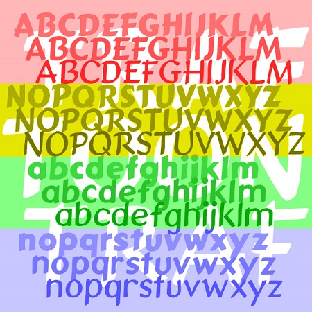
Traftoon is a set of three fonts that look like neat, slightly sloped hand lettering done with a brush and ink. Casual but not child-like, with full upper and lowercase, Traftoon offers an attractive and flexible alternative to many similar fonts such as Balloon and Comic Sans. Traftoon was inspired by Howard Trafton’s Cartoon Light and Cartoon Bold of 1936. My friend Vista Bill got me started on this. Cartoon Bold exists in digital form under various names. The Light had not been previously digitized and neither included lowercase originally. In creating these, I maintained the quirks of the originals… continued
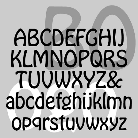
BOGO is a friendly and graceful font with an Art Nouveau feel. It was inspired by the light variant of Morris Fuller Benton’s classic Hobo that appeared in 1915 and seems not to have digitized. I completely redrew the typeface from historic examples, maintaining its curvy lines and descender-free lowercase. BOGO has a lightness and elegance that is sometimes lacking in Hobo and its many imitators.
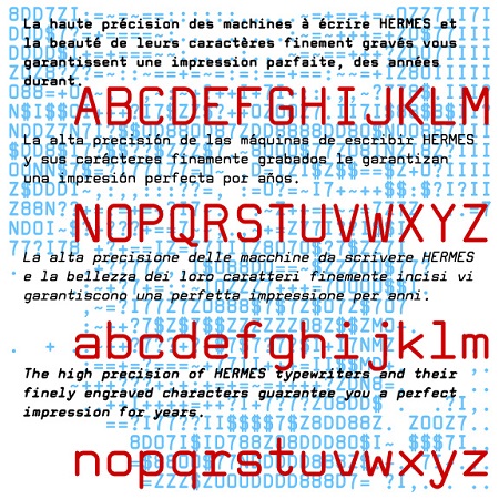
Tech Elite is a square sans-serif monospaced font, a stylish alternative to Courier or other typewriter-style fonts. Tech Elite was inspired by one of the styles offered on the classic, collectible Hermes 3000 Swiss-made typewriter. This is completely redrawn; I did not want it to have the uneven texture of vintage typing. I’ve expanded its usefulness with Bold, Oblique and Bold Oblique variations. A friend of mine had a similar typewriter in high school and it was so cool. You see, kids, back in the typewriter days, you were basically stuck with one size and one font, so a document… continued
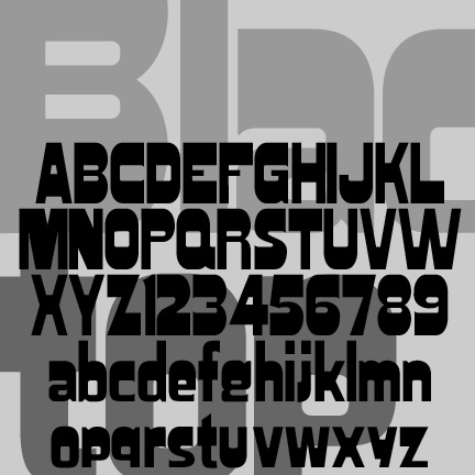
Blacktop has been tweaked, expanded and reissued in celebration of National Woodtype Day on March 15. The uppercase and numbers were originally inspired by a woodtype font variously known as Gothic Bold, Jubilee, or Skidoo Caps, and completely redrawn for clean edges. The lowercase is my own invention, following the example of certain fonts (Hobo, Publicity Gothic, Broadway) in which the descenders do not go below the baseline.
