
-Revivals-


The 2 ALÚMINO fonts were inspired by font designed for Alcoa, the aluminum company. Sleek, clean, modern, light and flexible. I’ve also made a narrower version with the same stroke weight, although it appears somewhat darker overall. Bob Trogman writes, “I worked on the Alcoa font while working for Saul Bass. The Alcoa project lasted over a year and a half. Half way through the project a presentation was made to the board in Pittsburgh and one of the board members said the logo looked too much like ALCAN’s logo and we started all over. Don Handel did the actual… continued
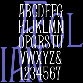
AEOLIAN is a narrow, elegant font that was inspired by the lettering on a pipe organ manufactured by the Aeolian Company. My friend Nelson got me started with scans of the various stop labels, like the one at left, found on the amazing Longwood Gardens Aeolian organ which he has worked to restore. I invented missing letters and numbers, then created two additional weights, Demi and Bold. Always grateful for posts like this: “Thanks for digitizing Aeolean for posterity. The original tradename was Façade, and it was introduced by the Boston Type Foundry in 1881. John F. Cumming cut certain… continued
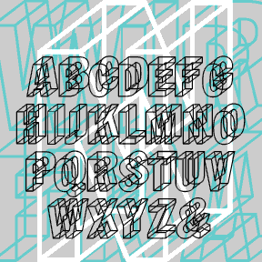

WIREFRAME was inspired by the “lost” Letraset font BOMBERE, designed by Carla Bombere. Like BLOCKED, Bombere apparently did not make the transition from dry-transfer (rub-down) letters into digital type. Rather than draw this font directly from Bombere, I started again, studying what made it work. I used the basic letterforms of the classic Franklin Gothic, refashioning the G, the 1, and some others. But Franklin Gothic would still make a good companion font. This font uses the principle of the Necker cube, creating a neat visual ambiguity. “A drawing of a wire cube…which spontaneously reverses in depth…was first described by…L…. continued
GOOD VIBES is my digital version of the Letraset font “Good Vibrations” designed by Trevor Hatchett and released in 1973. Janet Wilson, one of my dear font correspondents, sent me a scan of an unused sheet of the Letraset original. In redrawing the font, I’ve maintained the same number of lines per character and the uniform width of the Hatchett design. Not entirely successful here–the gradient stripes can turn to strobing, dithering detail onscreen. It’s much better used BIG in print (>60 pt.) With rub-down Letraset you would have been able to choose to use parts of letters; I haven’t… continued
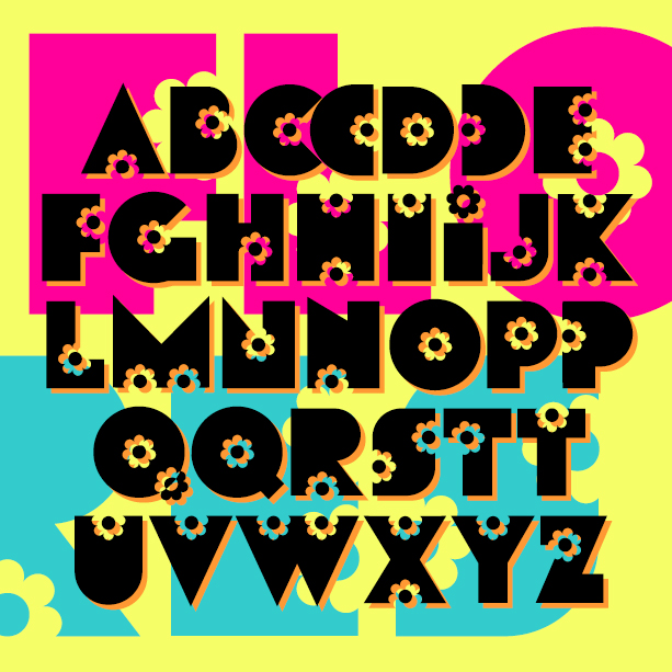
FLORES is my digital creation of a “flower power” style font from the late 60s or early 70s. I started this in 2001, inspired by a florist’s sign in Valencia, Spain. I had only the letters F L O R E S and made up the rest; later I was given examples FLEURDON and SACHET DISCRET and expanded the font accordingly. But I still have not tracked down the original font or its name. Version 1.5 has an expanded character set and improved spacing and kerning.
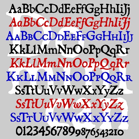
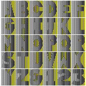
The Dominican fonts are designed to look like old letterpress printing. Originally inspired by a font from Dan X. Solo’s books, I expanded the series to also include Italic and Small Caps. Version 3.0 now contains lining figures with the old-style figures still available as stylistic alternatives. All 3 fonts have been expanded and refined, making these a fine alternative to the overused Caslon Antique.
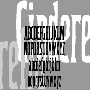
CINDERELLA was inspired by a font in one of the great Dan X. Solo 100 font books. The lowercase g first caught my eye; it’s ultra-condensed which can be very useful. The font has been retired for a number of years now. I had reason to use it recently and thought it was time to dust it off and round it out. Includes upper and lowercase, numbers, punctuation, and international characters.
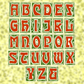
CARMEN CAPS is my digital interpretation of an Art Nouveau font of the same name, as illustrated in the Dan X. Solo books. The swirly backgrounds have great detail; use big as drop caps!
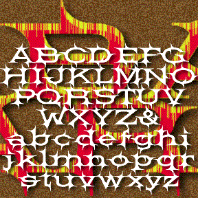
BARBECUE was inspired by the font BARB, illustrated in the great Dan X. Solo books from Dover. It’s in “100 Ornamental Alphabets” and in the “theme, topical” section of the “Solotype Catalog.” Other than that, I know nothing about Barb. To me, it has a Western feel, wide-set like a wood type, spiky like barb wire. I’ve recreated the caps with a few changes, and added everything else. Includes upper and lowercase, numbers, punctuation, and international characters.
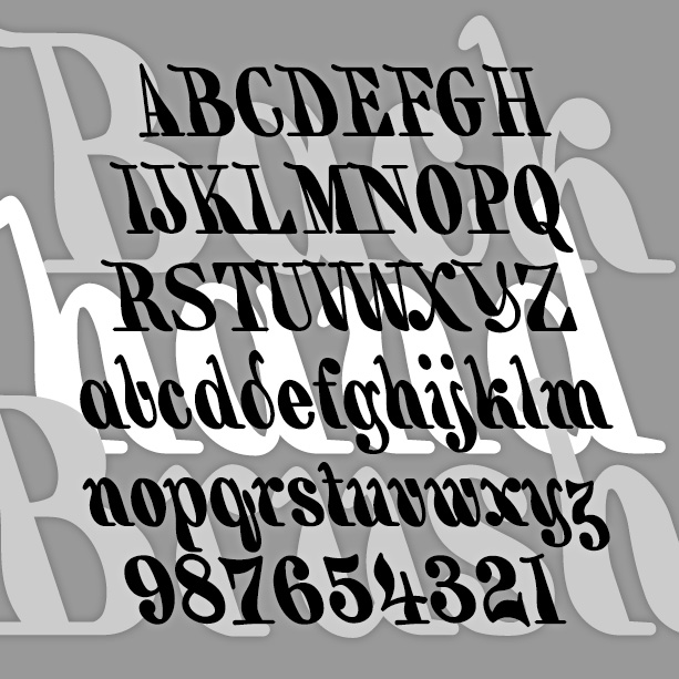
BACKHAND BRUSH is my re-creation of a classic 19th-century style of hand lettering, also known as a “marking” alphabet. Like some Victoriana and Art Nouveau fonts, it was revived in the psychedelic era. My font is completely redrawn from an antique guide to hand lettering. I have regularized it somewhat (maintaining a constant 18-degree slant) but also tried to keep a slightly random brush feel. Version 1.5 has an expanded character set and improved spacing and kerning.