
-Revivals-
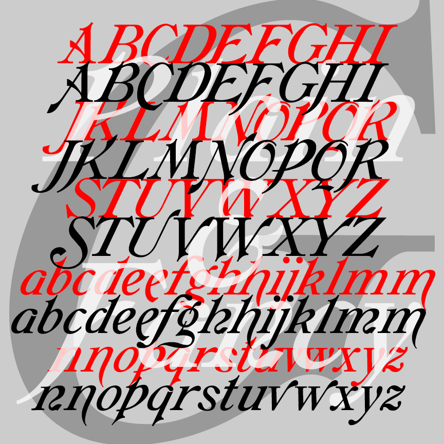

GALATHEA is an elegant italics-only font. My digital font was inspired by a 19th-century typeface from Schelter & Giesecke. After designing my version of Galathea, I found examples of another, very similar S&G font called “Italique Moyen-Age Demi-Grasse.” I’ve now recreated that second font, calling it simply GALATHEA PLAIN, as it shares so much with its sister, now called GALATHEA FANCY.
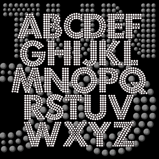
FORTUNA DOT gives your words the effect of being written with tiny lights or beads. This revival of a “lost” analog font was suggested by Bruce Baryla, the bold geometric letterforms were inspired by Paul Renner’s classic Futura®*. The open structure of the font makes it ideal for layering and laser-cutting, available in three weights. Version 1.5 includes an expanded character set, improved spacing and kerning. *Futura® is a registered trademark of Fundicion Tipografica Neufville S.A. The name is used here for reference only; my font was completely redrawn from analog sources. This is NOT a Futura® font.
The FLORENT fonts are bursting with beautiful, floral detail. The four fonts are designed to be used separately or layered together in different colors and combinations. Florent A (green in the animation at right) is bare branches or vines. Florent B (yellow) has white flowers on the branches. Florent C (blue) is the flowers alone, perfect for use alone or as a “fill” with B or D. Florent D (red) has the branches full of light and dark flowers. Florent was inspired by an analog font called “Garland” in Dan X. Solo’s 100 Ornamental Alphabets. I’ve completely redrawn the font,… continued
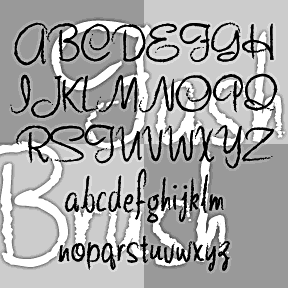
FASHION SCRIPTS are fraternal twins. The letterforms of each were inspired by an example of 1940s department store lettering. FASHION BRUSH has a rough, art brush texture; FASHION MARKER has the smooth line of a Sharpie®. The inspiration was this example of wood type formerly used by Thalheimers department stores. From examples in the collection of Virginia Commonwealth University, Richmond, VA. According to their information, “The type follows handlettering styles of the 1940s and is unique compared to 20th-century script typefaces in metal.” My Pen Script Monograms were also inspired by this wood type. Each font includes upper and lowercase,… continued
CRAZY HAROLD is a fun, retro-festive font. Inspired by an example of this name, as reproduced in Paul E. Kennedy’s 1974 Modern Display Alphabets, I’ve redrawn the font and expanded the set to include useful Condensed and groovy Flair varieties as well. And Condensed Flair too! Version 2.0 uses the Stylistic Alternates feature of Opentype to make the alternate characters easier to access, and includes an expanded character set and improved spacing and kerning.
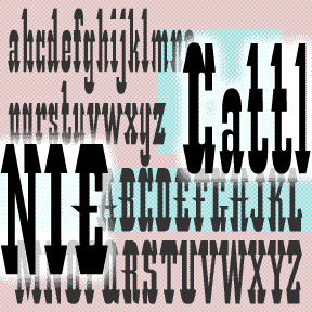
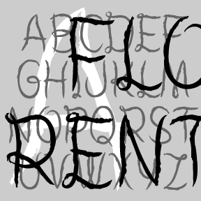
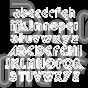
CATTLE ANNIE is my unauthorized digital interpretation of the analog font “Les Catalanes.” According to ABZ: More alphabets and other signs by Rothenstein and Gooding, it was designed n 1952 by Enric Crous-Vidal (1908-1987) but was never produced. Other Crous-Vidal fonts include Paris, Flash, and Ilerda from Fundición Tipográfica Bauer. The original source (with an incomplete character set) says Crous-Vidal’s Paris show was “the graphic hit of the ’52 season” and refers to Les Catalanes as “this flamboyant character of Mediterranean inspiration.” You may imagine hooves, horns, heels, hats and moustaches in its distinctive features. Many such wood-type fonts have… continued
BRUCE MIKITA is my digital version of an analog font of the same name. It has a rustic, hand-crafted feel and suggests East Asian calligraphy. The highlight is a distinctive feature; I’ve also made an un-highlighted version, which Dan X. Solo identifies as “Lantern.” At long last, its origin has been revealed to me by Herman: “Since you ask, there is no Bruce Mikita. The type you digitized was issued by George Bruce’s Son & Co’s New-York Type-Foundry. It was patented 12 Feb 1867. It was called by them Ornamented no. 1048. When Phoenix typefounders got some mats they invented… continued
BLOCKED is my reconstruction of a “lost” Letraset font. The original, called “Block Up,” was designed by Sally Ann Grover and was issued in 1974 by Letraset. Block Up is one of countless fonts that didn’t make the technological transition from transfer letters to digital. My digital version was constructed point by point, not autotraced, so it’s very clean. I’ve used all the available characters (except the 4) and rounded it out with more punctuation and international characters. I’m especially fond of my @. The Regular above; that’s what the original looked like. I’ve also created a series of four… continued
BARRIL is my digital interpretation of a “lost” analog font called Barrio. I started with a scan from a dry-transfer catalog (thanks, Jeff). I know it was produced originally by Neufville, but that’s all the information I have. Totally 70s! For my own amusement, I made a second inline version called Barril Doble. Great for layering. Each font includes caps, punctuation, numbers, and international characters.
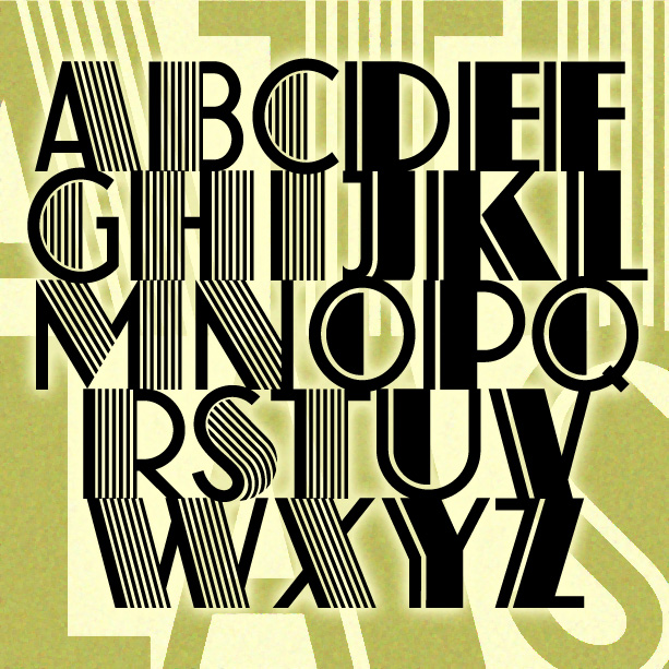
ATLAS captures the bold glamour of the Art Deco period. Inspired by a classic analog font, ATLAS comes in two varieties: original with dazzling pinstripes and solid with just the one. Since originally creating these in 2001—under the name Farouk as I’d seen it identified—I have learned much more about the original design that “goes back all the way to 1933…when it was designed by K[arl] H[ermann] Schaefer for the German type foundry Schriftguß AG… as Fatima Versalien [Versalien = uppercase]. In the same year, Fonderie Typographique Française published their version of Fatima Versalien under the name Atlas.” His grandson… continued