
-Revivals-
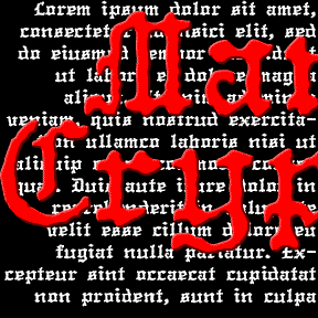

The MANUCRYPT fonts were inspired by an unusual example of “Olde English” (blackletter) typing. Preserving the original texture, these fonts have a look that’s much more “Haunted House” than “Wedding Announcement.” There are Regular (“Proportional”, the red screen above) and Monospace (“Fixed Width”, blue screen) fonts depending on your mood. Once upon a time, kids, there was the typewriter. It was like a keyboard and printer without a computer in between! That was where the typist came in, striking the keys and printing simulaneously. But you were stuck with one style and size per machine, usually Courier and always of… continued
LONDON BITMAP is a recreation of the classic Apple font London, originally designed by the great Susan Kare. (She also designed the wonderful icons at right, so familiar to us old appleheads.) The city-named fonts (Chicago, etc.) were a big improvement over previous computer typography, although they may now seem a bit quaint. Most have made the transition to scaleable fonts, such as my own L.A. fonts; now you can again enjoy London’s contrast between “Old English” style and bitmap texture. While I was at it, I also made a Harlequin, Cross-stitch and Shaded version; the initials at left show… continued
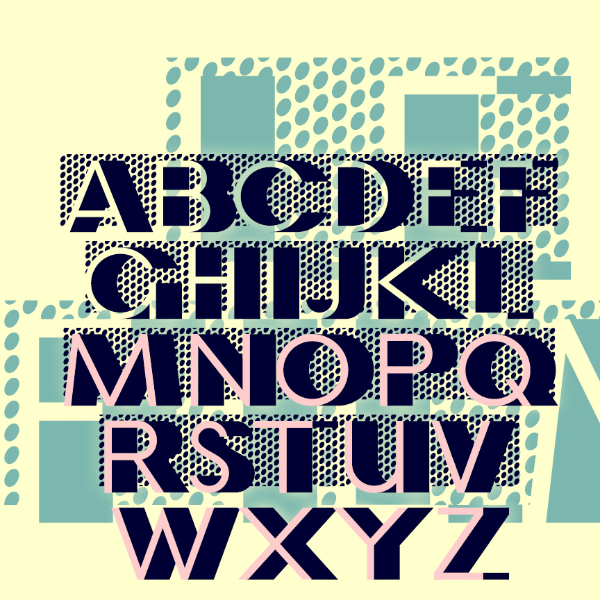
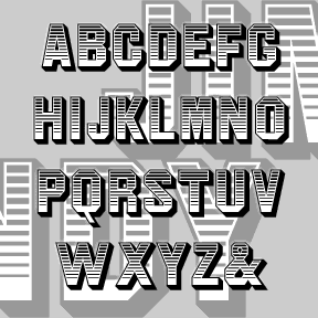
LE FILM is a classic Art Deco design of 3-D geometric letters set against a pattern of bold dots. This is my digital interpretation of the classic analog font of the same name, designed by Marcel Jacno and released in 1927 by Deberny & Peignot of Paris. The Classic font presents white letters with black sides against the dots. I’ve also made separate Letters and Shadow font that can be colored differently and layered with or without the Classic font. Pro tip: These characters ^ < > \ { } _ have been replaced with lines of dots. Use them… continued
LAPIS LAZULI is a set of 3 calligraphic fonts. Inspired by a simple, elegant font called “Papyrus” in one of Dan X. Solo’s great font books, but unrelated to the familiar ITC font of the same name. Any additional information would be appreciated. In completely redrawing the font, I’ve regularized and expanded it and added 2 more weights, Demi and Bold. Each font includes caps, lower case, numbers, punctuation, and international characters.
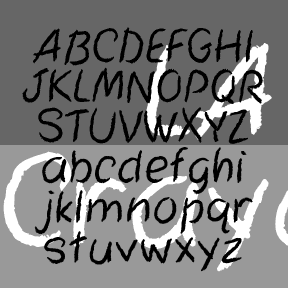
LA Marker and LA Crayon are big friendly handwriting fonts. They were inspired by the Apple Classic bitmap font “Los Angeles” which disappeared with the transition to TrueType fonts. Marker has a smooth edge, Crayon is rougher, suggestive of the original bitmap jagged edge. Includes caps, numbers, punctuation, numbers, and international characters.
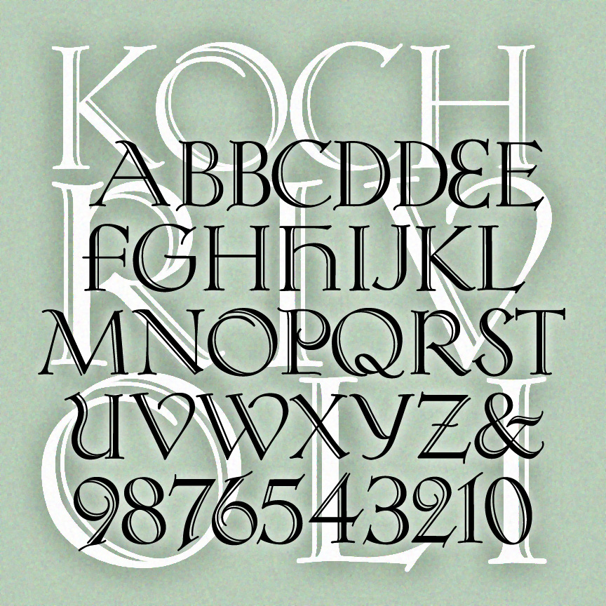
KOCH RIVOLI is a strong and graceful titling font. It was inspired by Rudolf Koch’s original “Zierbuchstaben” (decorative book initials) intended as a companion font to Koch Antiqua. If you like Koch, see also Koch Quadrat and Bride of the Monster. Version 1.5 has an expanded character set including numbers and punctuation not in Koch’s original design, and improved spacing and kerning.
JIM DANDY is my interpretation of a font that originated in the 1850’s as Gothic Shade from the Dickinson Type Foundry. It boldly suggests a political broadside, a circus poster, or a Western sign. Later this font would be known as Tombstone and Jim Crow as it was subsequently issued by other foundries in other formats. Jeff Levine jogged my memory with a scan of this gem from a 1970s dry-transfer catalog; thanks, Jeff. The Regular font is equivalent to the original. I’ve also created component fonts for the shading, shadows, and other elements that can be used separately or… continued
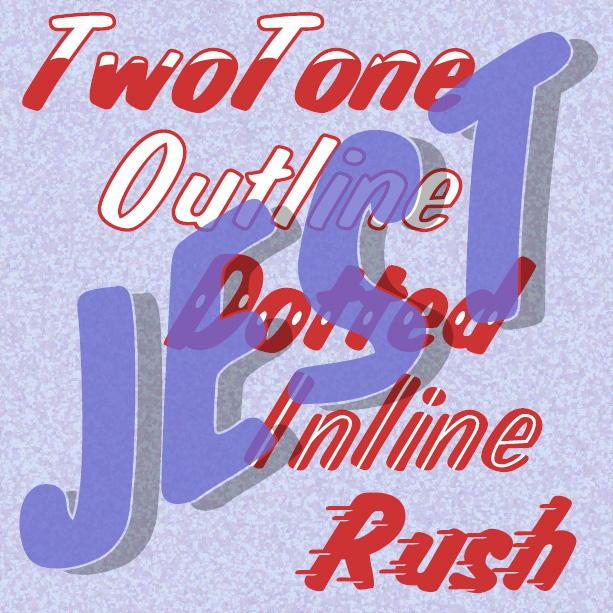
JEST is bold and gestural, as if painted with a brush by a skilled signpainter. It was inspired by a “lost” analog font, Jet, available in the 1970s as dry-transfer lettering. The original had a white inline; in recreating the font I added Solid, Dotted, TwoTone, and Shadow varieties. And now the newest member of the family, Jest Rush, uses another signpainter’s trick to suggest urgency.
JANUARY is my digital interpretation of the analog font Jana. The concave shapes of most characters and the notches on many give this sans-serif an elegant sparkle. There’s another digital version of Jana out there, but mine has been entirely redrawn and is very smooth. I’ve added two weights, Demi and Bold. People send me wonderful suggestions and information; the Jana story is no exception. Janet got me started with a scan which jogged my memory. Bill suggested it was released by Visual Graphic Corp. Now Philippe has confirmed that Jana was created by Richard D. Juenger (b. 1928, Illinois)… continued
This ornamental, calligraphic font was suggested to me by Bruce Baryla, who also proposed the name GRACEFUL GHOST. Here is all the information I have about the original: Completely redrawn–not traced–for very smooth lines. Looks great reversed and, of course, BIG. Includes caps, limited punctuation, and international characters.