-Deco + Geometric-
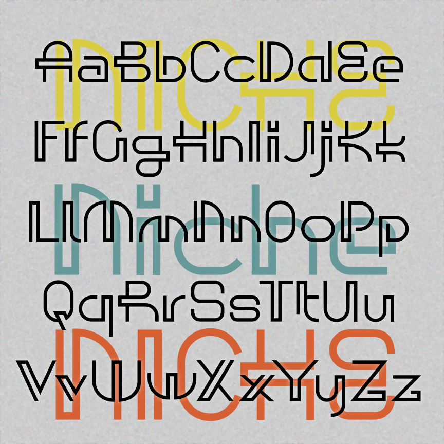

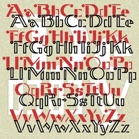
NICHE has the playful and decorative geometry of mid-century modern design. Used sparingly, these letters give add a dash of retro-future style. Inspired by a caps-only design in Ben & Ed C. Hunt’s 100 Alphabets from 1954. Version 1.5 has an expanded character set and improved spacing and kerning.
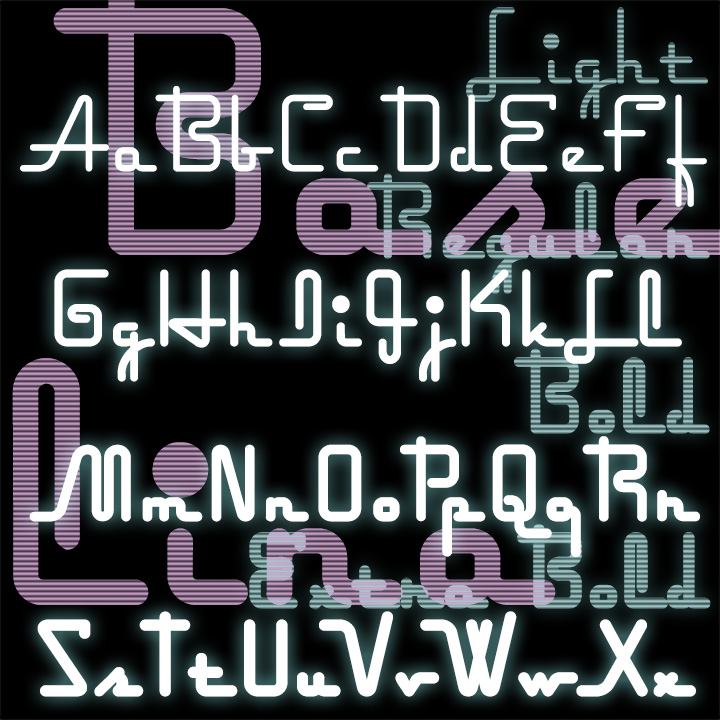
DESERT ROSE is sleek and stylish with letterforms composed of graceful repeating elements. Deceptively simple and elegant, DESERT ROSE was inspired by an example of hand-lettering included in Alphabets: Ancient & Modern, compiled by J. B. Russell (Padell, 1946).


BUCKET is a bold and bouncy geometric sans serif, familiar with just enough flair to catch the eye. And then there’s a second font, BUCKET SPATTER, where the letters each have a strong dot texture on the right side, as if sprayed or spattered. The fonts can be used separately or layered together in contrasting colors. The spacing of the Spatter font can adjusted so the letters overlap and remain legible. These fonts were inspired by early 20-century showcard lettering in which ink spatter, shading on rough paper, and other techniques were used to add texture and dimension.
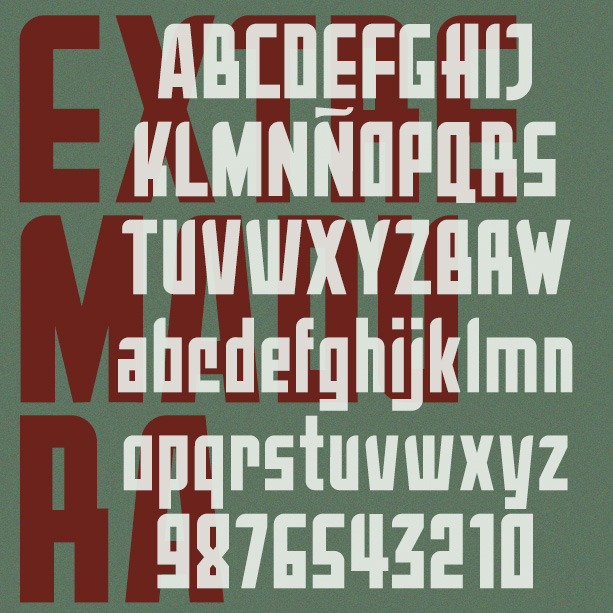
Extremadura is a bold geometric font. Straight lines and minimal curves give it a distinctive style. Extremadura was inspired by an example of vintage Art Deco lettering called Aragón; there are many fonts with that name so I picked a different region of Spain.
DECOY is a bright geometric font with Art Deco flair. The Stencil version is solid, the Template is outlined. Both also come in an alternate version without all the decorative circles on the caps. Decoy was inspired by one style of signature by the popular American artist, Norman Rockwell.
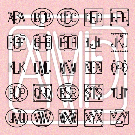
ART DECO MONOGRAMS combines elegant geometry, the intricacy of metal work, and a touch of musical flair. Create your own custom 3-letter monograms, with or without decorative frames. (If you prefer this style in a regular text font with upper and lowercase, please check out my True Confession font.)
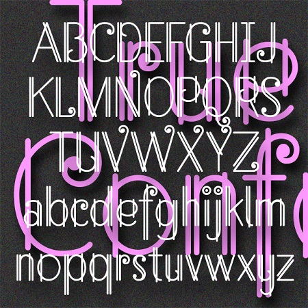
True Confession is a delicate and lively font that suggests Art Deco metalwork. Inspired by the hand-lettered main title of the 1937 film of the same name starring Carole Lombard, art directed by Hans Dreir and Robert Usher. Want this look in a handy monogram font? Check out my Art Deco Monograms.
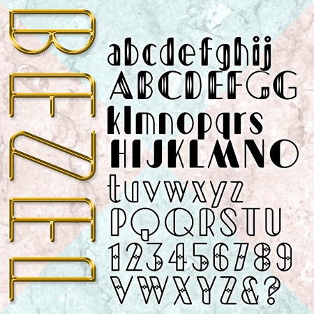
Bezel is an Art Deco font with a contemporary twist. Bezel starts with geometric forms but adds modern proportions and a sleek curve for a fresh feel. The set Bevel was inspired by this TV ad for Las Vegas and then expanded to include 4 decorative variations: Black, White, Diamond, and Shimmer.

The ALBANITA fonts were inspired by the city of Albany, New York, my hometown for over 30 years. Albany has a distinctive look and character that has often influenced my work, and that I’ve deliberately tried to capture here, if not literally. There are no “Egg” shaped letters, no Dutch-style peaks, no bricks. Albany includes many remarkable historic buildings, including the State Capitol and City Hall, repurposed railroad and industrial buildings, rows of brownstones and tree-lined streets, and an overall design that encompasses 4 centuries. Albany’s skyline is symbolized by the once-futuristic Empire State Plaza. Often the contrast between old… continued