
-Deco + Geometric-


WEXLEY is my digital interpretation of a rather forgotten analog font set called Wexford, very much in the geometric Bauhaus tradition. The original was designed by Richard A Schlatter and released by VGC in 1972. (Thanks, Bill, for the research.) Working from period sources, I’ve made my versions of four weights, expanding the character set and including a couple alternate characters. The Inline is an invention in the 70s spirit. If you like this general style, check out the Bowfin Guide to “Bauhaus” fonts.
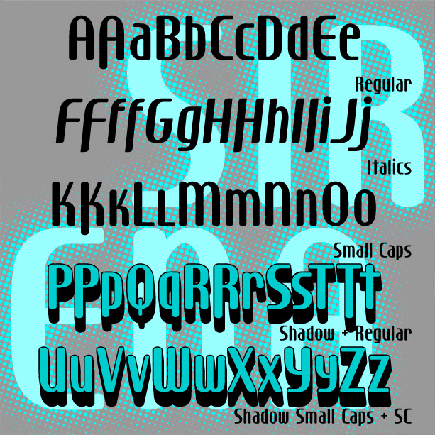
Sleek and stylish with modern curves, SIRENA was inspired by the hand-lettered opening titles of the film I Married a Witch (1942, art directed by Hans Dreier and Ernst Fegté, starring iconic screen siren Veronica Lake. I’ve expanded the font to include lowercase and created Small Caps and 3-D Shadow versions. And now there’s a companion Italic version! Version 1.5 includes an expanded character set including alternate letterforms as shown.
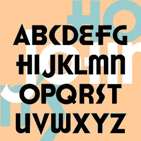
BARRYMORE is a sleek and stylish geometric font with an Art Deco influence. With rounded ends that suggest neon tubes, BARRYMORE comes in 3 weights. Inspired by vintage Pepsodent packaging. Formerly known as Sanitary.
The 4 RÉPUBLIQUE fonts were inspired by the lettering on this style of Paris Metro sign, designed by the architect Adolphe Dervaux and first installed in 1924. This design coexists with the more famous Art Nouveau “Metropolitain” signs, designed by Hector Guimard in 1900 and made of sinuous wrought iron. The “Candelabra Dervaux” uses simpler Art Deco letterforms, cut out of red metal, and illuminated from the back. The double row of stencil-style supports resembles train tracks. For fun, I’ve included a few alternate characters in the lowercase positions and created a Solid font without the horizontal lines, and two… continued
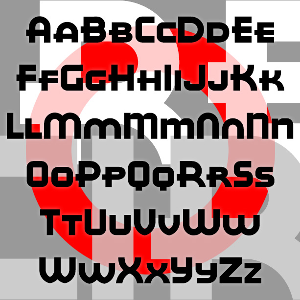
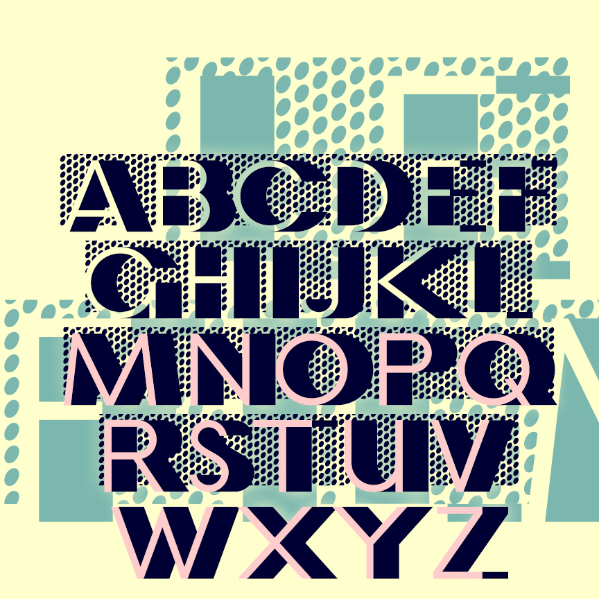
RED CIRCLE is a bold and stylish geometric sans serif with its roots in Art Deco design. It was inspired by the hand lettering formerly used on Eight O’Clock coffees. Once associated with A&P stores, Eight O’Clock coffees, including Bokar and Red Circle varieties, were the most popular brand in the US from the 1930s, the age of Art Deco. Version 2.0 is a large and small caps font; alternate letterforms are accessed thru Opentype feature. It also features an expanded character set and improved spacing and kerning.
ONION was inspired by an unidentified font included in Art Deco Initials, selected and arranged by Carol Belanger Grafton [Dover, 1991; “selected from rare periodicals (mostly European), type catalogs and printed ephemera ofthe 20s and 30s.”] Completely redrawn, the onion-like cross-section is simplified, the shapes regularized, and the character set expanded. Lends itself to overlapping, suggests the Op Art paintings of Bridget Riley and others. Includes caps, numbers, punctuation, and international characters.
MILKY WAY was inspired by an Art Deco alphabet seen in late 1930s Speedball lettering books by Ross F. George. A “future past” look, like the 1939 Worlds Fair and Tomorrowland. Originally, George directed that the distinctive white dots were to be made by spattering white ink with a toothbrush. The degree of detail in the Regular version of this font means it should be used fairly big, and that it’s a big file. At Jeff Levine’s insistence, I’ve added a second font without the stars but retaining the rings. Both fonts include caps and lowercase, plus numbers, punctuation, and… continued
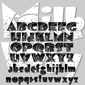
LE FILM is a classic Art Deco design of 3-D geometric letters set against a pattern of bold dots. This is my digital interpretation of the classic analog font of the same name, designed by Marcel Jacno and released in 1927 by Deberny & Peignot of Paris. The Classic font presents white letters with black sides against the dots. I’ve also made separate Letters and Shadow font that can be colored differently and layered with or without the Classic font. Pro tip: These characters ^ < > \ { } _ have been replaced with lines of dots. Use them… continued
The HONEST JOHN’S fonts are based on the old logo of the Howard Johnson’s restaurant chain. For missing letters, I consulted similar Deco fonts. There’s a solid Regular and outline Shadow version. Includes large and small caps, punctuation, numbers, and international characters.
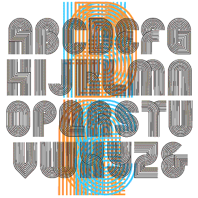
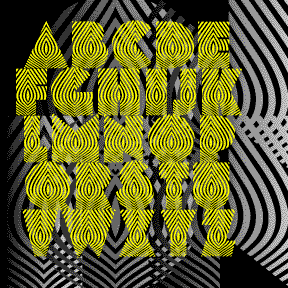
HARDLINE is an Op art font with a groovy, 60s/70s vibe, all geometric forms composed of parallel lines. It was inspired by the 3-letter logo at right, from an envelope my friend Dan gave me. (USU has apparently changed their logo.) This font is really fun when it’s used big and kerned so tightly that the letters overlap, creating cool moiré patterns as in the animation above. I’ve included a number of alternate letterforms in the lowercase positions for greater flexibility. Includes uppercase and alternates, punctuation, numbers, and international characters.