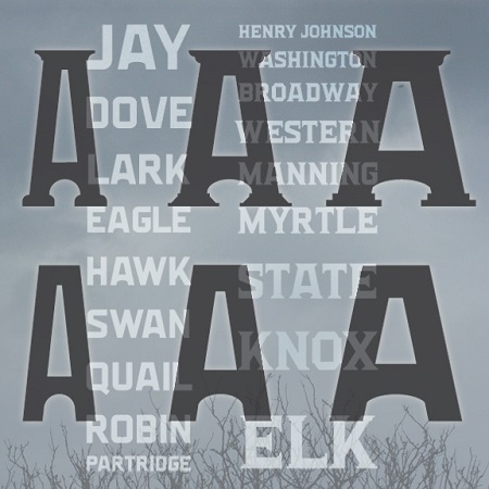
The ALBANITA fonts were inspired by the city of Albany, New York, my hometown for over 30 years. Albany has a distinctive look and character that has often influenced my work, and that I’ve deliberately tried to capture here, if not literally. There are no “Egg” shaped letters, no Dutch-style peaks, no bricks.
Albany includes many remarkable historic buildings, including the State Capitol and City Hall, repurposed railroad and industrial buildings, rows of brownstones and tree-lined streets, and an overall design that encompasses 4 centuries. Albany’s skyline is symbolized by the once-futuristic Empire State Plaza. Often the contrast between old and new is bridged by historic-themed details–lampposts, cornices, faux-painted modern structures–that so many cities use to reinforce their historic character.
The Albany Type Foundry was a major distributor of woodtype in the 19th century. Referencing one such font (Teniers) I created a squarish geometric letter structure, reminiscent of Art Deco, also reflected around town. Then I assembled a variety of serifs and other typographic details drawn from interior and exterior moldings and the like, with no particular buildings in mind. Integrating these with the basic letterforms produces Albanita, a loving pastiche of historic ornament.
I don’t claim that the finished product looks like Albany, or should be the official font, or will become widely used. It’s the result of my musings on historic themes, perfect for injecting some historic flavor, but remaining present in the 21st century. The name is intended to conjure up a mysterious woman of yesteryear, like Carlotta in Vertigo.
For those who prefer less of the gingerbread, there’s Albanita Sans. Both are available in 3 weights.
![]()

