
-Deco + Geometric-
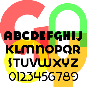

The GOYA fonts (including light, medium, heavy, ultra, and inline)were inspired by the logo of the GOYA® food products company. Another Art Deco font–like Red Circle–but this time with a preference for the circle over the square. GOYA 2.0 now includes small caps in the lowercase positions of each font (not just re-scaled but also re-weighted) plus a whole new font GOYA INLINE. Goya in use, by Alter
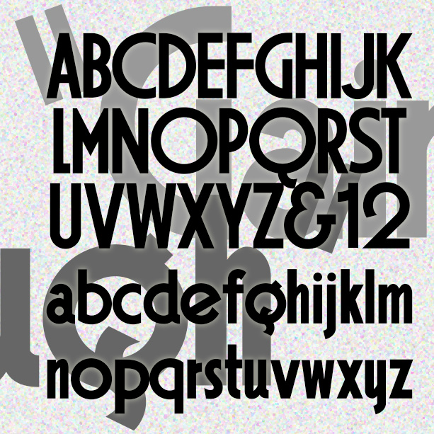
GAINSBOROUGH is a bold geometric font in a high Art Deco style. I was attracted to the extreme distortion in some of the letters, emblematic of the style, and preserved that in my design. Gainsborough was inspired by the hand-lettered titles of the 1938 Alfred Hitchcock film, The Lady Vanishes, “A Gainsborough Picture,” produced by a sister company of Gaumont-British, namesake of Gaumont. Version 1.5 includes an expanded character set and improved spacing and kerning.
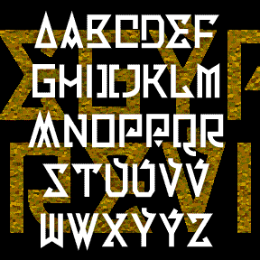
EGYPTIAN REVIVAL is an exotic retro font with geometric flourishes. It was inspired by the single word EGYPT on an old book, sketched at left. It’s named for a style of European decorative arts that uses Egyptian motifs. I imagined I was an early 20th-century designer, influenced by Art Deco and the discovery of King Tut’s tomb. There are regular and inline versions, each including some alternate letterforms. I made this sketch from the cover of a book of 19th-century photographs in the Dallas Museum of Art. Includes caps and some alternates, punctuation, numbers, and international characters.
BARRIL is my digital interpretation of a “lost” analog font called Barrio. I started with a scan from a dry-transfer catalog (thanks, Jeff). I know it was produced originally by Neufville, but that’s all the information I have. Totally 70s! For my own amusement, I made a second inline version called Barril Doble. Great for layering. Each font includes caps, punctuation, numbers, and international characters.
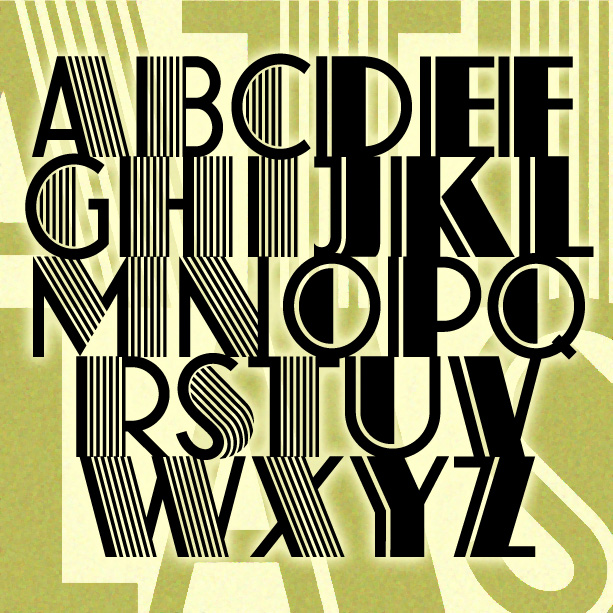
ATLAS captures the bold glamour of the Art Deco period. Inspired by a classic analog font, ATLAS comes in two varieties: original with dazzling pinstripes and solid with just the one. Since originally creating these in 2001—under the name Farouk as I’d seen it identified—I have learned much more about the original design that “goes back all the way to 1933…when it was designed by K[arl] H[ermann] Schaefer for the German type foundry Schriftguß AG… as Fatima Versalien [Versalien = uppercase]. In the same year, Fonderie Typographique Française published their version of Fatima Versalien under the name Atlas.” His grandson… continued

The 2 ALÚMINO fonts were inspired by font designed for Alcoa, the aluminum company. Sleek, clean, modern, light and flexible. I’ve also made a narrower version with the same stroke weight, although it appears somewhat darker overall. Bob Trogman writes, “I worked on the Alcoa font while working for Saul Bass. The Alcoa project lasted over a year and a half. Half way through the project a presentation was made to the board in Pittsburgh and one of the board members said the logo looked too much like ALCAN’s logo and we started all over. Don Handel did the actual… continued

LIBELED LADY was inspired by the hand-lettered titles of the film of the same name (1936). It’s an enjoyable romantic comedy directed by Jack Connolly and starring Jean Harlow, William Powell, Myrna Loy, and Spencer Tracy, art directed by Cedric Gibbons , William A. Horning, and Edwin B. Willis. The opening titles are a fine example of Art Deco lettering, appropriate to the style and tone of the film. Somewhat regularized and fleshed out, the font remains faithful to the original. Dan X. Solo laments the scarcity of period Art Deco fonts; consider this a reconstruction of one that never… continued
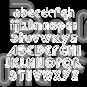
CARTEL was inspired by the logo of OPEC, Organization of the Petroleum Exporting Countries. Rigorously geometric to the point of near illegibility, Cartel could add an exotic touch in a futuristic or retro context. Includes lowercase (including long and short ascenders and descenders), numbers, punctuation, and international characters.