
-Monospaced-
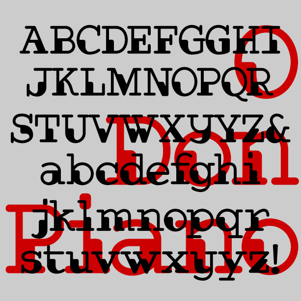

Don Piano is an unusual font that combines the look of two 20th-century technologies—punch cards and typewriters. Its dark shapes and lighter strokes give an interesting syncopation to the words, almost musical. Available in Regular, with proportional spacing, and Monospaced. Don Piano was inspired by a sketch in a lettering book from 1954 with this caption: “The authors were at a loss to give this alphabet a name except that it is different. It was made with a ball-point pen.” The name comes from this famous talking cat video that always makes me smile.
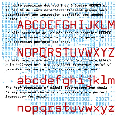
Tech Elite is a square sans-serif monospaced font, a stylish alternative to Courier or other typewriter-style fonts. Tech Elite was inspired by one of the styles offered on the classic, collectible Hermes 3000 Swiss-made typewriter. This is completely redrawn; I did not want it to have the uneven texture of vintage typing. I’ve expanded its usefulness with Bold, Oblique and Bold Oblique variations. A friend of mine had a similar typewriter in high school and it was so cool. You see, kids, back in the typewriter days, you were basically stuck with one size and one font, so a document… continued
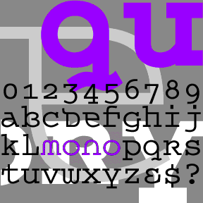
QUEER THEORY is my attempt to make a monospaced font with a less predictable feel. I was thinking about fonts like Envision, Democratica and Rotis Semi Serif, with their hybrid letterforms and irregular application of serifs. The basic letterforms of Queer Theory were derived from the invisible classic Courier, fusing upper and lowercase in a way that suggests an uncial. Unlike your average Courier though, this font has very square–not rounded–slab serifs. Includes single case letters, numbers, punctuation, and international characters.
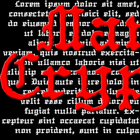
The MANUCRYPT fonts were inspired by an unusual example of “Olde English” (blackletter) typing. Preserving the original texture, these fonts have a look that’s much more “Haunted House” than “Wedding Announcement.” There are Regular (“Proportional”, the red screen above) and Monospace (“Fixed Width”, blue screen) fonts depending on your mood. Once upon a time, kids, there was the typewriter. It was like a keyboard and printer without a computer in between! That was where the typist came in, striking the keys and printing simulaneously. But you were stuck with one style and size per machine, usually Courier and always of… continued
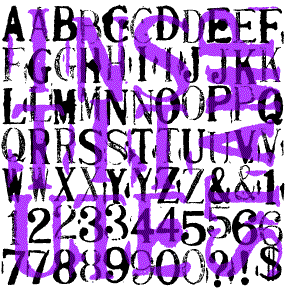
INSTITUTE STAMPS is a pair of monospaced rubber-stamp style font that emphasize the primitive nature of the medium, suggesting a telegram or oher early machine print. Working with a set of cheap, imported toy stamps, I deliberately printed them to include variation and accident. The Bold font has dark inky letters, the Regular is lighter and drier looking. These can be used separately or mIXed, depending on your taste. Named for the Albany Institute of History & Art with which I was working at the time I made this. Includes uppercase, numbers, punctuation, numbers, and international characters.
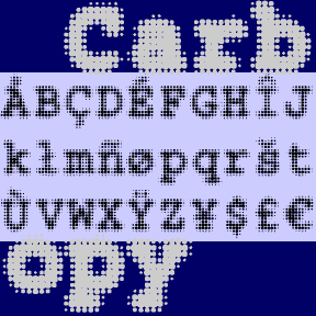
CARBON COPY is a dot-matrix take on Courier, the invisible classic with roots in typewriter style. Could be used to suggest the effect of screen display or of blurry old carbon paper. Includes 3 weights, plus one font with a full background of dots. Each font includes upper and lower case, numbers, punctuation, and international characters.
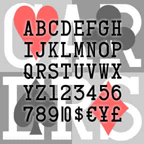

CARD CHARACTERS, as the name suggests, was derived from the characters on standard Bicycle playing cards. Starting with the K, Q, J, A and numbers 1-10, I completed the set, maintaining the somewhat clunky monospace slab-serif look of the original. Includes uppercase, numbers, punctuation, international characters, a 1-stroke 10, and the four card suit symbols. And because Mark Taylor suggested it, there’s a second font with half-width numbers, so you can compose numbers 11-99 to match the letters.