
-Revivals-
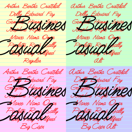

Business Casual is a lively, legible script font that can be both professional and informal. It was inspired by the “lost” analog font Delight (or Delite), produced by Formatt in the 1970s. I’ve kept the basic letterforms, but went for a more uniform stroke with rounded ends, like a felt-tip. The set includes Big Caps and Alternate variations, more closely resembling the original forms but somewhat less contemporary in feel.

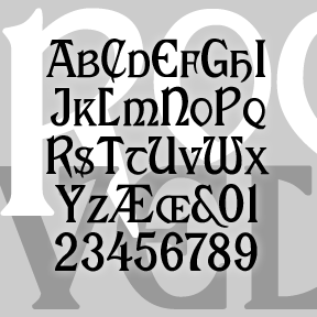
WEXLEY is my digital interpretation of a rather forgotten analog font set called Wexford, very much in the geometric Bauhaus tradition. The original was designed by Richard A Schlatter and released by VGC in 1972. (Thanks, Bill, for the research.) Working from period sources, I’ve made my versions of four weights, expanding the character set and including a couple alternate characters. The Inline is an invention in the 70s spirit. If you like this general style, check out the Bowfin Guide to “Bauhaus” fonts.
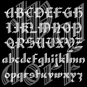
WALDORF TEXT is my digital revival of a classic “lost” font of the same name. An elegant blackletter font with details that spell luxury. Waldorf Text was produced by Barnhart Brothers and Spindler Type Foundry in 1914. When American Type Founders acquired BBB&S, they continued to produce it, including it in their 1934 and 1941 catalogs. And then it was gone, never making the transition from type to film or digital. (Thanks, Bill, for all your help!) I’ve completely redrawn the font, maintaining the graceful lines while expanding the font and making other slight changes for modern use. There are… continued
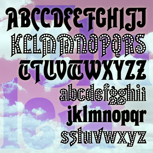
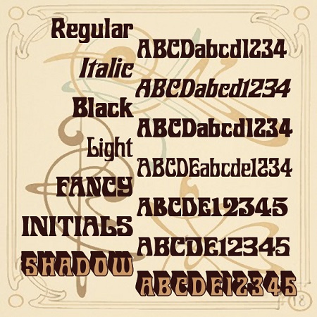
THALEIA is a bold and curvy font, suggestive of both the 1920s and the 1970s. This is my digital interpretation of an analog commissioned by a client who could no long find the original in a usual form. The new THALEIA LIGHTS font has is set with white dots, suggesting an old music hall marquee. Version 1.6 includes an expanded character set, improved spacing and kerning.
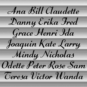
SWIZZLE SCRIPT is my digital interpretation of the classic analog font “Stylescript”, designed by Sol Hess in 1940 for the Lanston Monotype Company. Elegant and low-slung, in the manner of Trafton (designed byHoward Trafton, cast by Bauer, 1933) and Coronet (R. H. Middleton for Ludlow, 1937). But it’s bolder with a thin-thick contrasting stroke and a higher x-height. I worked from a print reference (VGC Alphabet Library, 14th Edition, 1988) and some metal type (left) for certain characters. Thanks, Bill, for the inspiration and research! Includes caps, lowercase, punctuation, numbers, and international characters.
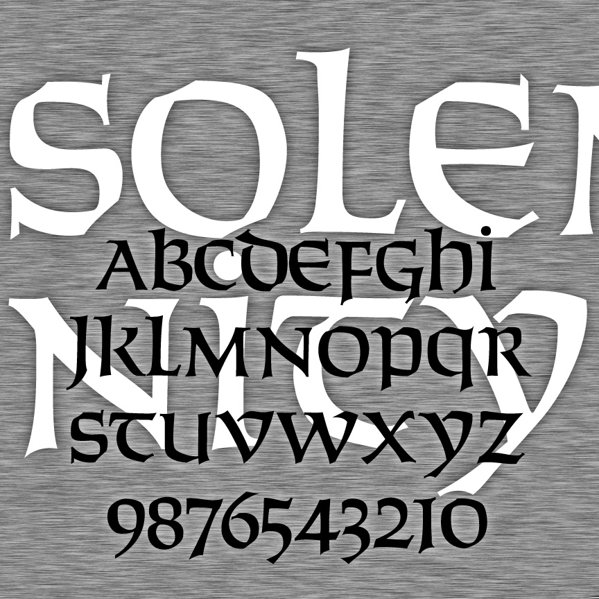
SOLEMNITY is a bold calligraphic font. It’s an uncial, having a single case that has aspects of upper-and lowercase forms. SOLEMNITY was inspired by Solemnis, designed by Günter Gerhard Lange in 1952. I drew my font fresh using analog examples and invention as needed, and the name was chosen to honor its origin without misusing any trademarks. Version 2.0 has refined letters and numbers, an expanded character set, and improved spacing and kerning.
My version of ROOSEVELT began with a request by Rob Case for the font once used on Aeolian pianos and organs. I drew the letters from analog examples, regularizing and filling out the set. Subsequently another correspondent, Richard Vance, told me the history of the design (at right) and showed me more examples of the original font in action, prompting the revised version which now includes small caps and a more conventional T. (The curvy one is now located at | and \.) If you like this font, please see my Celtic Knot Monograms. According to Rollin Smith’s “The Aeolian… continued
ROBERTA is a digital interpretation of Bob Trogman’s delightful Art Nouveau analog original. This classic font suggests elegance and fun, exoticism and friendliness. Bob’s story: “I originally hand cut this font in 1962. It is based on a Belgian restaurant sign. I named it after my daughter Roberta. Many Mexican food companies used this font, but they didn’t know it was from Europe. Dan Solo was going to digitize it for me, but he retired from the font business last year. Just give me credit for the design and it is all yours to do what you want.” And you… continued
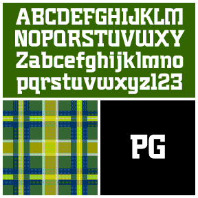
Plumber’s Gothic is my digital interpretation of the font formerly used by 3M to brand its products. According to their excellent corporate history, the “boxy, serifed…decidedly industrial” logo and font were designed by Gerald Stahl & Associates in 1960 and used throughout their product line until the late 1970s. “Unfortunately ‘plumber’s gothic’ no longer accurately reflected the image of the more sophisticated, higher-tech company that 3M had become.” (Thanks, John, for getting me started on this!) Includes upper- and lowercase, numbers, punctuation, and international characters.
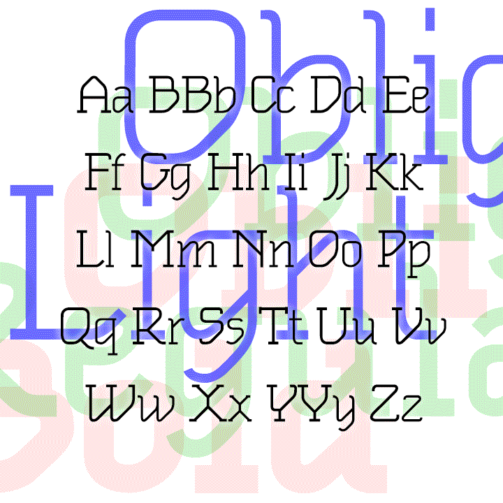
OBLIGADO is a stylish slab-serif font in three weights. The strong diagonals in each letter create a novel effect while remaining very legible for continuous reading. OBLIGADO was inspired by 2 sheets of 1983 dry-transfer lettering from Esselte/Letraset, designer unknown. My fonts were first released as “Oblique Text.” The new fonts are greatly expanded and improved from the original series.