
-Suitable For Text-
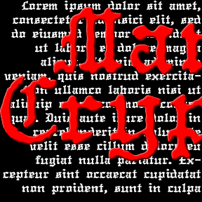

The MANUCRYPT fonts were inspired by an unusual example of “Olde English” (blackletter) typing. Preserving the original texture, these fonts have a look that’s much more “Haunted House” than “Wedding Announcement.” There are Regular (“Proportional”, the red screen above) and Monospace (“Fixed Width”, blue screen) fonts depending on your mood. Once upon a time, kids, there was the typewriter. It was like a keyboard and printer without a computer in between! That was where the typist came in, striking the keys and printing simulaneously. But you were stuck with one style and size per machine, usually Courier and always of… continued
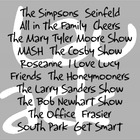
LAUGHTRACK is a set of 3 fonts in a quirky, cartoon style that says “funny”. Inspired by the work of Jerry Robinson, whose “True Classroom Flubs and Fluffs” was a highlight of the Sunday News comics section when I was a kid. Robinson also did a panel called “Still Life” in a similar humorous drawing and lettering style. Although he’s better known for his work in superhero comics, the “funnies” interest me more. His papers are archived at Syracuse University. Each font includes caps, lower case, numbers, punctuation, and international characters.
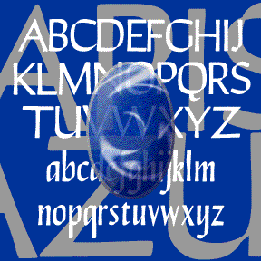
LAPIS LAZULI is a set of 3 calligraphic fonts. Inspired by a simple, elegant font called “Papyrus” in one of Dan X. Solo’s great font books, but unrelated to the familiar ITC font of the same name. Any additional information would be appreciated. In completely redrawing the font, I’ve regularized and expanded it and added 2 more weights, Demi and Bold. Each font includes caps, lower case, numbers, punctuation, and international characters.

The KOMBINE FONTS are experiments in crossing fonts, font mashups. My inspiration was found in Blackletter: Type and National Identity (Cooper Union, 1998, p.33), a most interesting book for anyone keen on fraktur. There was a small illustration (below) of a font called “Centralschrift (C. G. Schoppe Foundry) 1853, a 19th c. hybrid of fraktur and a neo-classical roman”. The upper parts–those which most enable reading–are the more familiar roman, producing a more legible font for those (like me) unfamiliar with the fraktur. I used as my models a Wittenberger fraktur and various members of the Century family, recognized for… continued
JANUARY is my digital interpretation of the analog font Jana. The concave shapes of most characters and the notches on many give this sans-serif an elegant sparkle. There’s another digital version of Jana out there, but mine has been entirely redrawn and is very smooth. I’ve added two weights, Demi and Bold. People send me wonderful suggestions and information; the Jana story is no exception. Janet got me started with a scan which jogged my memory. Bill suggested it was released by Visual Graphic Corp. Now Philippe has confirmed that Jana was created by Richard D. Juenger (b. 1928, Illinois)… continued
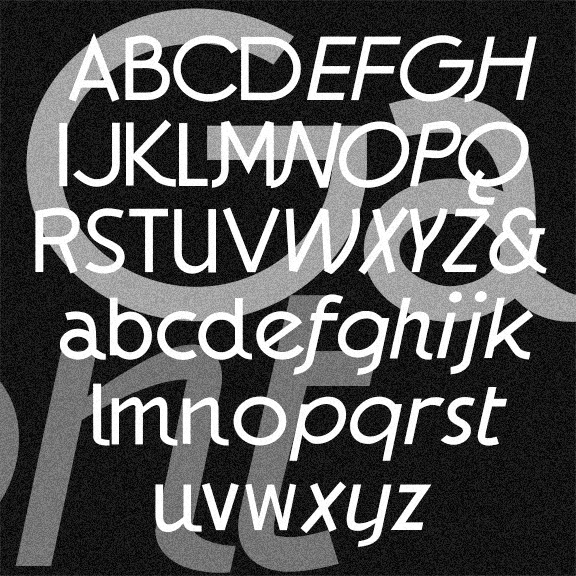
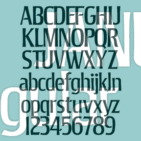
The GAUMONT fonts are elegant sans serif fonts in the Art Deco style. These were inspired by the hand-lettered titles of Alfred Hitchcock’s 1935 The 39 Steps, a Gaumont-British Picture. I’ve taken a few liberties, regularizing the characters but preserving the quirkier letterforms and rounding out the font in the same spirit. In Regular, Italic, and Light varieties. Version 1.5 has the alternate characters accessed as Stylistic Alternates, an expanded character set, and improved spacing and kerning.
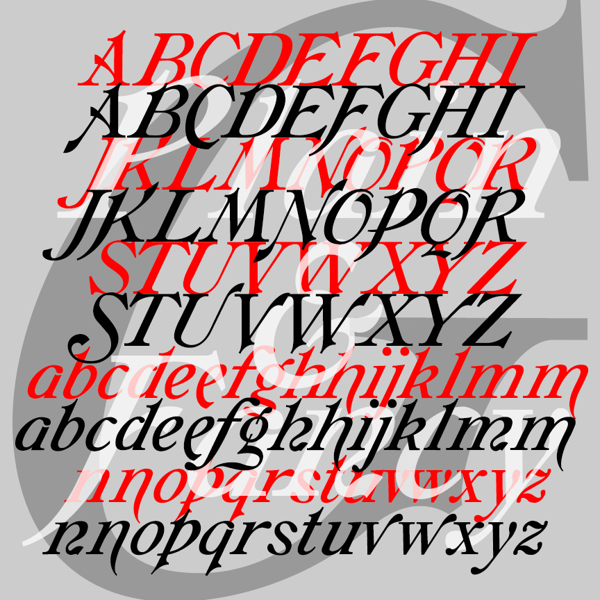
GALATHEA is an elegant italics-only font. My digital font was inspired by a 19th-century typeface from Schelter & Giesecke. After designing my version of Galathea, I found examples of another, very similar S&G font called “Italique Moyen-Age Demi-Grasse.” I’ve now recreated that second font, calling it simply GALATHEA PLAIN, as it shares so much with its sister, now called GALATHEA FANCY.
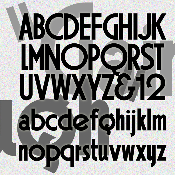
GAINSBOROUGH is a bold geometric font in a high Art Deco style. I was attracted to the extreme distortion in some of the letters, emblematic of the style, and preserved that in my design. Gainsborough was inspired by the hand-lettered titles of the 1938 Alfred Hitchcock film, The Lady Vanishes, “A Gainsborough Picture,” produced by a sister company of Gaumont-British, namesake of Gaumont. Version 1.5 includes an expanded character set and improved spacing and kerning.
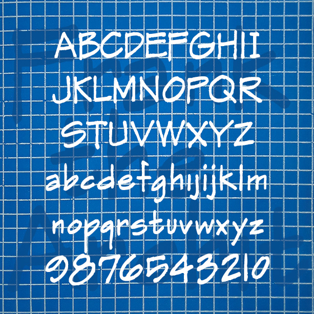
FRANK THE ARCHITECT was inspired the hand lettering in Frank Ching’s classic book Architectural Graphics (1975) that influenced so many draftspeople. In these fonts I’ve tried to evoke the idiosyncrasies of Ching’s beautiful original, including the texture. Version 1.5 combines the separate regular and alternate fonts into single fonts that use the stylistic alternates function of Opentype. Version 1.5 also features and expanded character set and improved spacing and kerning. More information I started this font years ago, then set it aside, releasing only the Markerman variant. Then I really needed a convincing “architect’s hand” font for a design project… continued
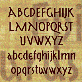
EPICURUS was inspired by Roman manuscripts on papyrus from Herculaneum. I’ve modernized the forms of the distinctive capitals, adding the “new” letters, lowercase and non-Roman numerals. Epicurus has a clean stroke and the feel of a contemporary sans serif. The example is just for reference. The texts I actually used are in Oxford’s Bodleian Library and cannot be reproduced here. The font is named for the Greek philosopher, not the recipe website. Includes upper and lowercase, numbers, punctuation, and international characters.