
-Suitable For Text-
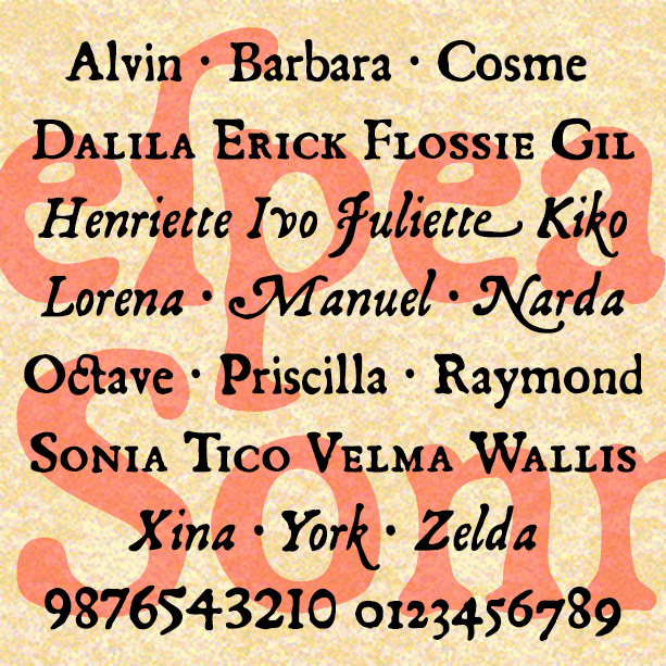

SONNET is a set of fonts with the look of early letterpress printing; the bold and beautiful letterforms contrast with the roughness of the technology and paper of the time. This would be a good alternative to the overused and ahistoric Caslon Antique. Sonnet was inspired by a facsimile of Shakespeare’s First Folio as published by Thomas Thorpe in 1609. The full series includes many typographic features of the original, including italics, swash italics, small caps, old-style figures, long s, and more. Version 2.0 makes use of Opentype features for easier use. Now the Regular font also includes the Small… continued
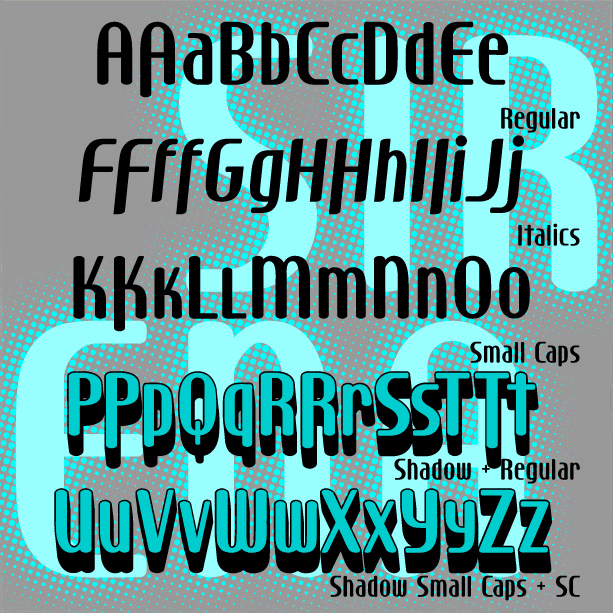
Sleek and stylish with modern curves, SIRENA was inspired by the hand-lettered opening titles of the film I Married a Witch (1942, art directed by Hans Dreier and Ernst Fegté, starring iconic screen siren Veronica Lake. I’ve expanded the font to include lowercase and created Small Caps and 3-D Shadow versions. And now there’s a companion Italic version! Version 1.5 includes an expanded character set including alternate letterforms as shown.
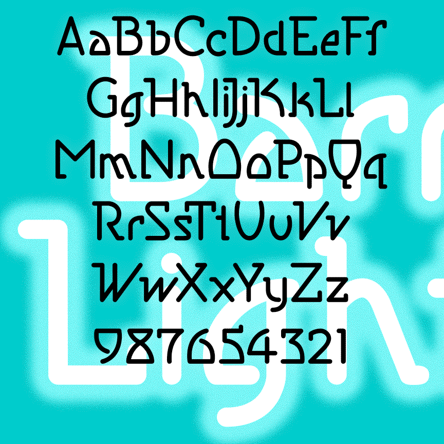
BARRYMORE is a sleek and stylish geometric font with an Art Deco influence. With rounded ends that suggest neon tubes, BARRYMORE comes in 3 weights. Inspired by vintage Pepsodent packaging. Formerly known as Sanitary.
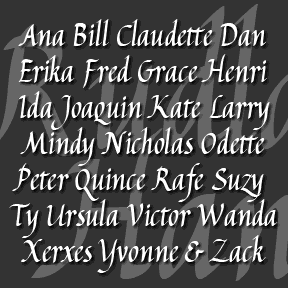
RUDLAND HAND is a calligraphic font, inspired by the work of the British artist and designer Peter Rudland. As explained in his book From Scribble to Script (John De Graff, 1956) Rudland was an advocate of this style of script–italic hand–as a way to improve one’s handwriting. So although it may seem like ornamental calligraphy, Rudland intended that ordinary people would develop this beautiful, flowing, pen lettering. You could use the font as a resource for practicing your own script or, if your handwriting is as hopeless as mine, a convenient substitute. I’ve created two fonts, one with the fancier… continued
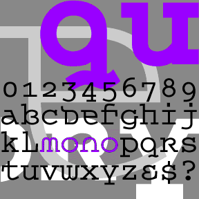
QUEER THEORY is my attempt to make a monospaced font with a less predictable feel. I was thinking about fonts like Envision, Democratica and Rotis Semi Serif, with their hybrid letterforms and irregular application of serifs. The basic letterforms of Queer Theory were derived from the invisible classic Courier, fusing upper and lowercase in a way that suggests an uncial. Unlike your average Courier though, this font has very square–not rounded–slab serifs. Includes single case letters, numbers, punctuation, and international characters.
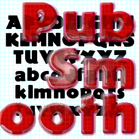
PUB SMOOTH was inspired by the classic font Publicity Gothic, which was “based on the sturdy woodcut display faces of the late 19th century.” Remarkable for its fat, friendly letterforms and bumpy outline. Adobe sells a fine version and if that’s what you want, buy it from them, as I did. In using Publicity Gothic, I realized that the bumpy outlines didn’t work well on-screen and at smaller sizes in print. So I completely redrew the font with smooth clean edges and corners. I’ve tried to remain faithful to the spirit of the original design. Just for fun, the set… continued
POIGNANT is an elegant titling font that combines aspect of a “modern” or Didone font with calligraphic flourishes. Available in roman and italic. Poignant was inspired by the hand-lettered titles of certain Twentieth Century dramatic films, including All About Eve (1950), Gentleman’s Agreement (1947), and Niagara (1953), all art-directed by Lyle Wheeler, perhaps a clue to the original hand. Version 1.5 features an expanded character set and improved spacing and kerning.
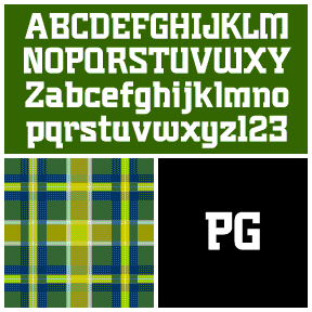
Plumber’s Gothic is my digital interpretation of the font formerly used by 3M to brand its products. According to their excellent corporate history, the “boxy, serifed…decidedly industrial” logo and font were designed by Gerald Stahl & Associates in 1960 and used throughout their product line until the late 1970s. “Unfortunately ‘plumber’s gothic’ no longer accurately reflected the image of the more sophisticated, higher-tech company that 3M had become.” (Thanks, John, for getting me started on this!) Includes upper- and lowercase, numbers, punctuation, and international characters.
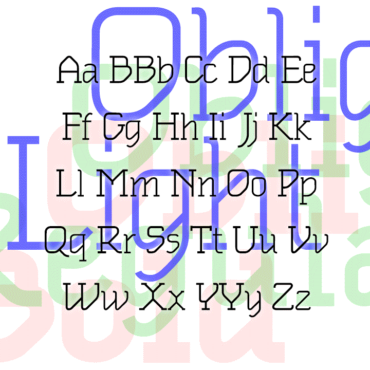
OBLIGADO is a stylish slab-serif font in three weights. The strong diagonals in each letter create a novel effect while remaining very legible for continuous reading. OBLIGADO was inspired by 2 sheets of 1983 dry-transfer lettering from Esselte/Letraset, designer unknown. My fonts were first released as “Oblique Text.” The new fonts are greatly expanded and improved from the original series.
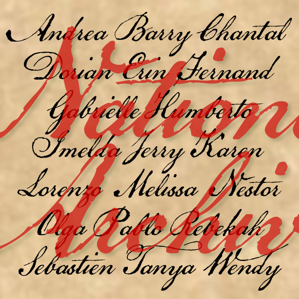
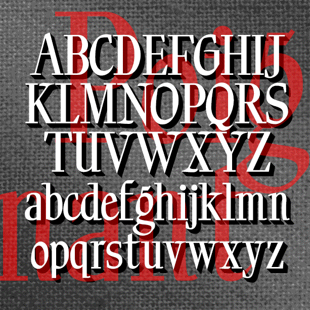
NATIONAL ARCHIVE has the feel of a historic script: elegant penmanship paired with the roughness of quill on paper. National Archive was inspired by the familiar look of the Declaration of Independence. Although the text was composed by Thomas Jefferson and others, Timothy Matlack is the person who inscribed it on vellum so beautifully, creating an indelible symbol of our nation’s founding. Version 4.0 includes all new numbers as well as an expanded character set and improved spacing and kerning.