


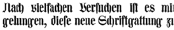
The KOMBINE FONTS are experiments in crossing fonts, font mashups. My inspiration was found in Blackletter: Type and National Identity (Cooper Union, 1998, p.33), a most interesting book for anyone keen on fraktur. There was a small illustration (below) of a font called “Centralschrift (C. G. Schoppe Foundry) 1853, a 19th c. hybrid of fraktur and a neo-classical roman”. The upper parts–those which most enable reading–are the more familiar roman, producing a more legible font for those (like me) unfamiliar with the fraktur.
 I used as my models a Wittenberger fraktur and various members of the Century family, recognized for its legibility. In working with the fraktur, I was reminded that its origin is in pen calligraphy. A natural extension then was the companion italic (Kombine Kursiv), an anomaly in blackletter type which has never used the upright roman/inclined italic convention.
Includes caps, lower case, numbers, punctuation, and international characters.
![]()
![]()