
-Hand-Lettered-
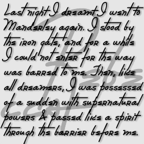

The REBECCA font was inspired by the distinctive and stylish handwriting of the title character of the classic film. Rebecca (1940) was based on the novel by Daphne du Maurier and directed by Alfred Hitchcock. The title character is dead and not even a portrait of her is ever seen. Her handwriting appears several times in the film and is perhaps the thing that most personalizes her. Her large initial R appears embroidered on a number of her possessions, including the pillow in flames at left. Rebecca’s signature, address book, and correspondence all appear in closeups as evidence of her… continued
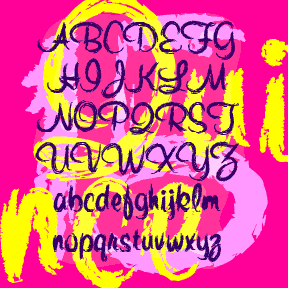
QUINCE is a brush script with a different attitude. The basic letterforms were inspired by Murray Hill (Emil J. Klumpp, 1956). I’ve completely redrawn the letterforms with a rough “art brush” to produce an expressive, painterly line, rather than a pen line. Could be crayon, lipstick, of graffiti. More “Bratz®” than “Barbie®”. Includes upper and lowercase, numbers, punctuation, and international characters. Although Linotype says Murray Hill was named for a “small town in New Jersey”, I’m certain it was named for the Manhattan neighborhood of the same name (as was the NJ town.) To me, the original Murray Hill font… continued
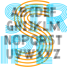
The characters of PENSTRIPE and PENCILSTRIPE are each composed of bands of 5 parallel lines, suggesting a sketch, weaving, or even a musical staff. Looks great layered in contrasting colors. In three weights and two textures (smooth Pen and rougher Pencil) which are best seen at larger point sizes. These fonts were inspired by the 1940’s pajama ad shown here. Includes uppercase, numbers, punctuation, and international characters.
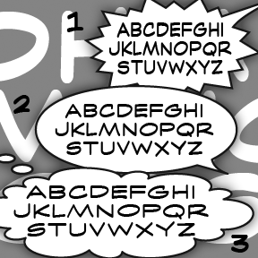
OHMIGOSH is a series of 12 fonts inspired by the style of classic comic strip lettering. There are 3 widths–1, 2, 3–each with Regular, Italic, Bold, and Bold Italic. The direct inspiration for #3 was the strip Gil Thorp, from the days it was drawn by Frank McLaughlin (a classic frame at left). For a fresh perspective on the state of comic strip art, check out the blog Comic Curmudgeon! It’s given me a reason to laugh at the “funnies” again. Includes caps, numbers, punctuation, and international characters.

MARKERMAN is comic-book style font that is highly legible and able to be italicized and bolded. Its inspiration is the same as my Frank the Architect fonts, if you’re looking for something more formal, less “comic.” Version 4.5 has an expanded character set that includes a few special comic glyphs in place of ^ ~ { } and improved spacing and kerning.
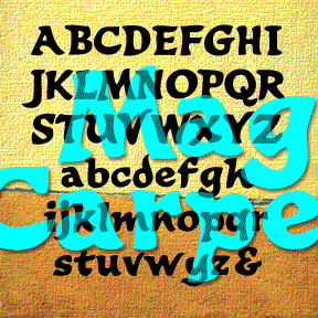
MAGIC CARPET is a calligraphic font with a lively, brush-like style, even vaguely exotic. It was inspired by the hand-painted titles (below) of the film Lust for Life (1956), a biography of Vincent Van Gogh, directed by Vincente Minnelli, art directed by Cedric Gibbons, Hans Peter and Preston Ames. Includes upper and lowercase, numbers, punctuation, and international characters.
LAUGHTRACK is a set of 3 fonts in a quirky, cartoon style that says “funny”. Inspired by the work of Jerry Robinson, whose “True Classroom Flubs and Fluffs” was a highlight of the Sunday News comics section when I was a kid. Robinson also did a panel called “Still Life” in a similar humorous drawing and lettering style. Although he’s better known for his work in superhero comics, the “funnies” interest me more. His papers are archived at Syracuse University. Each font includes caps, lower case, numbers, punctuation, and international characters.
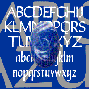
LAPIS LAZULI is a set of 3 calligraphic fonts. Inspired by a simple, elegant font called “Papyrus” in one of Dan X. Solo’s great font books, but unrelated to the familiar ITC font of the same name. Any additional information would be appreciated. In completely redrawing the font, I’ve regularized and expanded it and added 2 more weights, Demi and Bold. Each font includes caps, lower case, numbers, punctuation, and international characters.
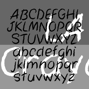
LA Marker and LA Crayon are big friendly handwriting fonts. They were inspired by the Apple Classic bitmap font “Los Angeles” which disappeared with the transition to TrueType fonts. Marker has a smooth edge, Crayon is rougher, suggestive of the original bitmap jagged edge. Includes caps, numbers, punctuation, numbers, and international characters.
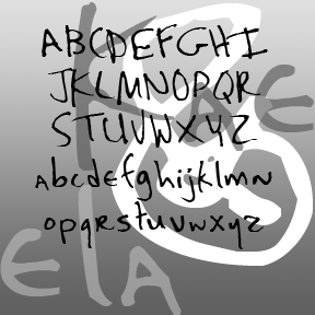
KAELA was one of my early fonts and was “retired” a while back. After a couple requests and a major sighting, I’m bringing it back. Expanded character set, slightly heavier weight for better appearance on screen, and a few other improvements. Originally derived from the handwriting of one of my students. KAELA as seen in use in the opening credits of My Name is Earl, an NBC comedy starring Jason Lee. Includes upper- and lowercase, punctuation, numbers, and international characters.