-Hand-Lettered-

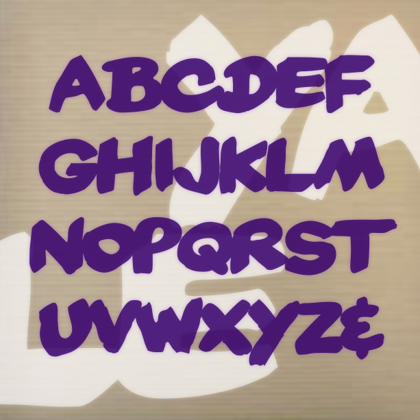
DENNEY SALTY and DENNEY SPICY are playful, comical, and quirky fonts, inspired by the work of Alan Denney for the Barker Greeting Card Company of Cincinnati, OH, circa 1969–74. DENNEY SALTY (formerly Denney One) has the bumpy edges and whimsical letterforms of hand lettering done with a crayon. DENNEY SPICY (formerly Denney Two) is more dynamic, like bold pen or brush lettering. Both fonts are essentially unicase, but have alternate letterforms in the upper-and lowercase positions for more variety. Version 2.0 of both fonts includes an expanded character set and improved spacing and kerning. Alternate characters are now accessed as… continued
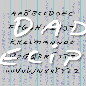
DAD’S RECIPE is derived from my father’s hand printing. I used a recipe he had written out for me (for cole slaw specifically, simulated above) and rounded it out with other samples from my cookbook. Dad almost always used a blue ballpoint pen on lined tablet paper, so these shared recipes had a very consistent look. V1.5 has been rescaled and fleshed out with my usual character set. Includes two versions of each letter, punctuation, numbers, and international characters. DAD’S RECIPE as featured onthe back of bags of Sun Chips. DAD’S RECIPE as used in the “Words in Transit” program… continued
CURATOR is a handwriting font that’s both precise and quirky, tighly spaced with a high x-height. It is a collaboration with my friend Corinna Ripps Schaming who has maintained this immaculate hand since I met her in college. She is Associate Director/Curator at the University Art Museum, Albany, NY. In Light, Regular and Bold.
COMFY has the bold but friendly look of cutout letters. Inspired by an example of “Pinselschrift” (brush lettering) by Wilhelm Dechert*. Has the feel of a handlettered version of a 20th-century geometric font like Paul Renner’s Futura* or Rudolf Koch’s Kabel. *Reproduced in Iron Fists: Branding the 20th-Century Totalitarian State by Steven Heller (thanks, John, for bringing this to my attention.) This font, of course, is much more gemütlich (comfortable, homey, informal, cozy, approachable, good-natured) than that title suggests. Includes upper and lower case, numbers, punctuation, and international characters.
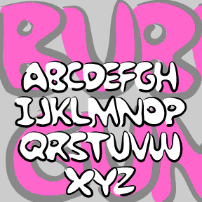
BUBBLE GUM ROCK is based on a kind of graffiti lettering that kids do. Each letter is a big fat outline that underlaps the one to its left. My friend Kate Lee helped me remember it. To Create The Underlapping Effect, Type Your Sentences Like This Because The Caps Are Designed As Initial Letters And The Lowercase To Follow.This is a set of two fonts that work together. The Outline font contains pseudo brush-drawn outlines; the Fill font is the solid part that goes inside. In a program that allows layering, set the same bit of text in each of… continued

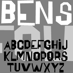
BENSGOTHIC was inspired by the work of the artist Ben Shahn. (See also Bensfolk) This style–which Shahn applied to psalms, Christmas cards, posters, and many other item—suggests inscriptional capitals like those of Byzantine mosaics, the Bayeux tapestry, or medieval manuscripts. He made great use of fanciful ligatures, which are included in the font for a totally hand-lettered feel. The new OpenType version of Bensgothic allows you to access the ligatures easily. In applications that support OpenType features, enable “discretionary ligatures.” Type your text in ALL CAPS to automatically use the ligatures as available. Type in lowercase (or MiXeD cAsE) to… continued
The BENSFOLK fonts were inspired by the work of the artist Ben Shahn. He was a political activist, a painter, and a calligrapher, among many talents. One of the lettering styles Shahn used was derived from the work of amateur sign painters. As trained artists often react to the work of so-called naive or folk artists, he found their crude beauty to be “cacophonous and utterly unacceptable. Being so it is irresistibly interesting.” Shahn used this lettering to represent the speech of the common person, and it blended perfectly with his pen work Shahn also lived to see his work–itself… continued
BENIGHTED is my stab at a blackletter font that with a loose, hand-lettered feel, sort of an Old English Casual or Fraktur Frisky. I first drew all the letters with a Sharpie marker, ultimately creating a font with an irregular baseline and a creepy feel. And now there’s a matching font with elongated letterforms and drips suggesting melting candles or blood. Version 1.5 includes an expanded character set and improved spacing.


ZITZ is my second cartoon font, based on the hand lettering in the King Features daily strip Zits by Jim Borgman and Jerry Scott. According to Robert C. Harvey’s thoughtful Children of the Yellow Kid: The Evolution of the American Comic Strip, “Zits” is a “teenage strip…ostensibly drawn by Borgman and written by Scott…. Borgman produces the final art.” The tall, tight lettering and expressive drawing style of Borgman’s political cartoons has long appealed to me; since 1997, “Zits” has represented a daily dose of his art. The scratchy outlines of the letters reflect both the artist’s pen and the… continued