
-Hand-Lettered-
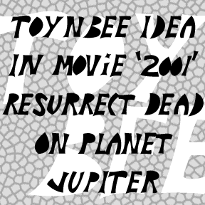

TOYNBEE IDEA was inspired by the mysterious Toynbee tiles phenomenon. Like the original tiles, these letters appears to have been cut out with a knife. You may have stepped over this strange crosswalk art and not realized the tiles have been a source of wonder for over 20 years. My photo of a weathered Philadelphia tile is at left; that’s the primary message of the tiles. For more information including a possible explanation, you should watch the 2011 film, Resurrect Dead: The Mystery of the Toynbee Tiles. My font suggests how the letters must have looked when first made. The… continued
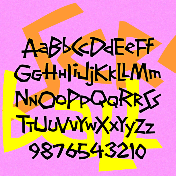
SCREWBALL looks like whimsical hand-lettering. It’s unpredictable with lots of close-fitting pairs. It was inspired by the hand-lettered titles of the movie What’s Up, Doc? (1972), designed by The Golds West Inc. Version 1.5 includes an expanded character set and many alternate characters that make use of Opentype features to create a more hand-lettered look, as well as improved spacing and kerning. What’s Up, Doc? is a personal favorite, directed by Peter Bogdanovich, starring Barbra Streisand, Ryan O’Neal, and, in her first film, the late Madeline Kahn, to whose memory this font is dedicated.
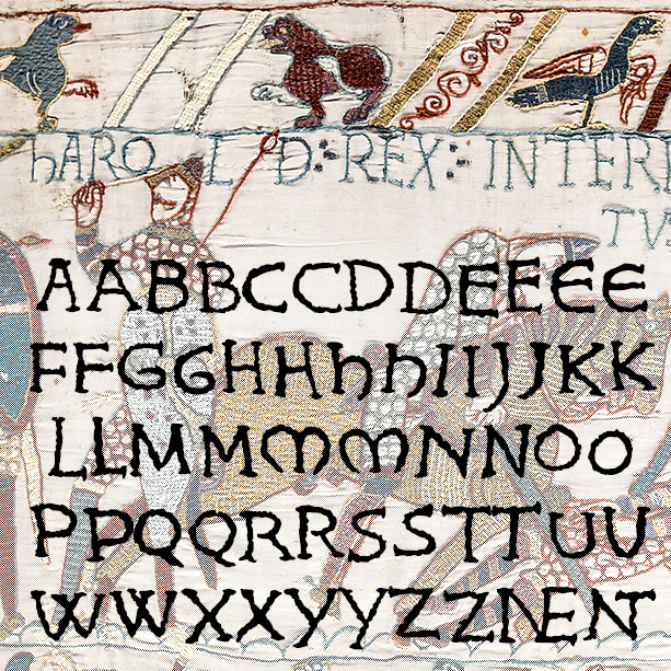
KING HAROLD looks like hand-embroidered lettering and was inspired by the Bayeux Tapestry. To get it just right, I drew, embroidered, and scanned all the characters. Version 1.5 makes use of Opentype features for alternate letterforms and ligatures, an expanded character set and improved spacing and kerning. The Bayeux Tapestry was made c.1073-83 and records King Harold’s adventures and loss at the Battle of Hastings to William the Conqueror, with a special appearance by Halley’s Comet. It measures 230 feet long (69 meters) and is one of the great examples of Romanesque art.
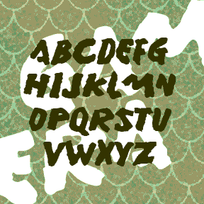
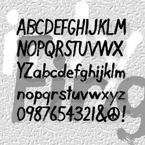
GAMERA was inspired by the hand-lettered titles of the English-language version of certain Gamera films. The font is emphatic and primitive with a rough organic edge, rather like its giant mutated namesake. Gamera was Daiei Studio’s answer to Toho Studio’s Godzilla. At the start of the series, the giant mutated turtle was a grave threat, but then became “friend to all children.” To me, all these such monster movies are just awful, but with the MST3K treatment they become good for a few laughs. Of course the atrocious dubbing and other attempts to sell the films in the West may… continued
DIRTY FINGER is a deceptively simple font, based on my own hand printing. It was begun by inking a Plexiglas plate, then drawing the letters backwards into the ink with my finger and a rag, the same way I draw my monoprints. Then I scanned, reversed, and flipped it to make what you see here.
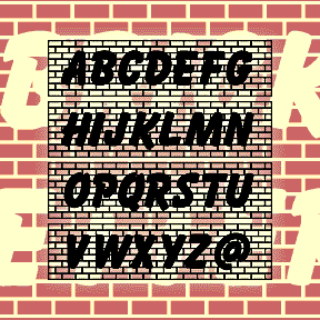
BRICKLETTER was inspired by Jeff Levine’s interlocking all-brick font “Off the Wall.” I took the brick idea that and added letters based on Max Kaufmann’s classic font Balloon. Each letter fits with the next to create a brick wall emblazoned with bold graffiti. The brackets and underscore can be used to create square ends and bricked space. Parodied on Something Awful as “Bricks of Failure…What could make a font read better than putting a bunch of bricks behind it? Absolutely nothing! It’s perfect!” This font contains caps, numbers, punctuation, and international characters.
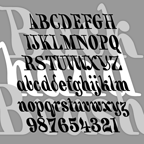
BACKHAND BRUSH is my re-creation of a classic 19th-century style of hand lettering, also known as a “marking” alphabet. Like some Victoriana and Art Nouveau fonts, it was revived in the psychedelic era. My font is completely redrawn from an antique guide to hand lettering. I have regularized it somewhat (maintaining a constant 18-degree slant) but also tried to keep a slightly random brush feel. Version 1.5 has an expanded character set and improved spacing and kerning.